 ISAAC WOOTEN
Raging Systems
Custom gaming computers. A charging-bull mark, and the brand world it implied.
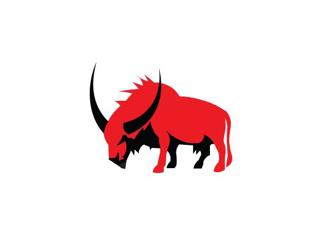
A mark that looks like it would rather be charging. Raging Systems built high-end gaming computers to each customer’s specification. At Levid Media I designed the identity: a red bull with its head down and its horns forward, over a wide, squared-off wordmark, so the brand read as fast and physical rather than as another beige box. What it taught me: in a category of beige boxes, the fastest way to stand out is to give the brand a pulse.
The brief
Every rig is built for one person. The brand had to feel like a weapon, not a spec sheet.
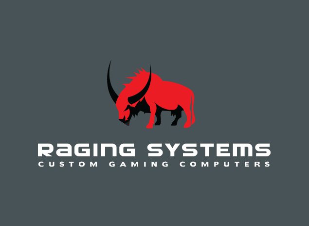
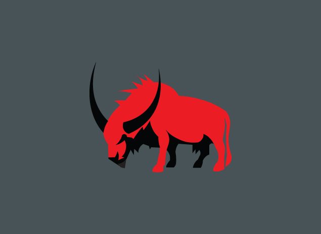
Gaming hardware brands tend to shout in rainbow LEDs and chrome. The answer here was one colour and one animal. The bull is drawn as a silhouette in mid-charge, red body and black horns, so it holds up at favicon size and on a case badge. The wordmark underneath is wide and mechanical, like lettering machined into a panel, with CUSTOM GAMING COMPUTERS spaced out beneath it to say exactly what the company does.
Silhouette over detail
The bull reads from its outline alone, head down, horns forward, mane up. No gradients, no fur.
Red on charcoal
One red and a charcoal slate, with black and white for contrast. The machines supply any other light.
Machined type
A wide, squared-off wordmark that feels engineered, set over a tracked-out descriptor.
Two grounds
The mark works on charcoal for the product and on white for print, packaging and paperwork.
The mark
Brand system
One mark, one wordmark and a lot of attitude. I locked that attitude as brand DNA (raging red on charcoal, a wide mechanical face, dramatic light on dark rigs) and rendered where it would go: packaging, merch, product screens and a storefront.
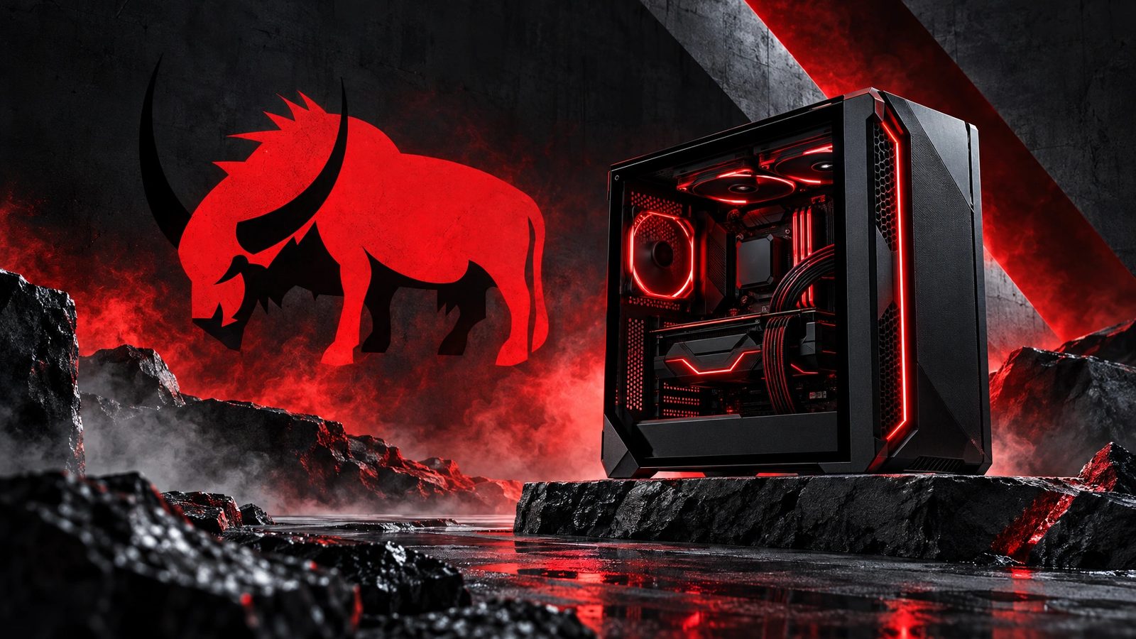 Brand world · rendered from the locked brand DNA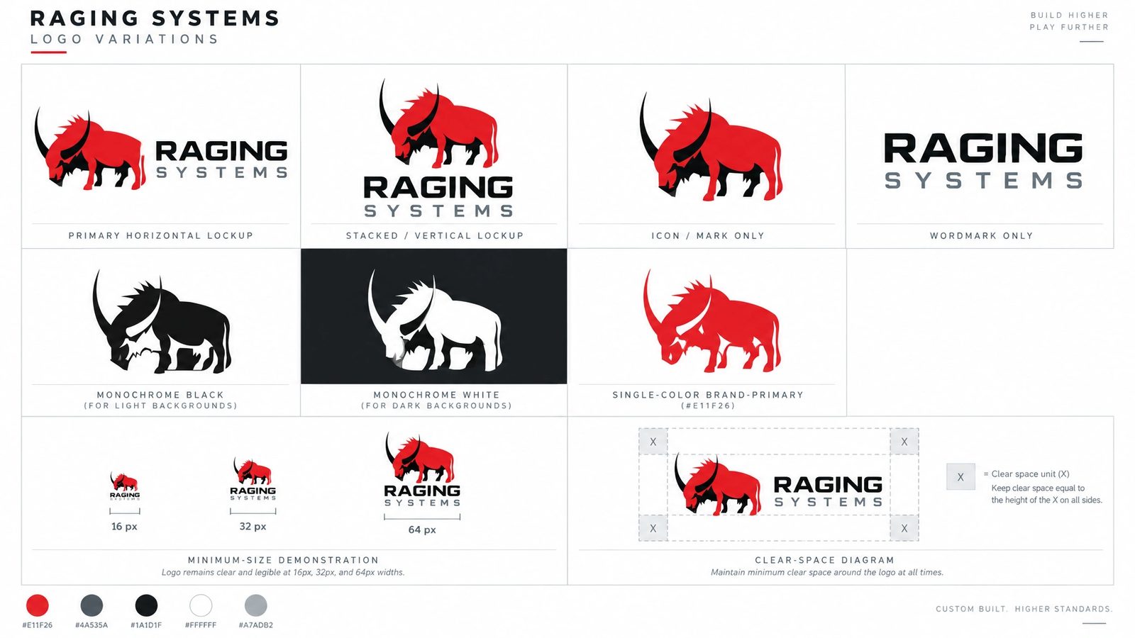
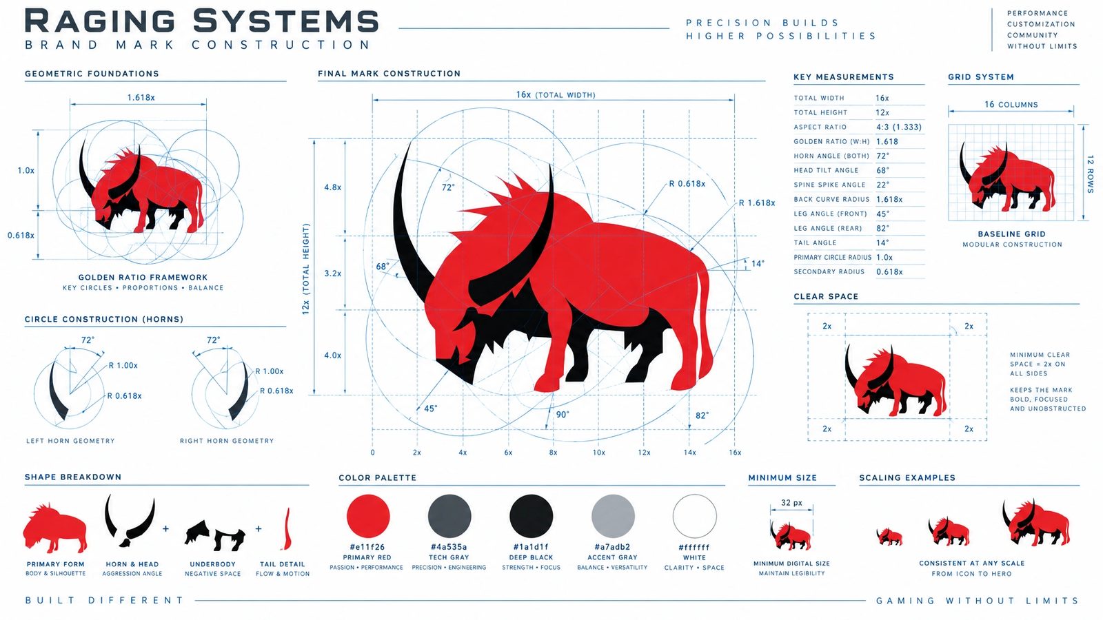
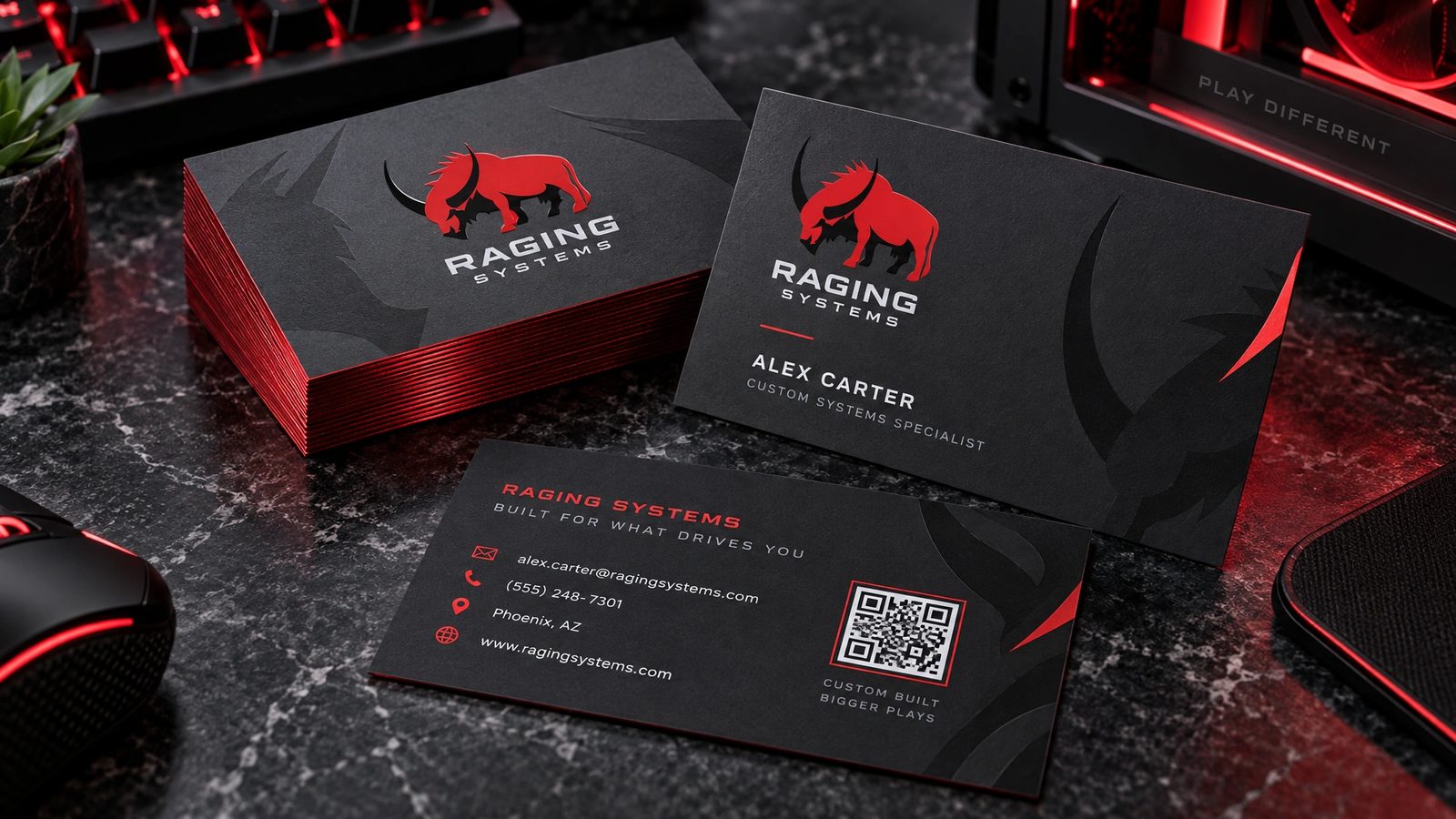
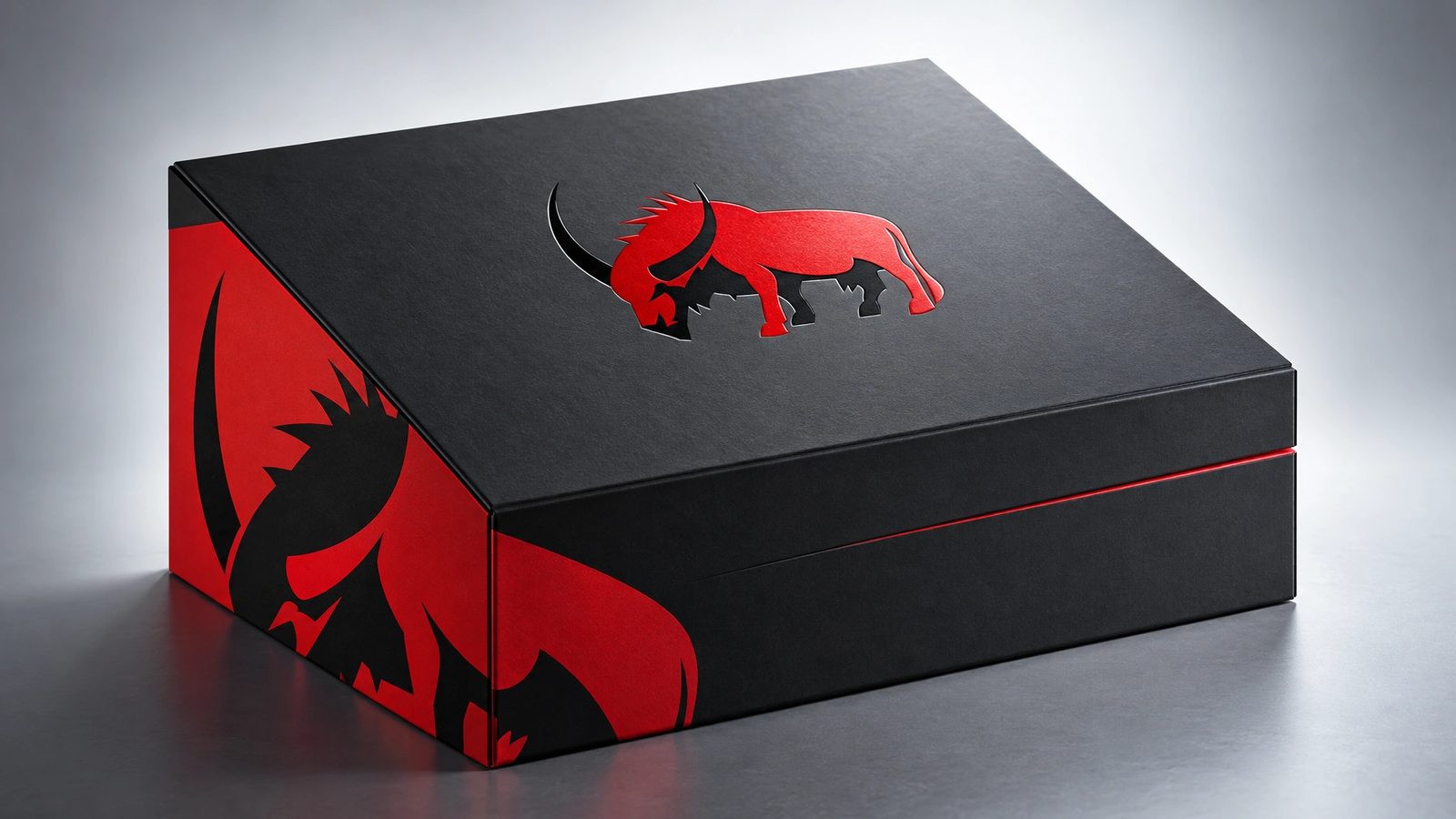
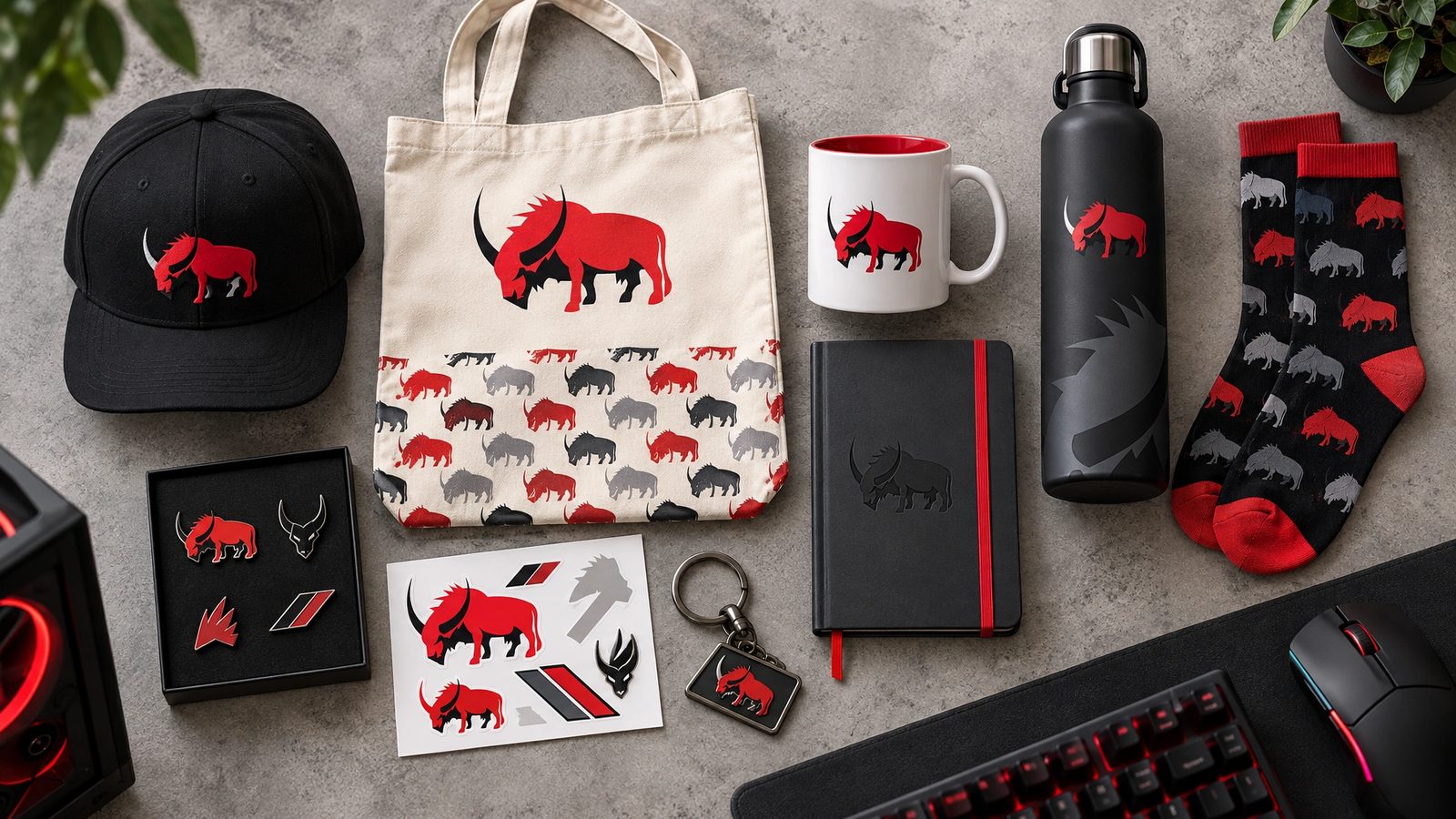
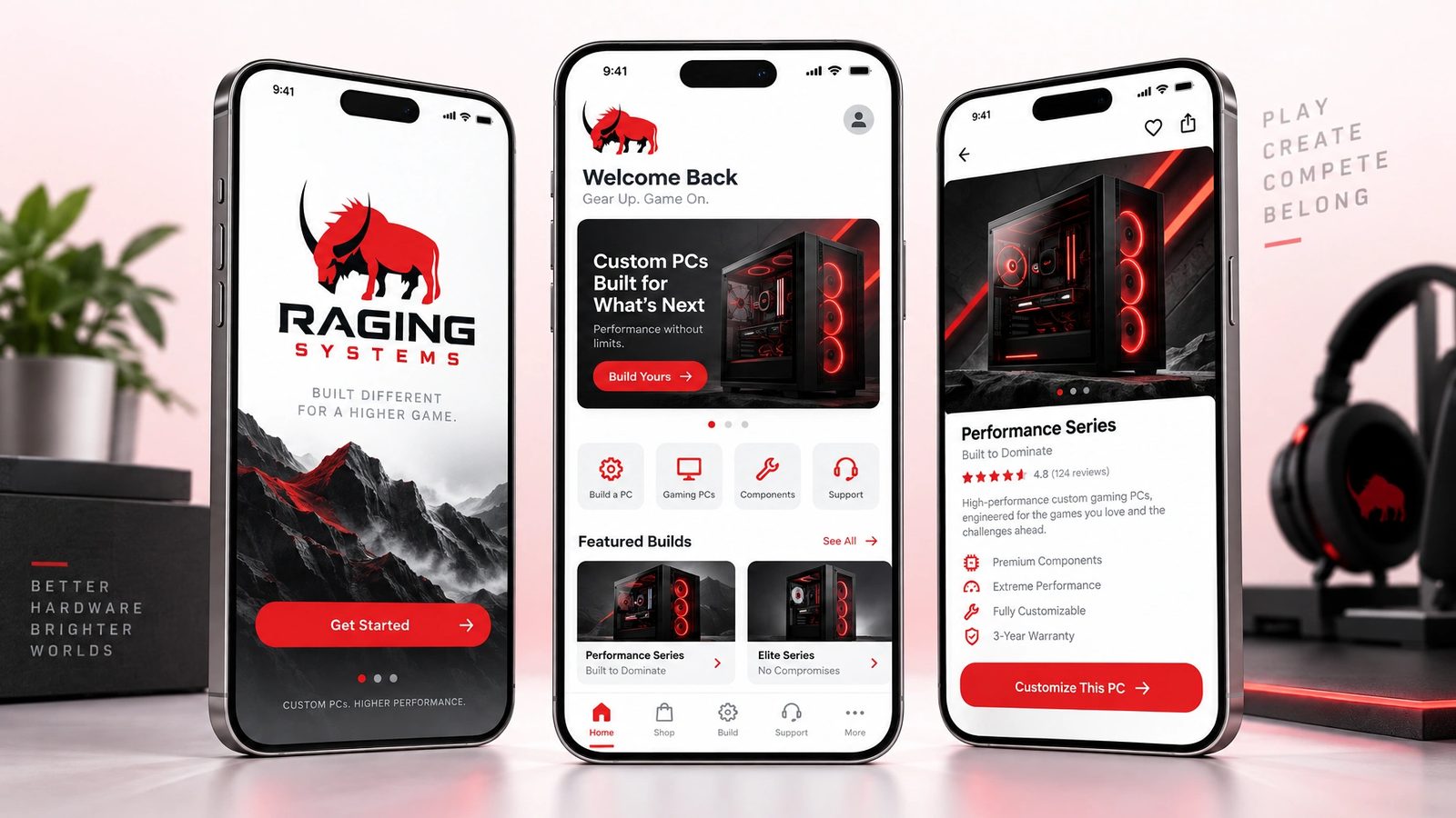
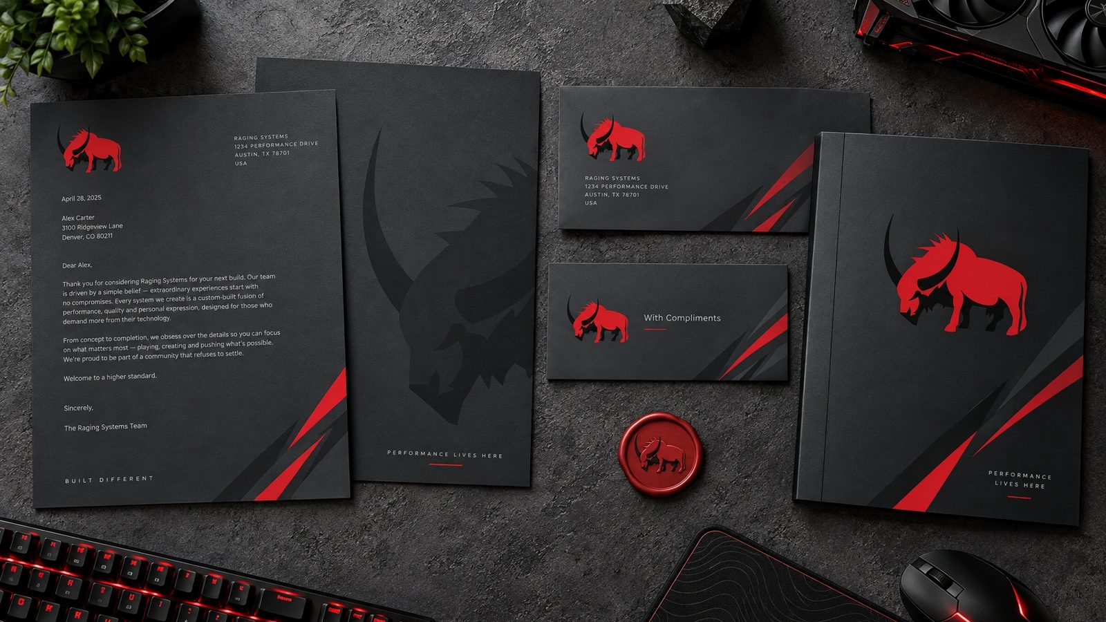
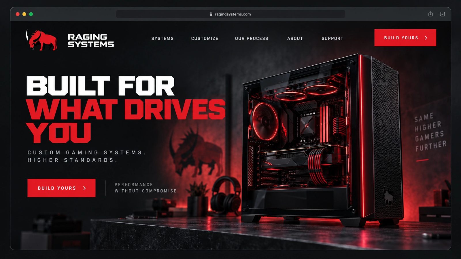
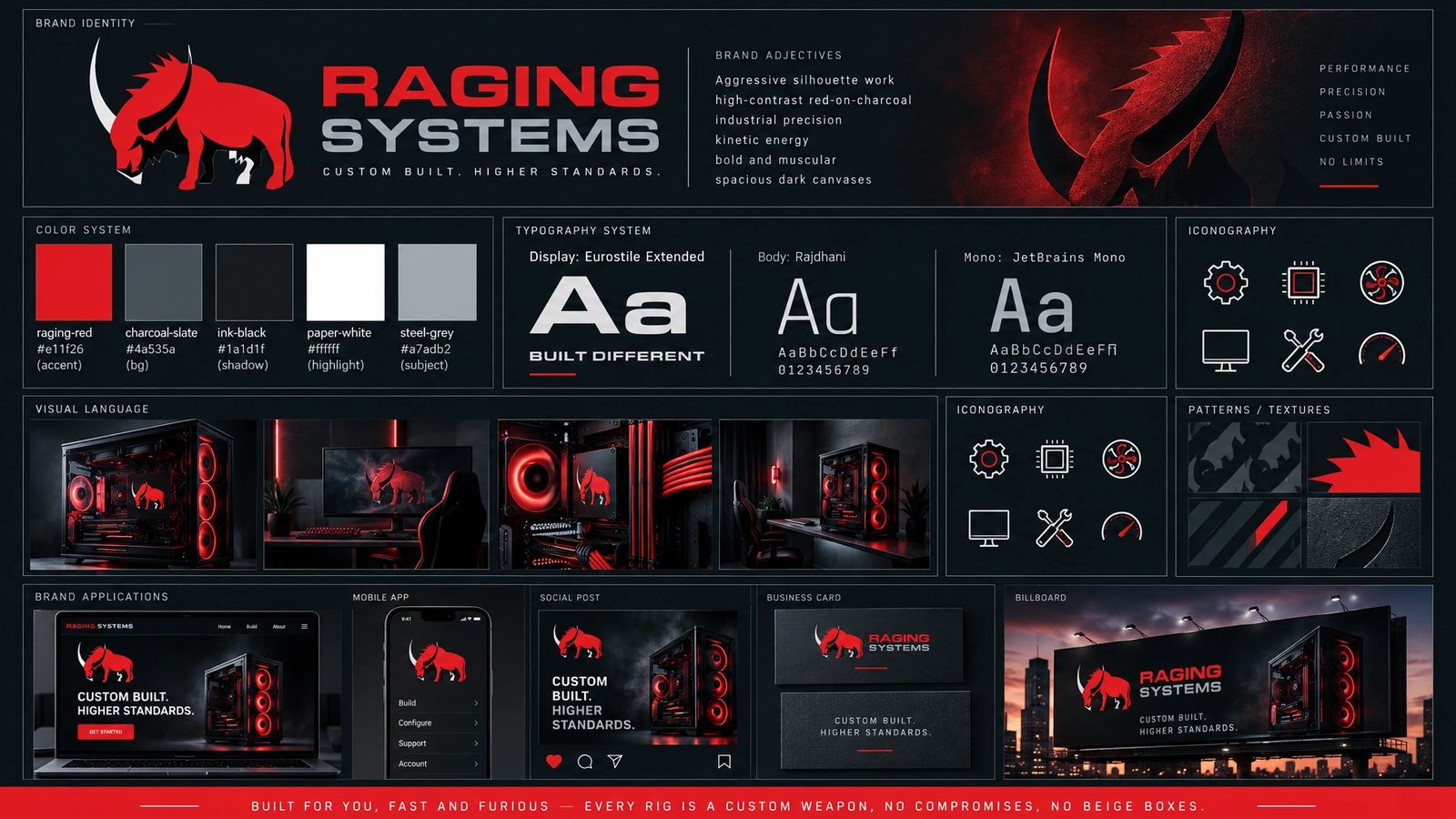
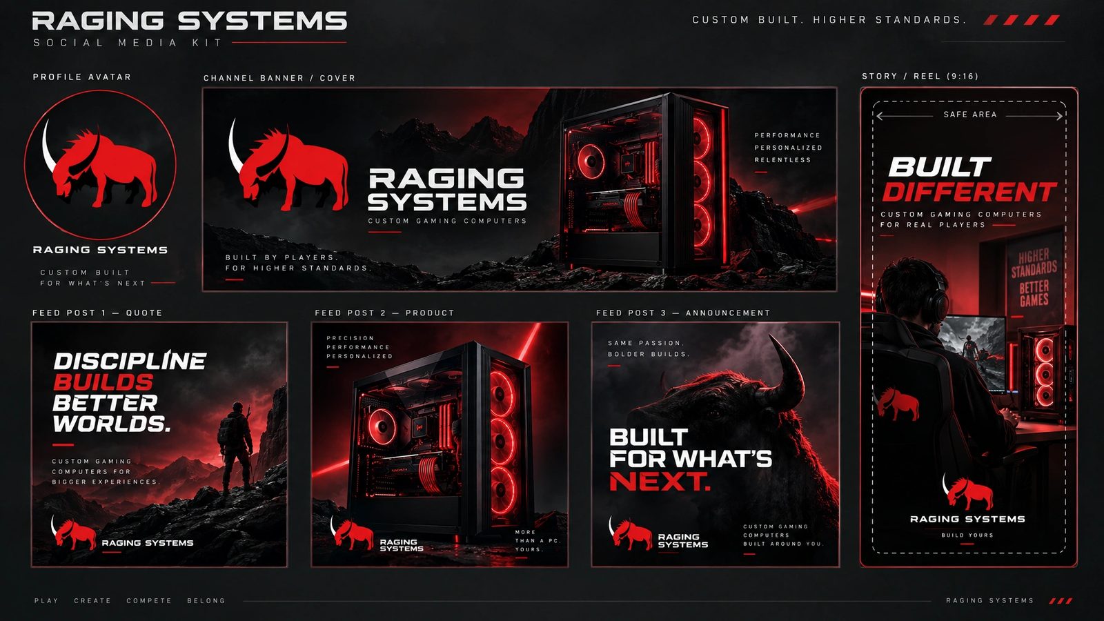
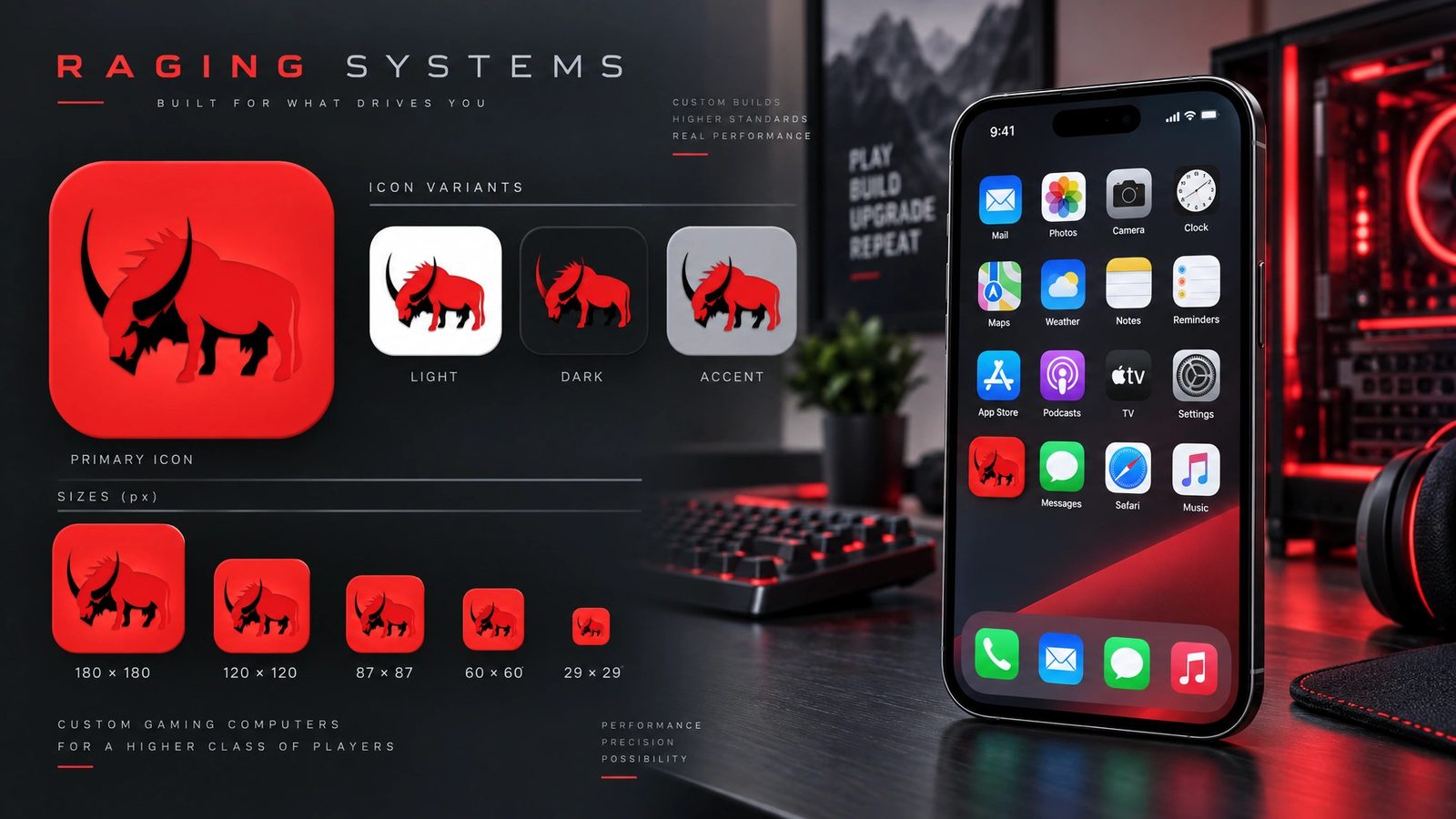
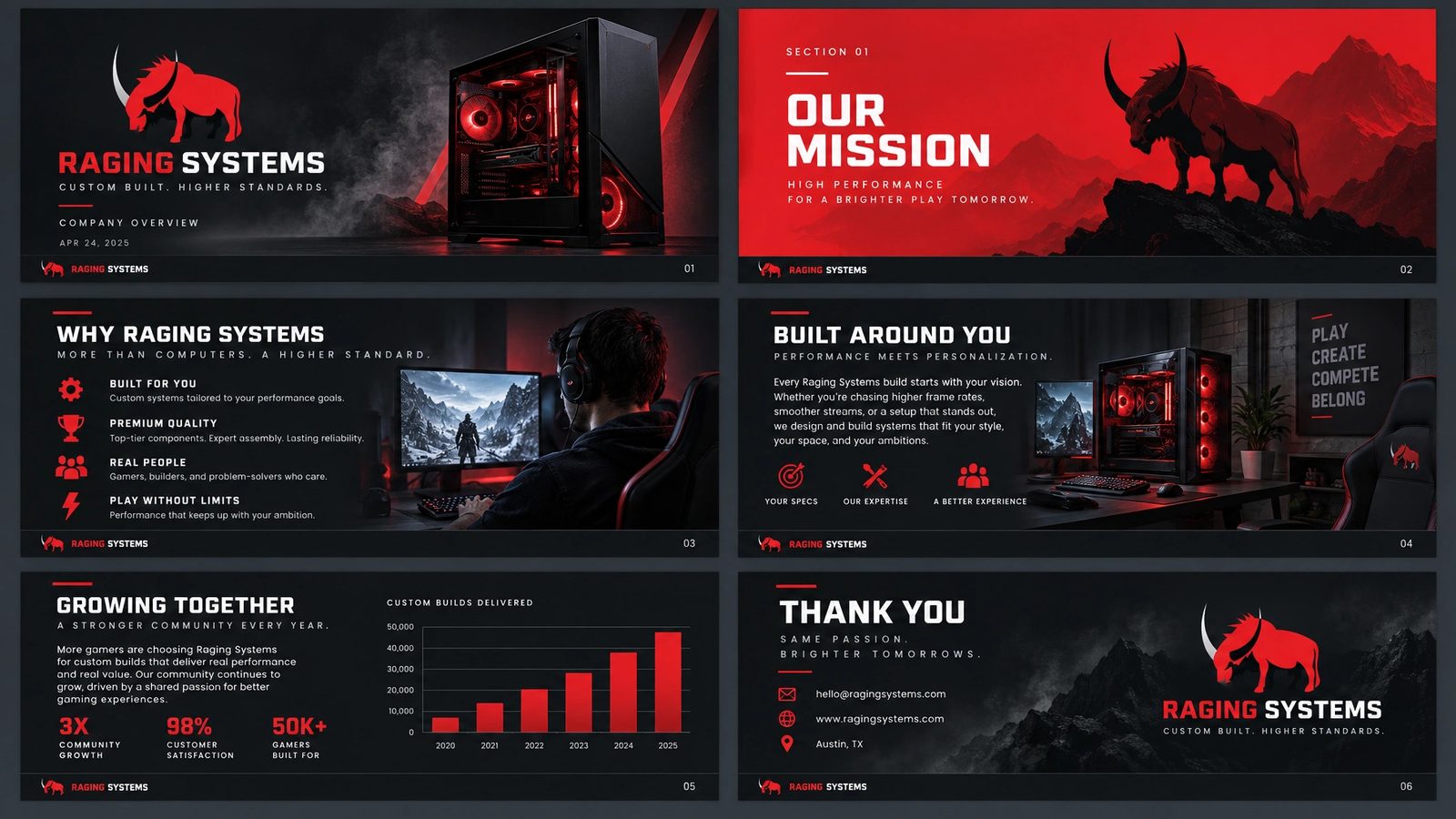
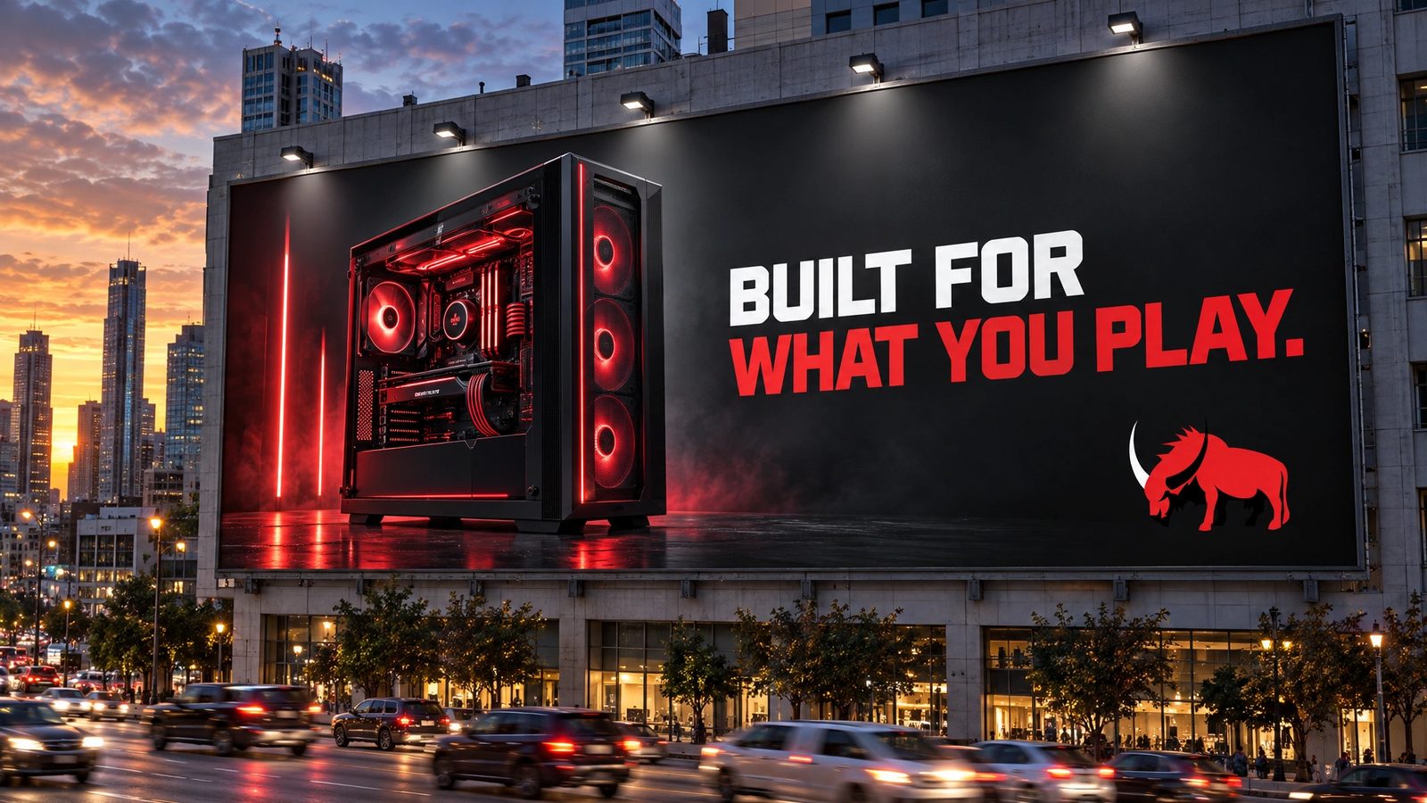
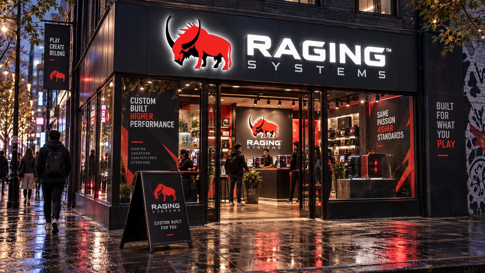
The marks are the design. The brand world is a 2026 study made with my own tool from them, not work delivered to the client.
Every rig is a custom weapon. No compromises, no beige boxes.
Raging Systems, the brand line
Role
Levid Media for the mark and wordmark. A 2026 study for the brand world.
Creative direction
Founder and creative director at Levid Media, the agency that took the brief.
Mark and wordmark
The charging bull, the wordmark and the lockup, on dark and light grounds, designed end to end.
Brand DNA
Extracted from the marks and locked: palette with roles, display and body type, imagery rules, anti-defaults.
Fifteen surfaces
Logo system, cards, stationery, packaging, merch, social kit, a presentation, web, app and app icon, billboard and storefront, rendered from the locked DNA.
- Logo design
- Brand identity
- Consumer hardware
- Gaming
- Brand DNA extraction
- Brand systems
Next
The mark lives in the archive with forty-three other projects from the agency years.
Browse the archive →