 ISAAC WOOTEN

The I.C.E. Society
A photography school on the web. Inspire, challenge, educate: a public home and a members’ hub, 2011.
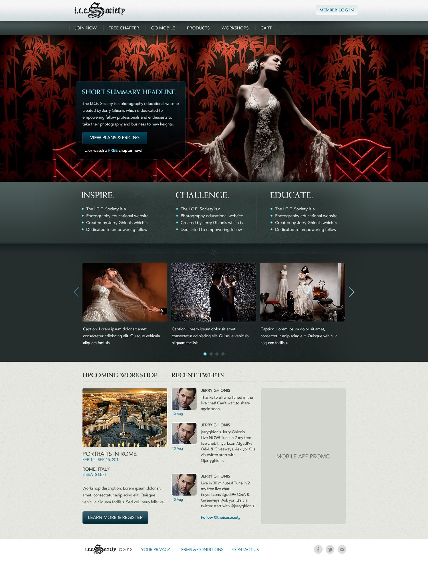
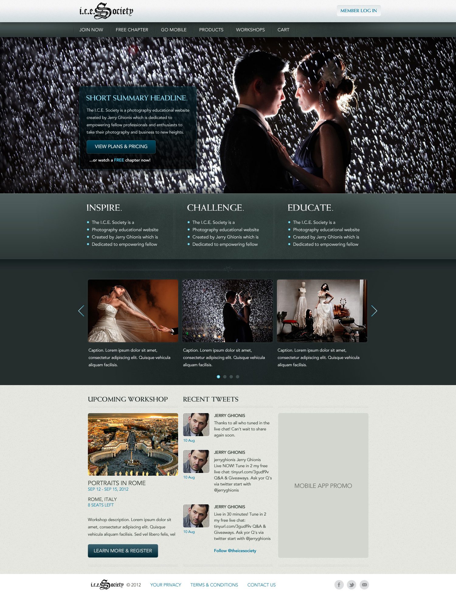
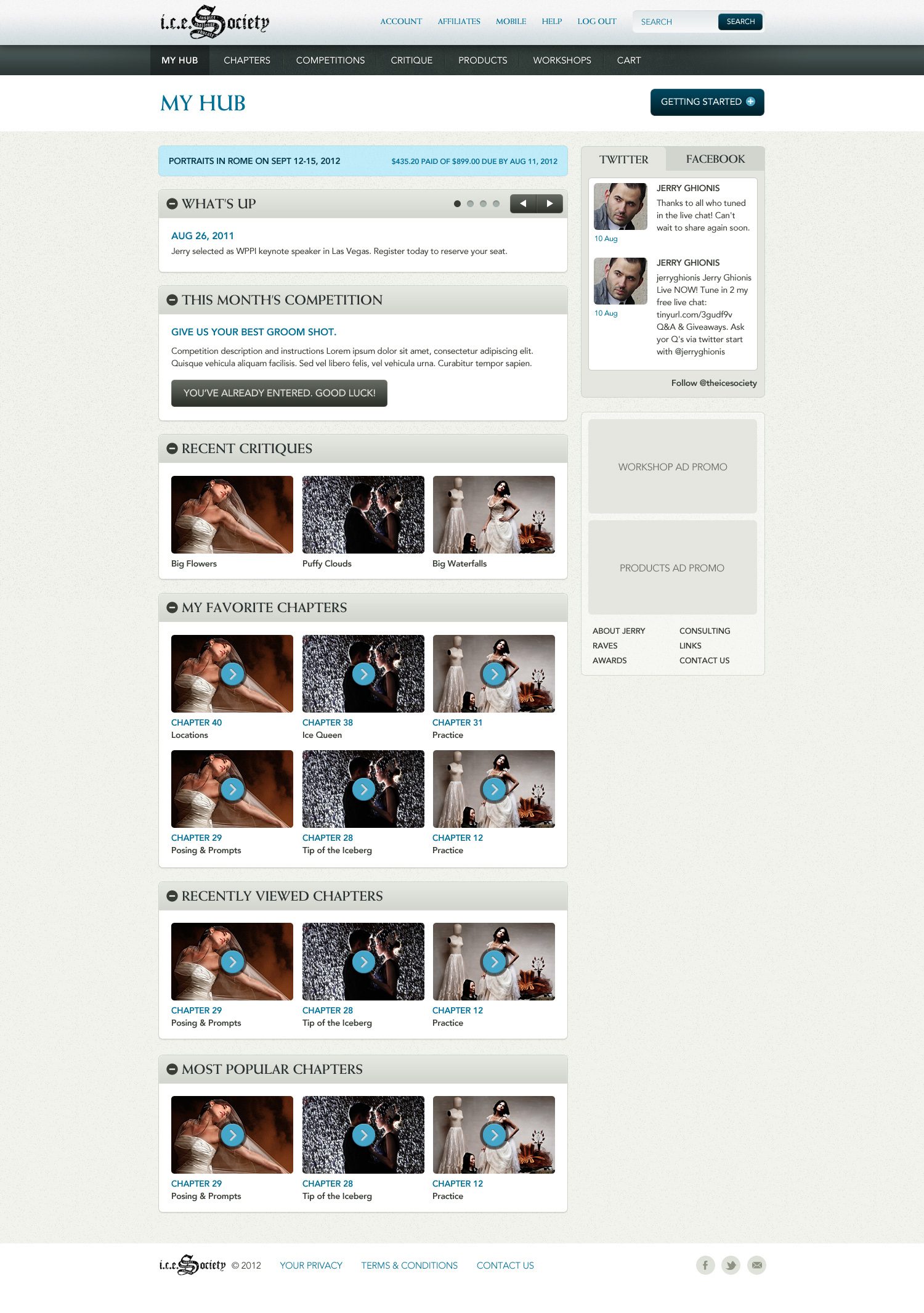
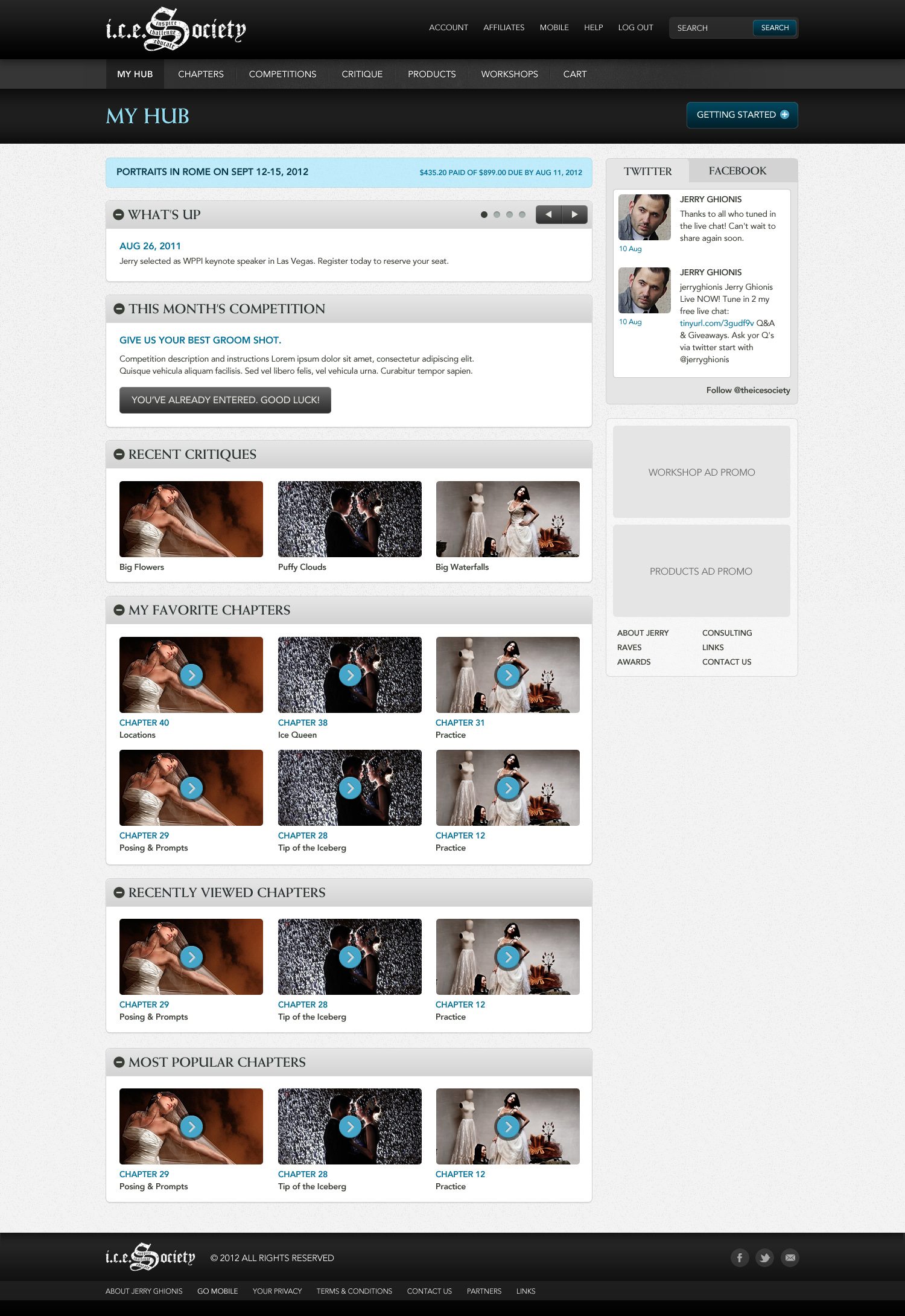
A site that had to sell a photographer’s teaching without upstaging his photographs. The I.C.E. Society was Jerry Ghionis’s photography school: video chapters, monthly competitions, critiques and workshops for professionals and enthusiasts, built around inspire, challenge, educate. In 2011, at Levid Media, I designed the public home and the members’ hub. What it taught me: when the product is someone else’s work, the best design is the one you barely notice.
The brief
The product was the photographs. Everything else had to stay out of their way and still close the sale.
Ghionis shoots high-drama portraiture: backlit rain, smoke, red bamboo wallpaper, brides in chiaroscuro. The public home lets one of those images fill the screen and puts the pitch in a translucent panel over it, with the three words of the mission in a small-caps serif underneath and a carousel of the work below that. The members’ hub is the opposite problem, a dashboard of chapters, competitions and critiques that has to stay legible after a hundred logins, so it goes to paper and collapsible panels, with the drama kept to the thumbnails.
Blackletter, once
The gothic wordmark carries inspire, challenge and educate inside its S. It is the only blackletter on the site; everything else is a quiet serif and a sans.
Ink and teal
Near-black and a slate teal for the chrome, one ice-blue for links and buttons, and the warmth left to the photographs.
Two temperatures
The home is dark and cinematic; the hub is pale paper with dark bars. Same brand, two jobs.
Panels that collapse
What’s up, this month’s competition, critiques, favourite chapters: each a panel a member can close, so the hub is theirs to arrange.
The templates
Brand system
The templates set a mood more than a system. I kept the mood (ink and teal with one ice-blue accent, blackletter kept for the wordmark, serif small caps, chiaroscuro photography), locked it as brand DNA and rendered the rest: print, packaging, product screens and out of home.
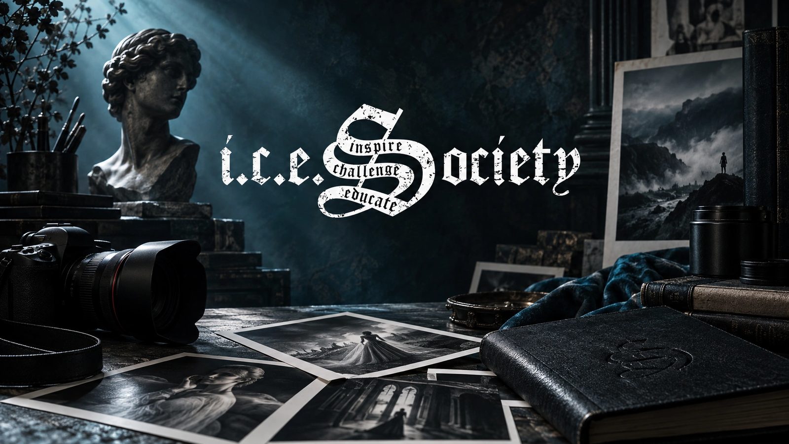 Brand world · rendered from the locked brand DNA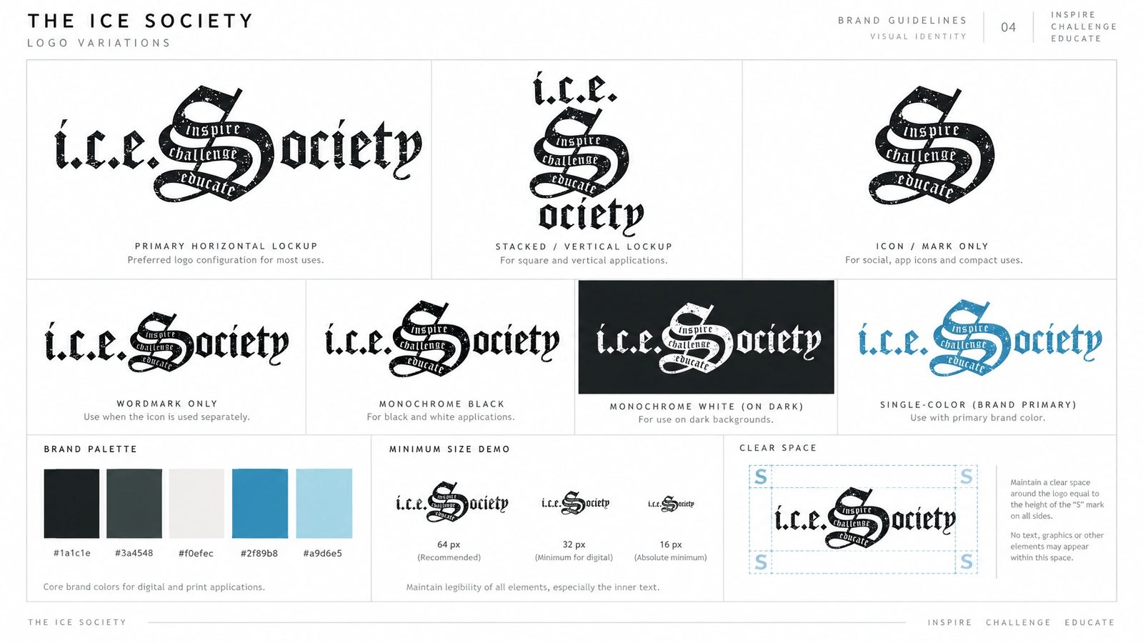
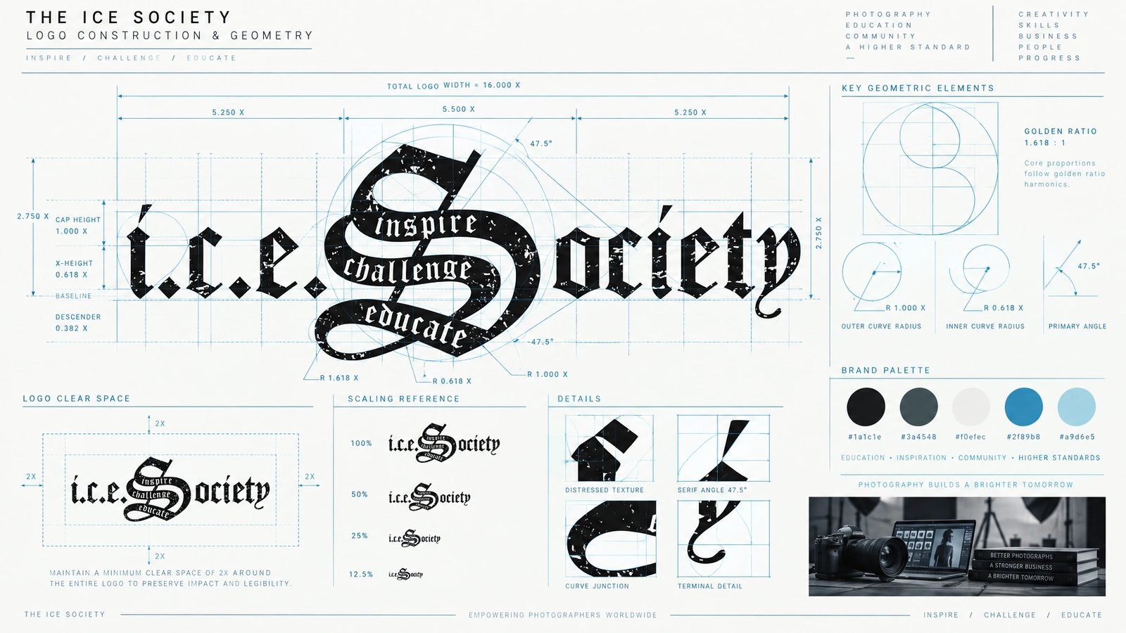
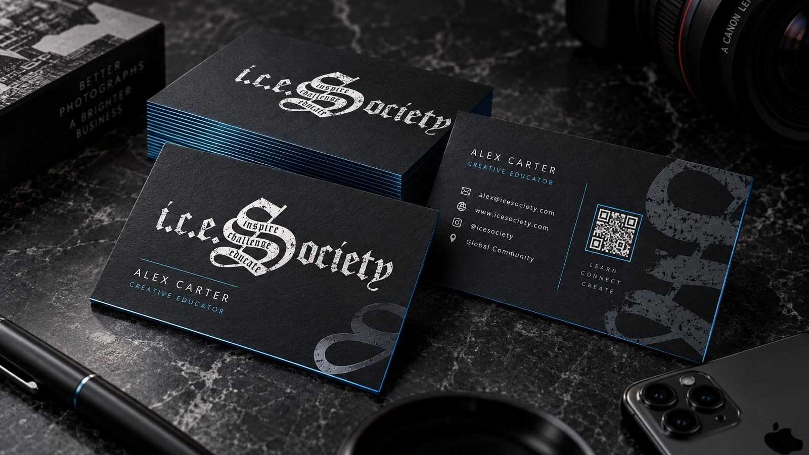
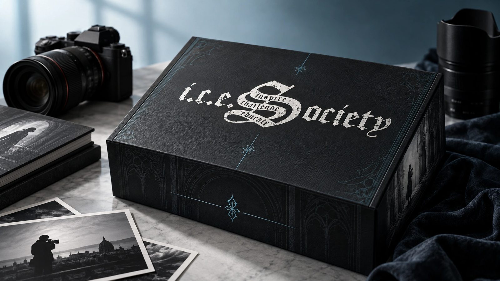
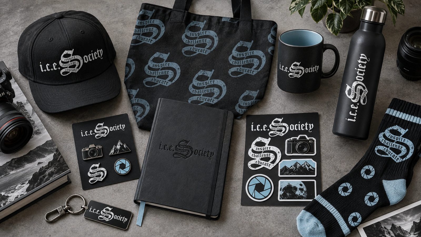
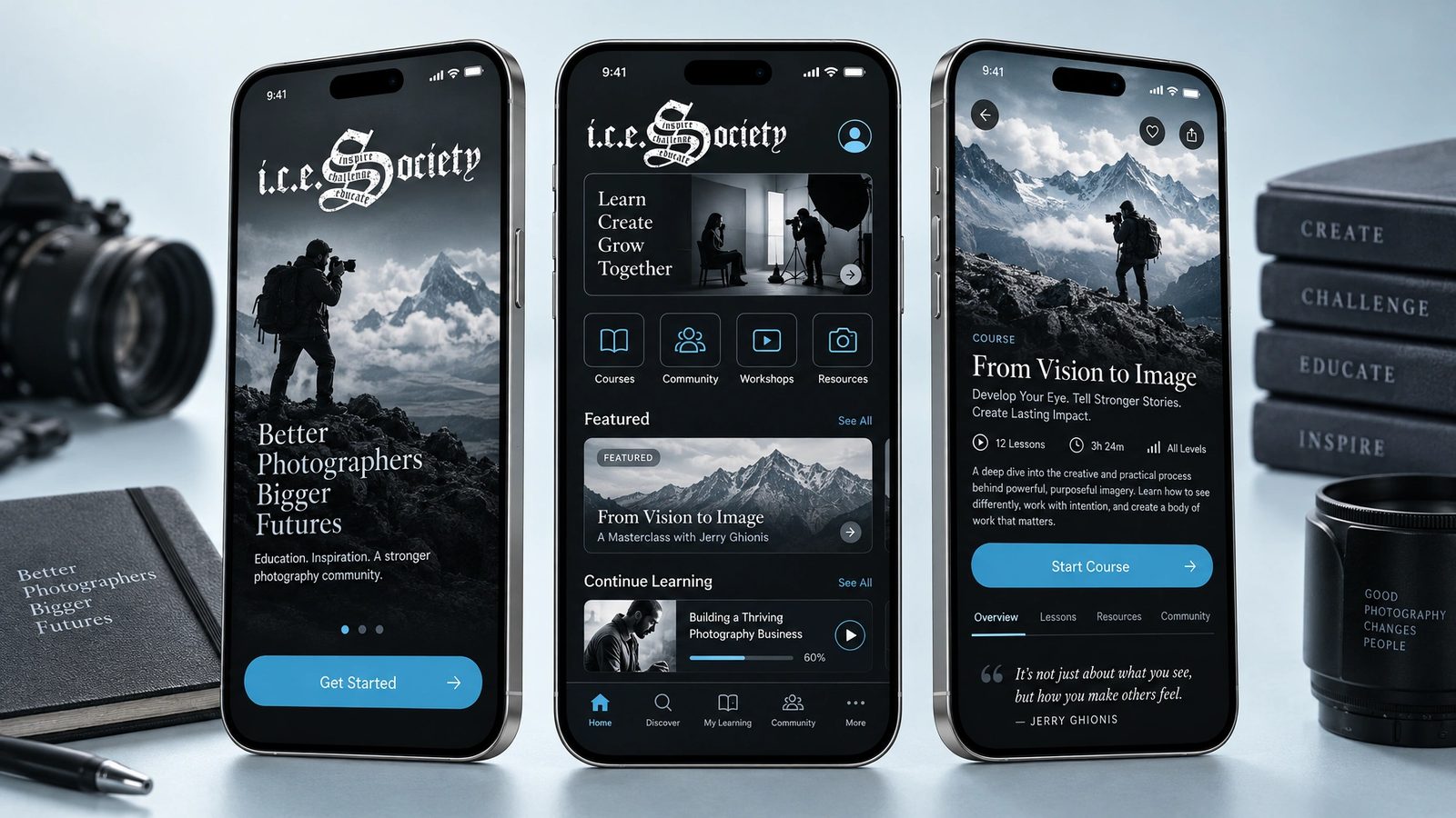
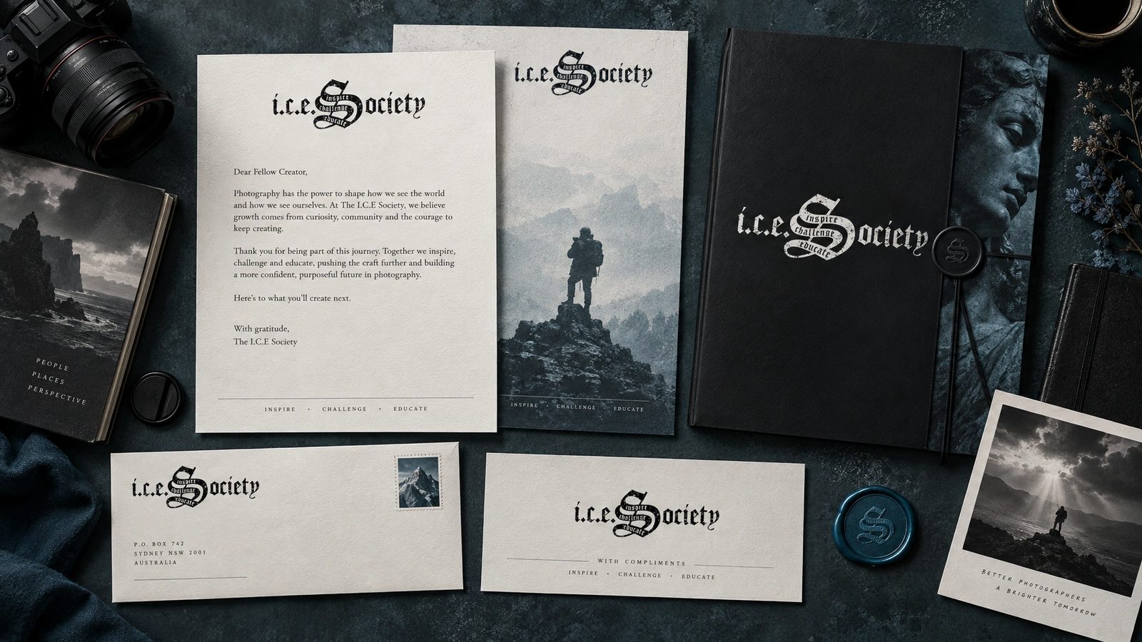
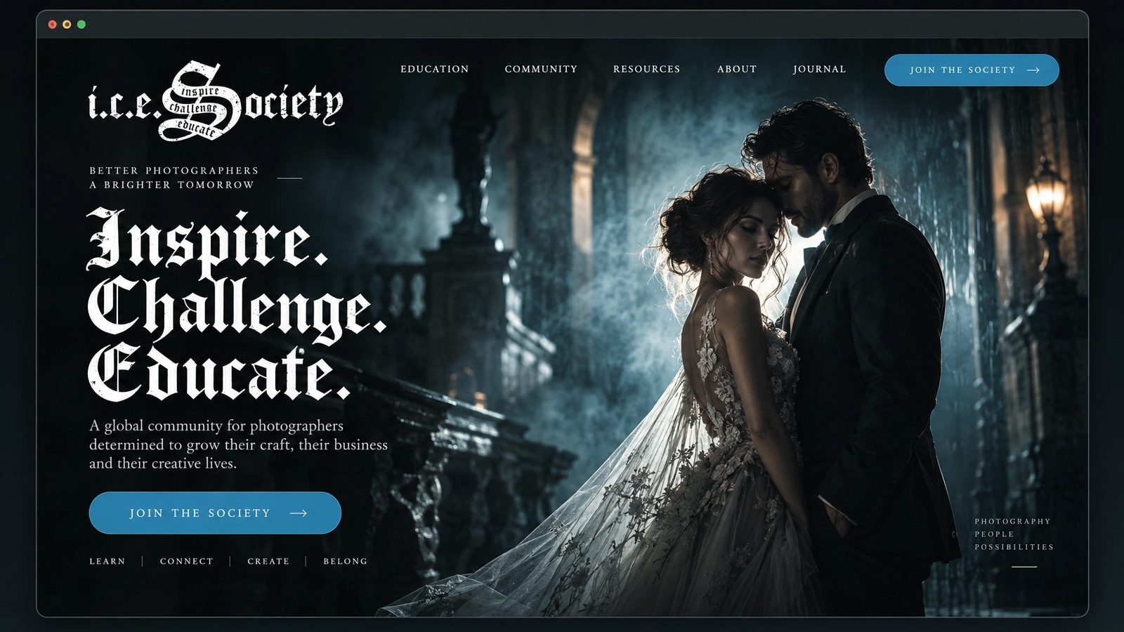
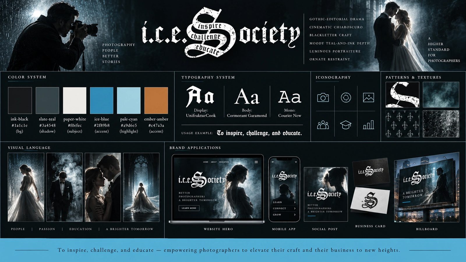
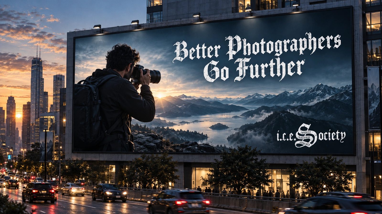
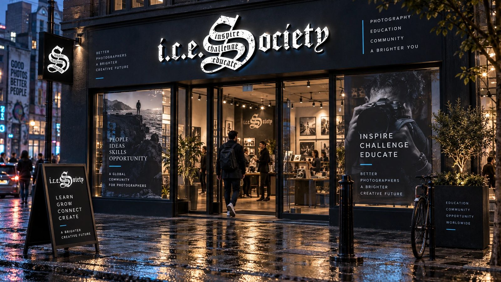
The 2011 templates are the design. The brand world is a 2026 study made with my own tool from those templates, not work delivered to the client. The photographs in the templates are Jerry Ghionis’s.
Inspire. Challenge. Educate.
The I.C.E. Society, the three words in the mark
Role
Levid Media in 2011 for the site. A 2026 study for the brand world.
Creative direction
Founder and creative director at Levid Media, the agency that took the brief.
Home and hub
The public home and the members’ dashboard, two temperatures on one brand, designed end to end.
Brand DNA
Extracted from the templates and locked: palette with roles, blackletter and serif type, imagery rules, anti-defaults.
Twelve surfaces
Logo system, stationery, packaging, merch, web, app, billboard and storefront, rendered from the locked DNA.
- Web design
- Editorial design
- Art direction
- Membership products
- Brand DNA extraction
- Brand systems
Next
The templates live in the archive with forty-three other projects from the agency years.
Browse the archive →