 ISAAC WOOTEN
Loma Linda University
A health-sciences university on the web. Three 2011 templates, and the brand world behind them.
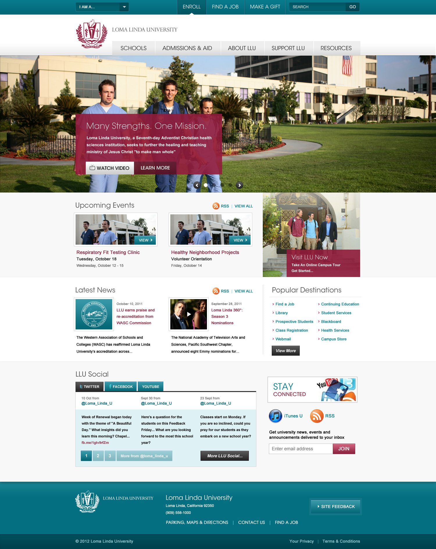
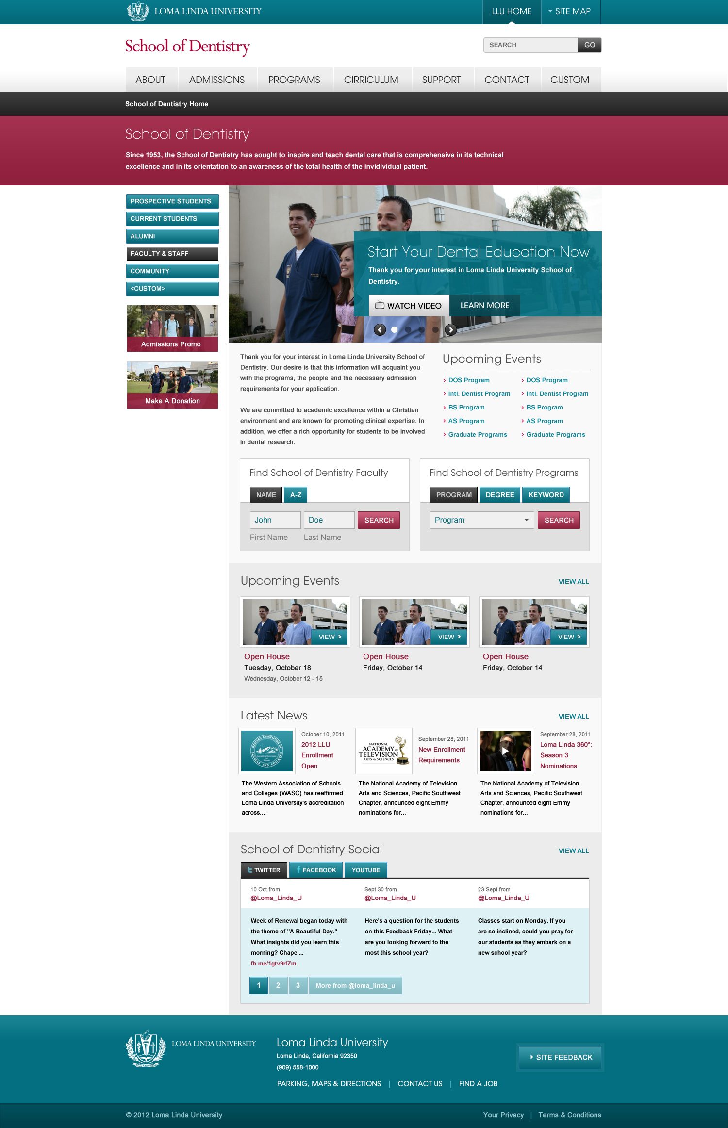
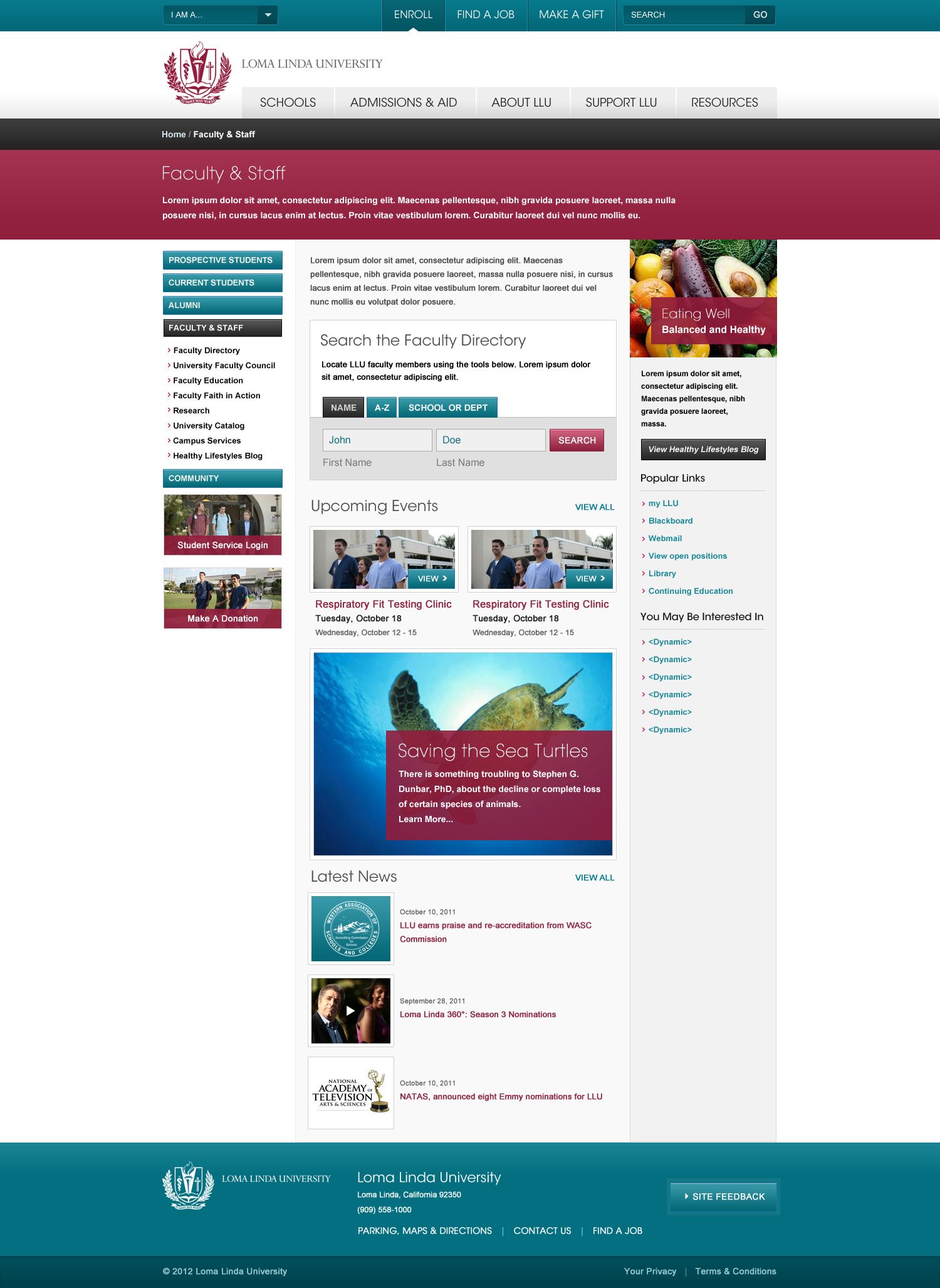
Three templates for a university that is also a hospital. Loma Linda University is a Seventh-day Adventist health-sciences university in Southern California. In 2011, at Levid Media, I designed its web system: the university home, a school home and a section page, one chrome and one set of modules that had to hold eight schools and a medical centre. What it taught me: when one site serves students, patients and donors, the system matters more than any single page.
The brief
One university, eight schools, a medical centre, and a site that had to speak to a prospective student, a patient and a donor on the same page.
The answer was a system rather than a homepage. A persona selector at the very top, "I am a…", routes each visitor before the navigation does. Under it, the crest and the university's tabbed navigation stay fixed at every level, while the schools get their own name in a serif and their own crimson band. Events, news, social and popular destinations are modules that repeat on the university home, the School of Dentistry home and the Faculty and Staff page, so a school could run its own site without redesigning anything.
Crest and crimson
The heraldic crest leads every page, and the mission statement sits in a translucent crimson panel over the photograph, the one place the brand raises its voice.
Photography first
Full-bleed campus photography, students in scrubs, real buildings, warm light. No illustration, no stock handshakes.
Teal for utility
The top bar, the tabs, the footer and every button are teal, so the working parts of the page read apart from the crimson of the message.
Modules, not pages
Events, news, social and a directory search as repeatable blocks, in the same positions at every level of the site.
The templates
Brand system
The templates set a palette, a type stack and a posture but never wrote them down. I wrote them down (crest, crimson and teal, serif headlines over a condensed sans, photography framed in bands of white) and rendered the rest of the brand from that DNA: print, packaging, product screens and signage.
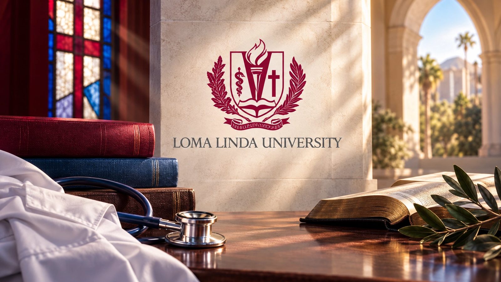 Brand world · rendered from the locked brand DNA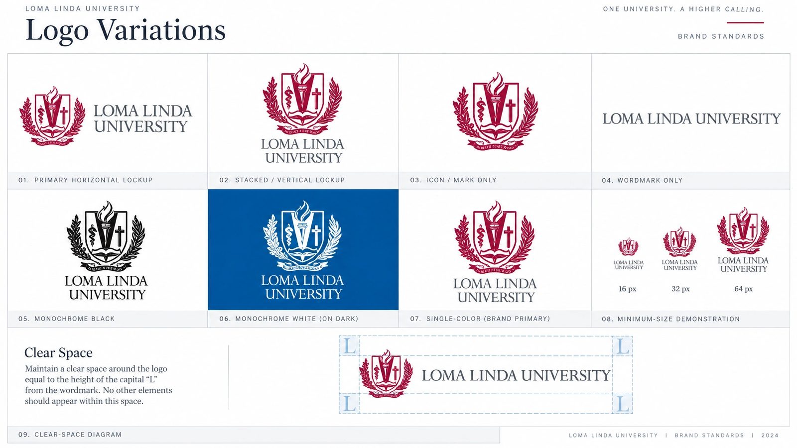
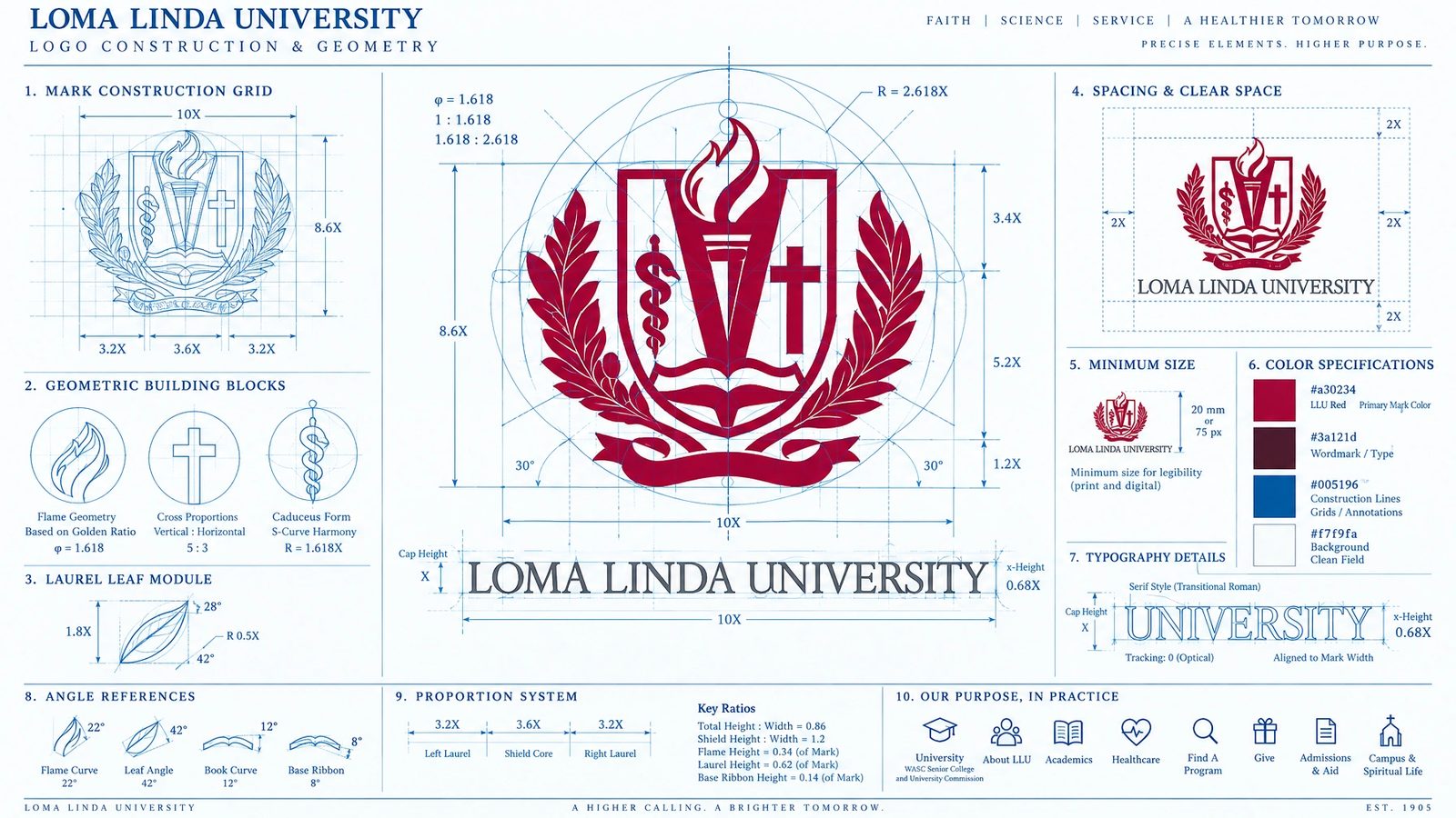
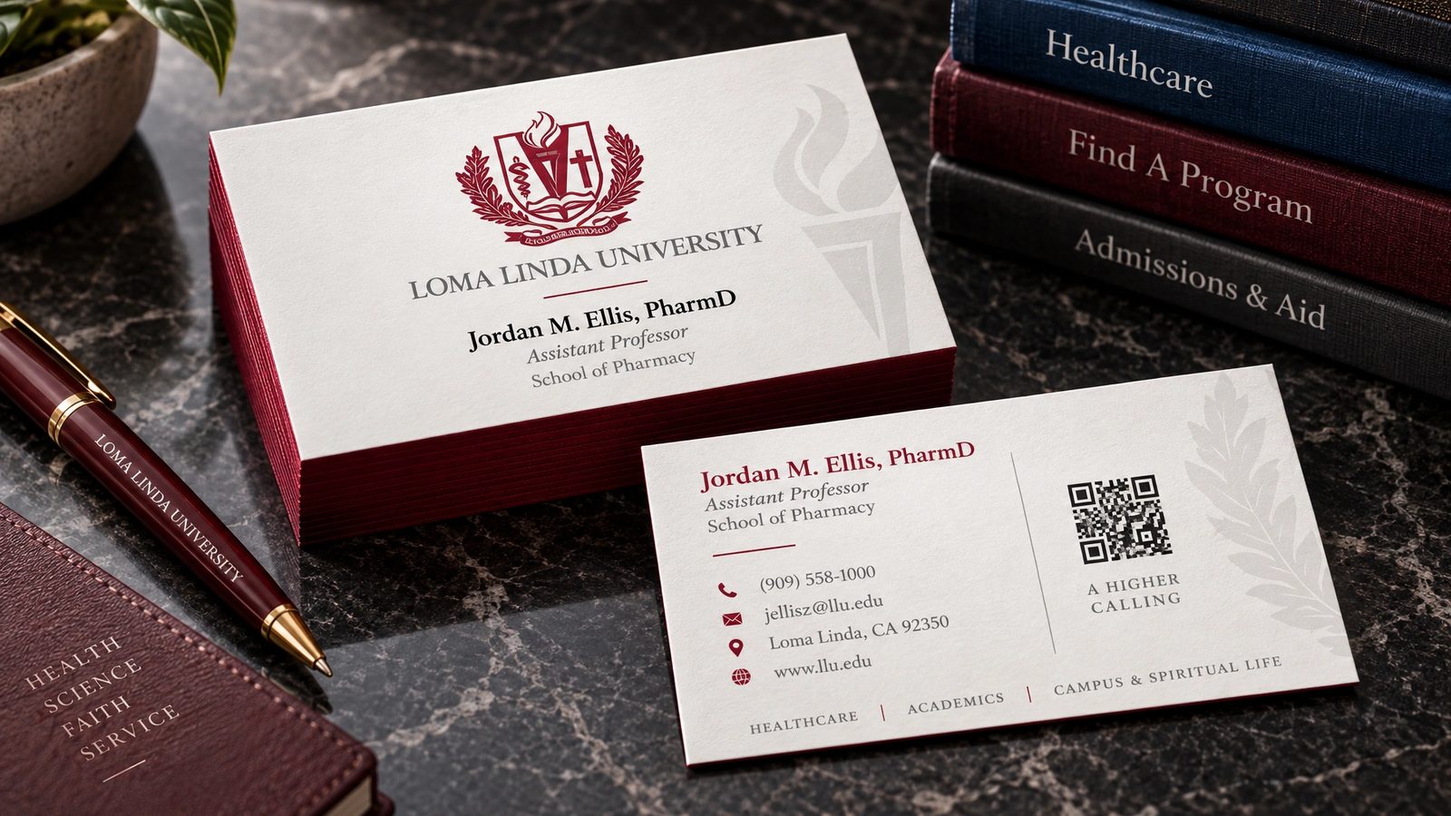
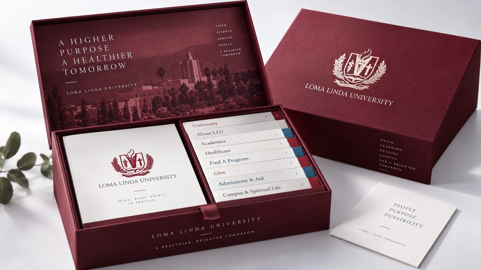
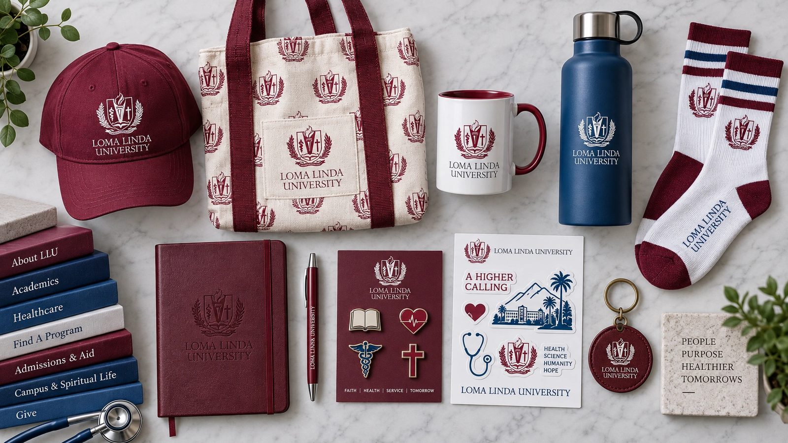
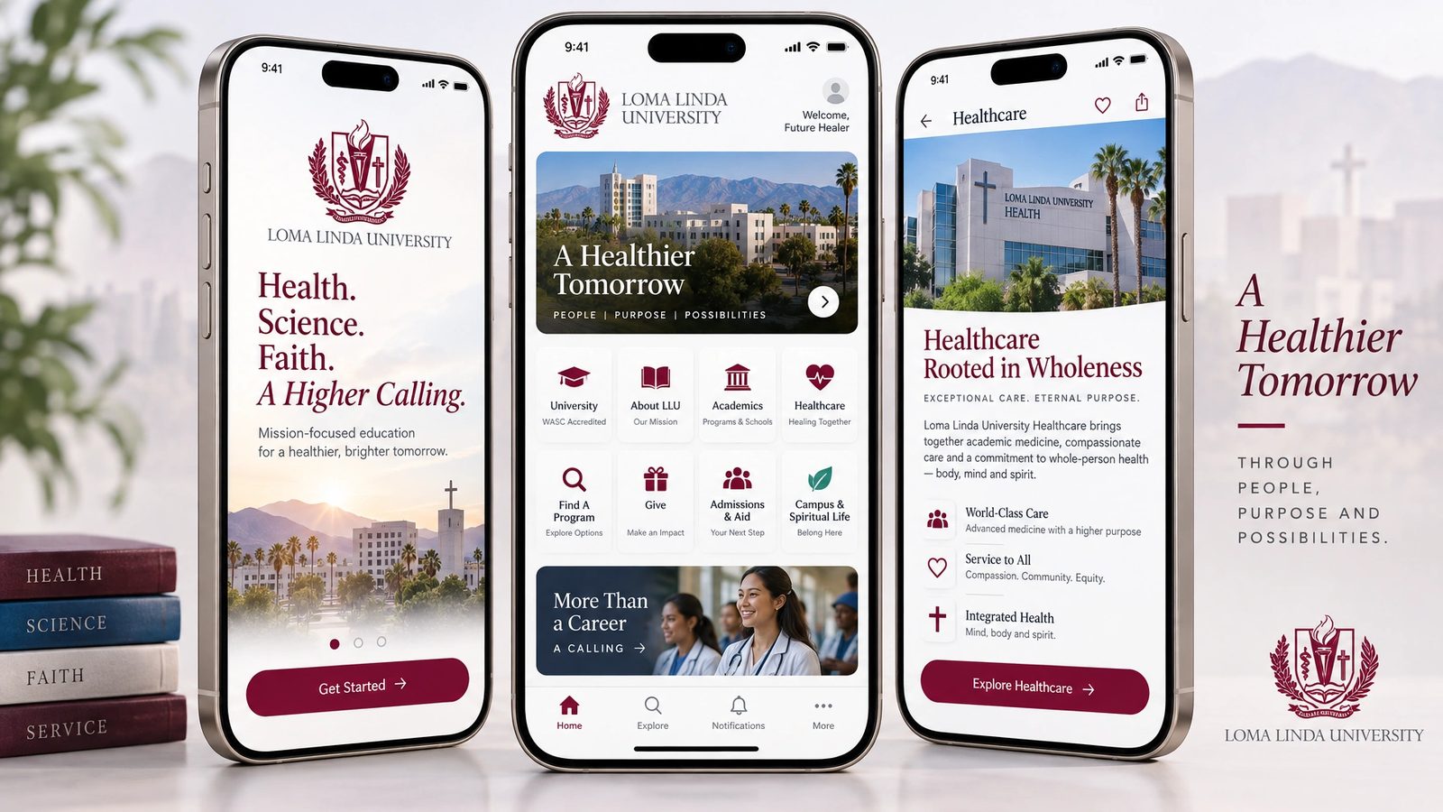
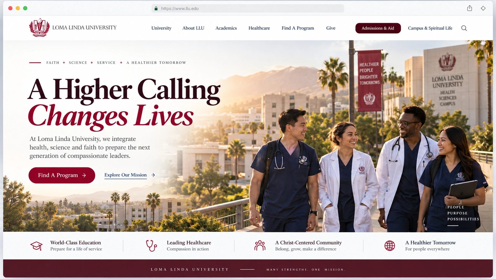
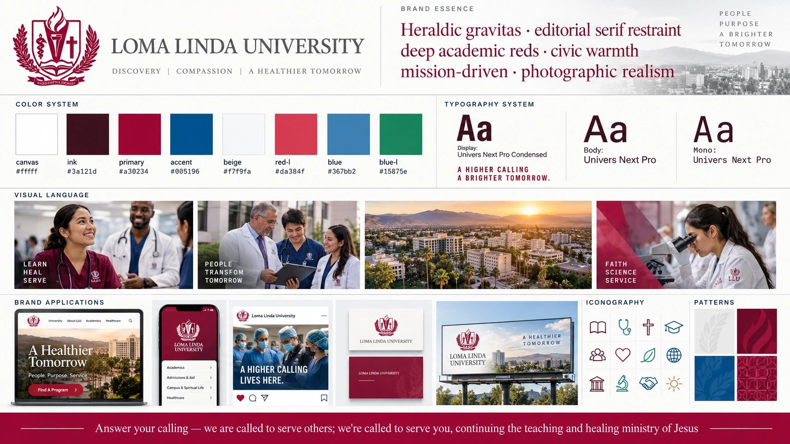
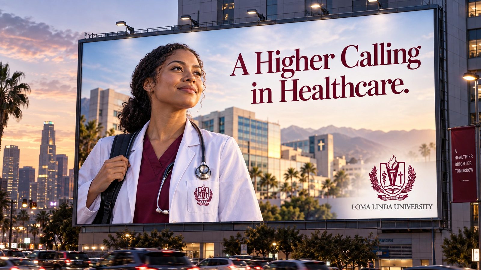
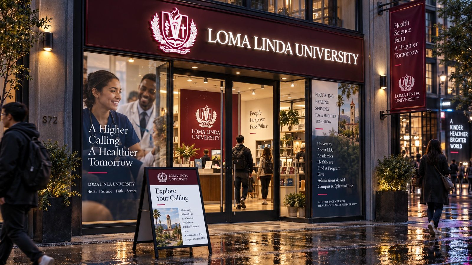
The 2011 templates are the design. The brand world is a 2026 study made with my own tool from those templates, not work delivered to the university, and the crest and name are Loma Linda University's.
Many strengths. One mission.
Loma Linda University, the line on the 2011 homepage
Role
Levid Media in 2011 for the web system. A 2026 study for the brand world.
Creative direction
Founder and creative director at Levid Media, the agency that took the brief.
The web system
Three templates, one chrome, a set of repeatable modules and a persona selector, designed end to end.
Brand DNA
Extracted from the templates and locked: palette with roles, serif and condensed type, layout posture, anti-defaults.
Eleven surfaces
Logo system, stationery, packaging, merch, web, app, billboard and campus signage, rendered from the locked DNA.
- Web design
- Design systems
- Art direction
- Higher education
- Brand DNA extraction
- Brand systems
Next
The templates live in the archive with forty-three other projects from the agency years.
Browse the archive →