 ISAAC WOOTEN

Wii.com
Nintendo of America, 2006. The website for a console that wanted everyone to play, and the brand world its design implied.
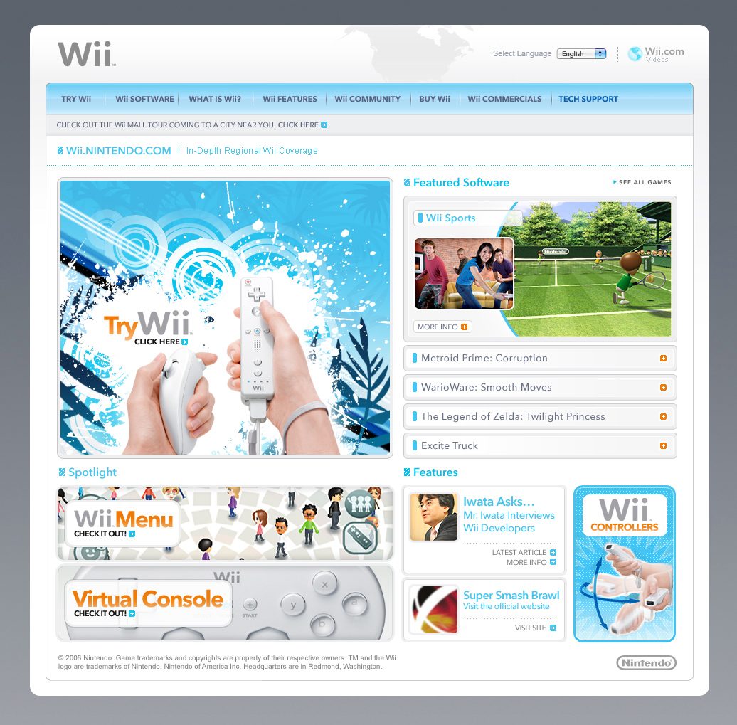
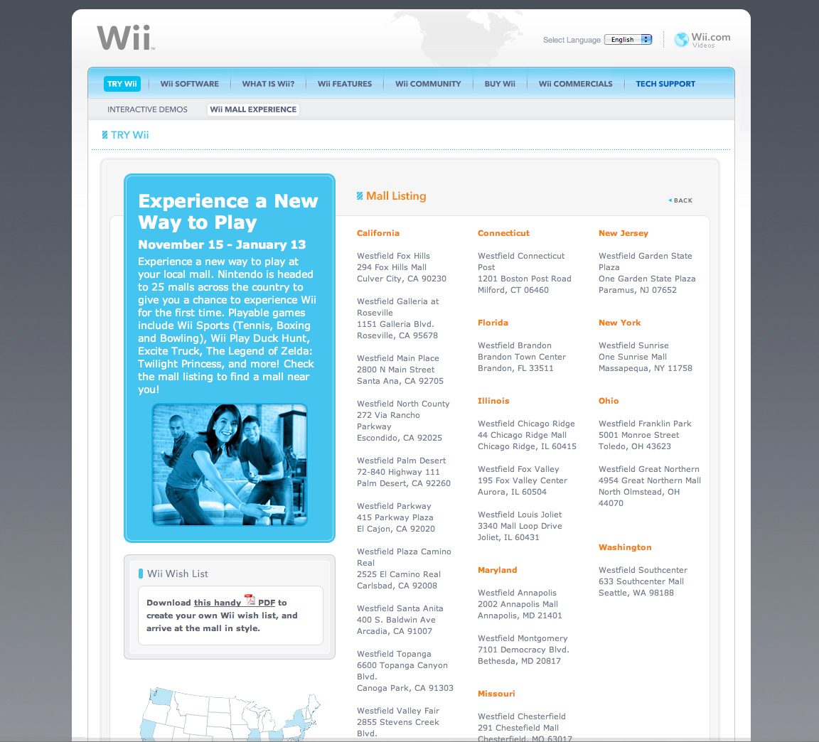
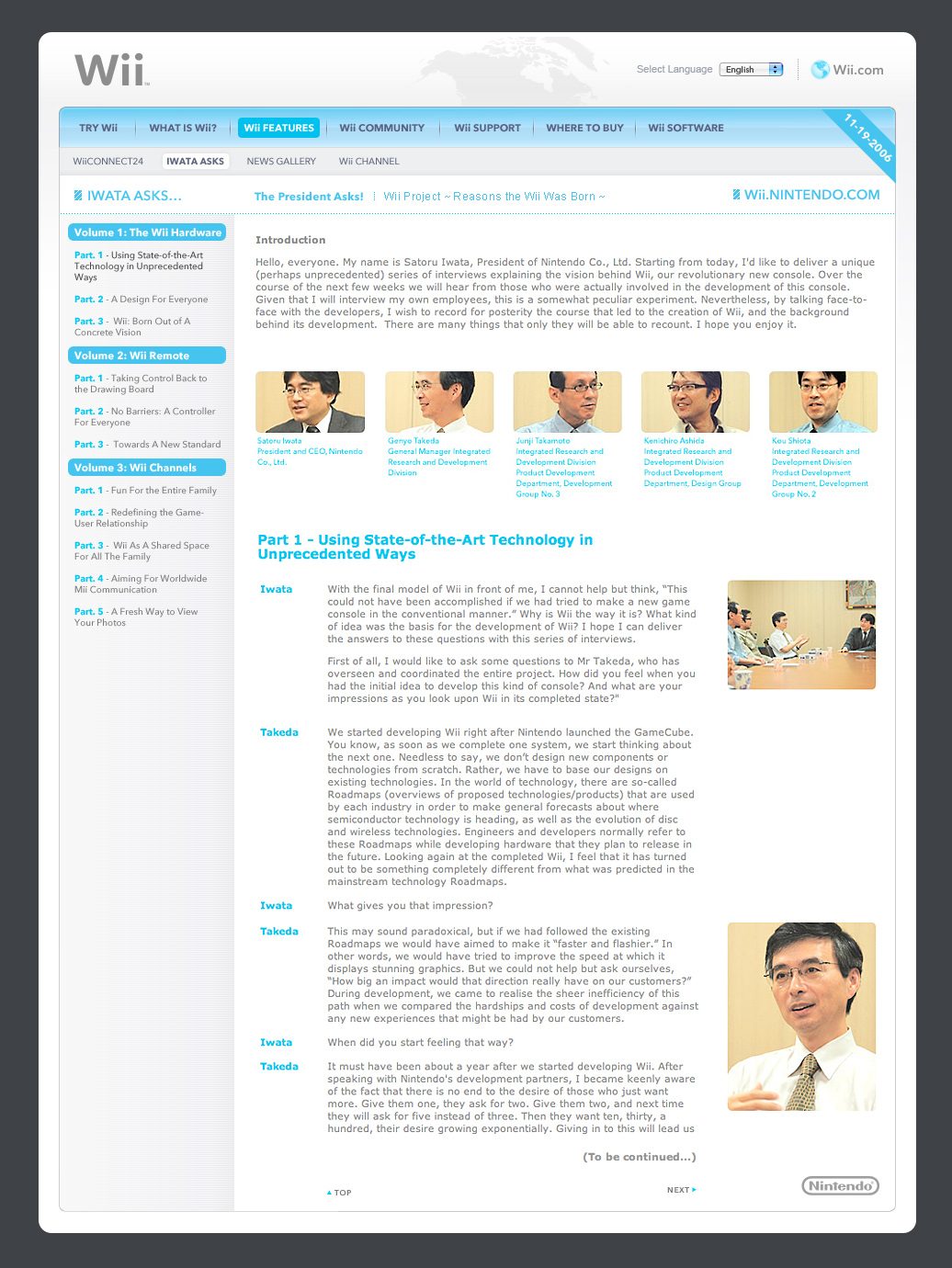
A new way to play, explained to people who had never held a controller. Wii.com had to sell motion control to families, grandparents and lapsed players in the months around the console’s November 2006 launch. I was an online technical designer and Flash developer on Nintendo of America’s Online Publications team, working on pages like these: the home page, Iwata Asks, the Wii Mall Tour, game pages and the software library. What it taught me: when your audience has never held the product, invite them to try it before you explain it.
The brief
A console for everyone needs a website anyone can read.
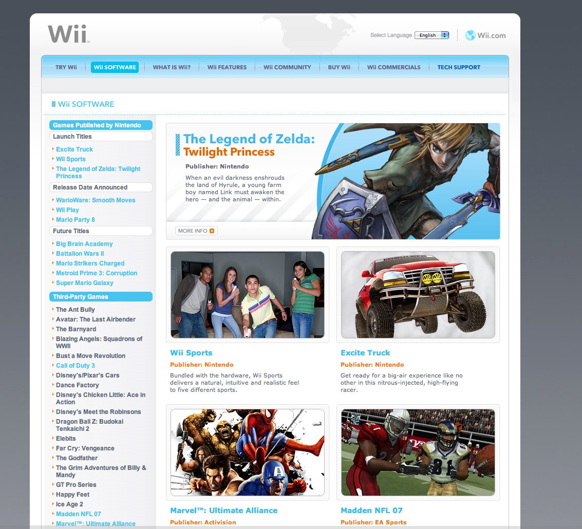
The Wii was a bet that games could reach people who didn’t play them. The site had to carry that: glossy white, sky-blue rules and generous space, with a Try Wii invitation front and centre and the games grouped so a parent could find Wii Sports as easily as a fan could find Metroid Prime 3. Around it sat the launch programme: Iwata Asks, where Nintendo’s president interviewed his own developers; a mall tour that put Wii Sports in front of shoppers across the country; and a software library that grew every week.
White and sky blue
The hardware’s gloss carried into the page: white panels, cyan rules and tabs, grey type with an orange call to action.
Try Wii first
The home page led with a Remote in hand and an invitation to try it, not with specs.
Iwata Asks
Long-form interviews with the people who made the console, set for reading, volume by volume.
Games for everyone
A software library that put Wii Sports, Zelda and Excite Truck side by side, sorted so anyone could browse it.
The site
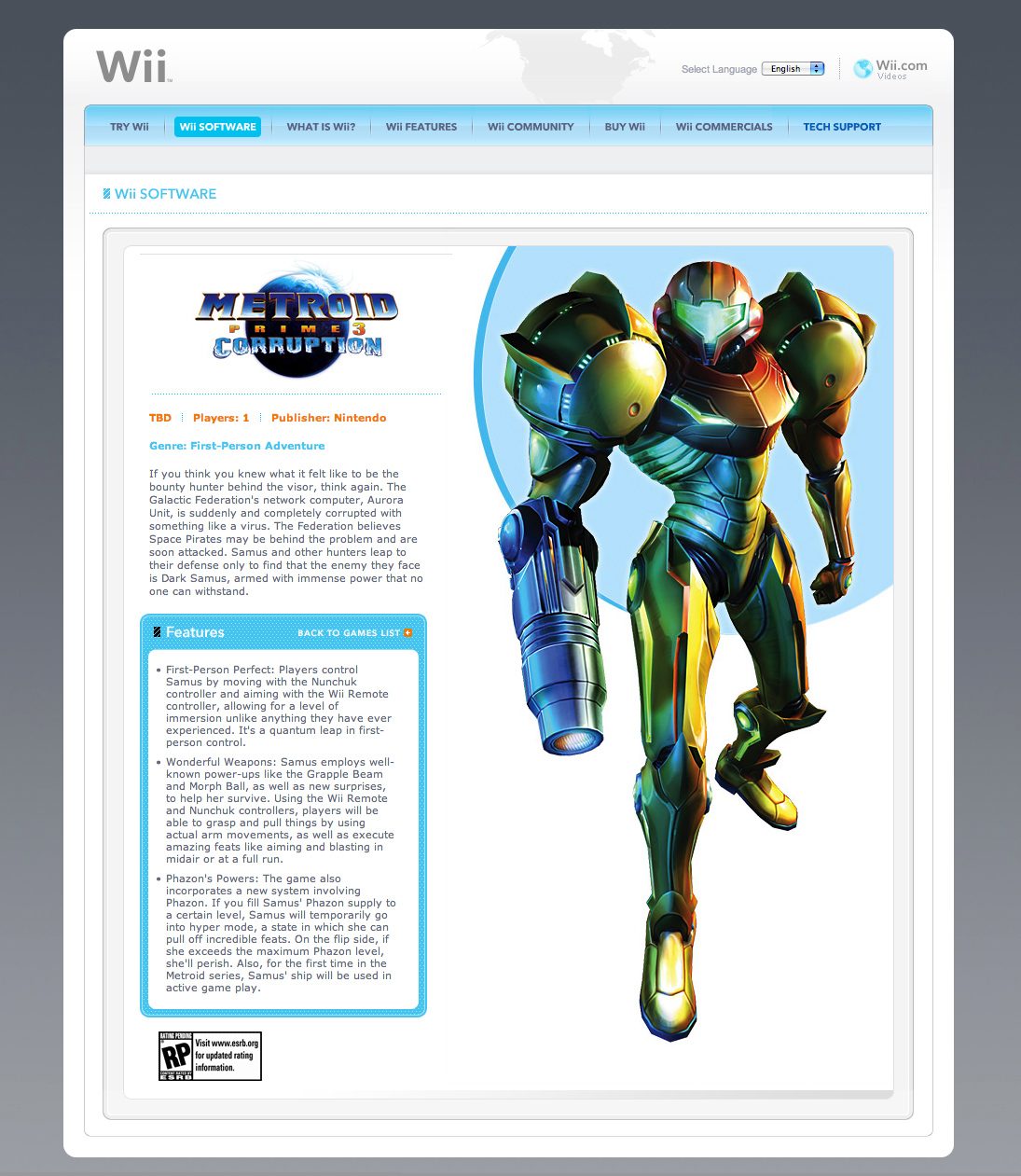
Brand system
The Wii identity is Nintendo’s; what interested me was how much of it the website carried. I started from these pages and the wordmark, locked their DNA (glossy white and silver, Wii blue with a splash of orange, a rounded geometric face, bright family photography) and rendered the rest of the brand from it, from the logo system to a storefront.
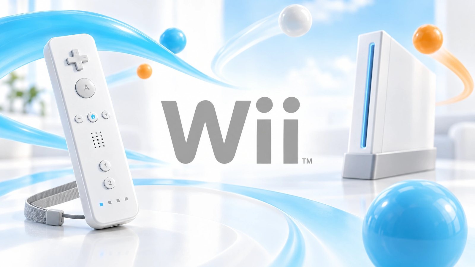 Brand world · rendered from the locked brand DNA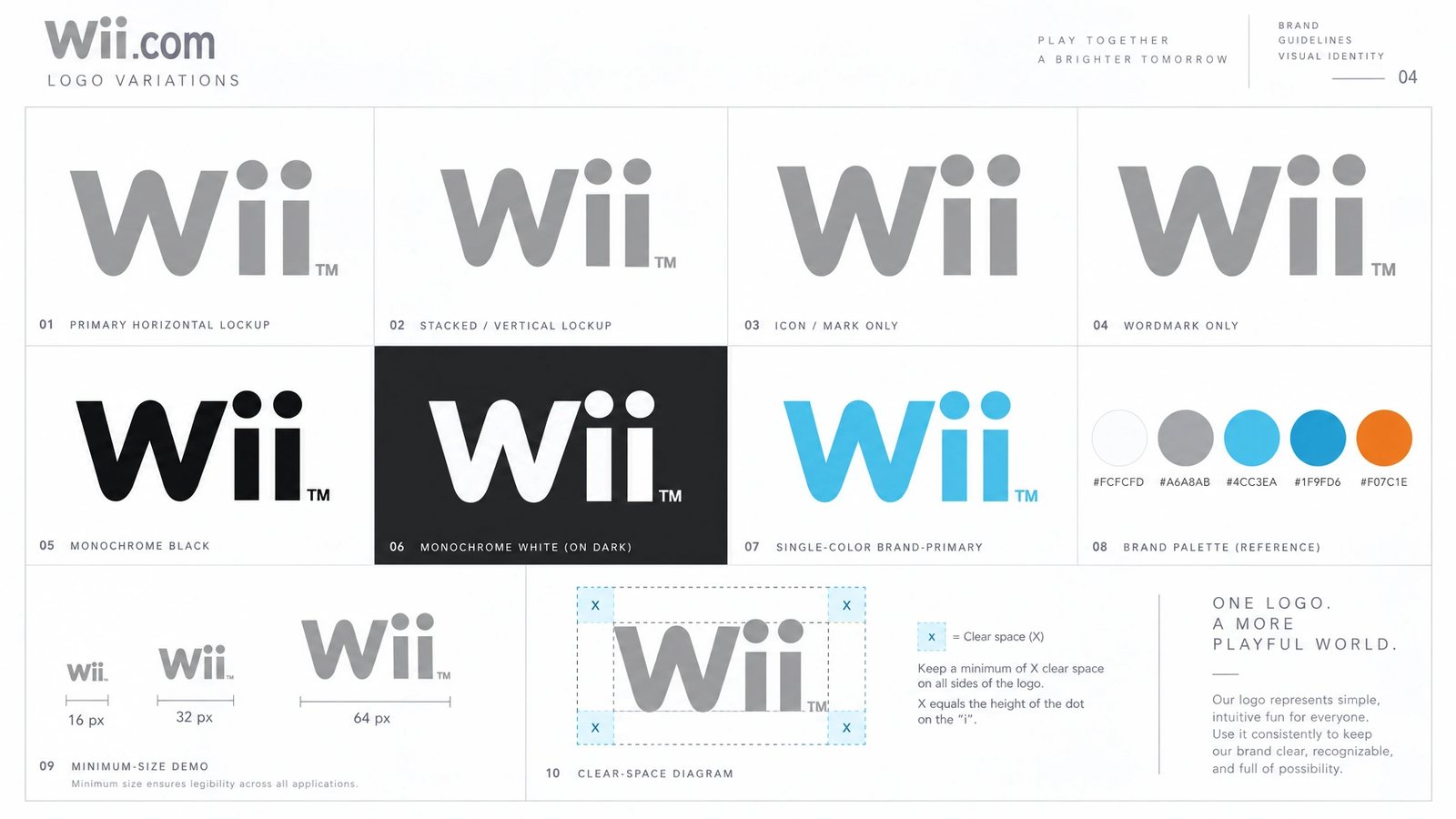
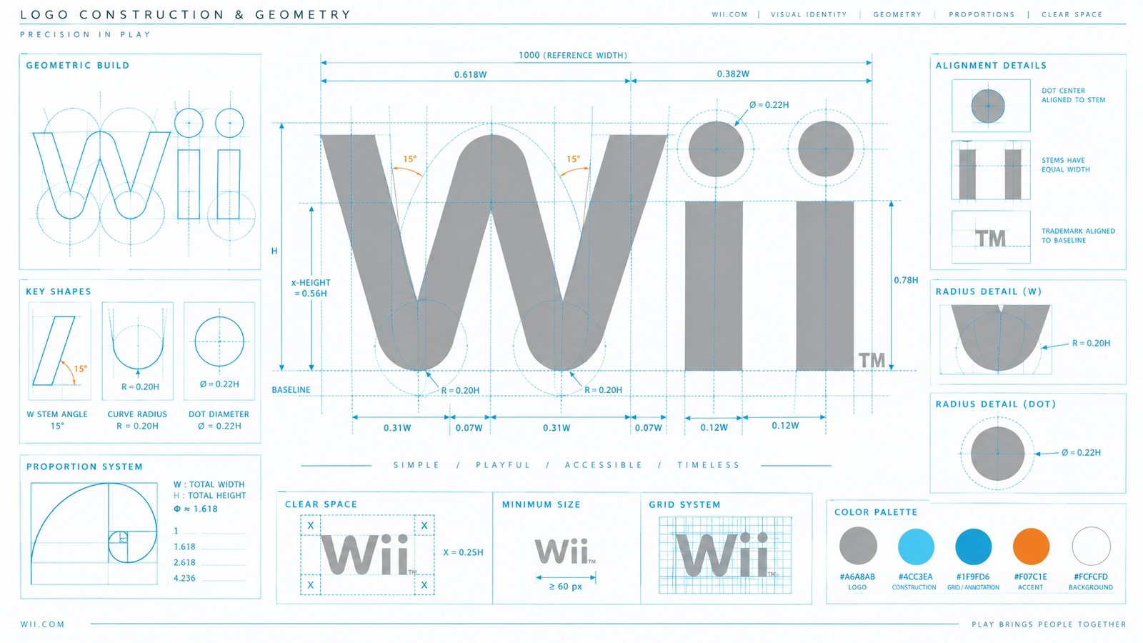
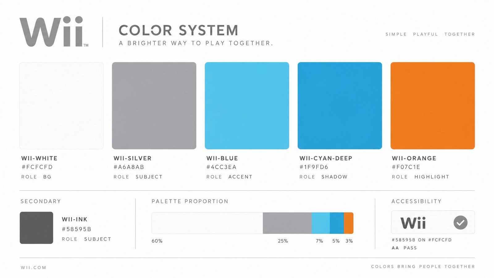
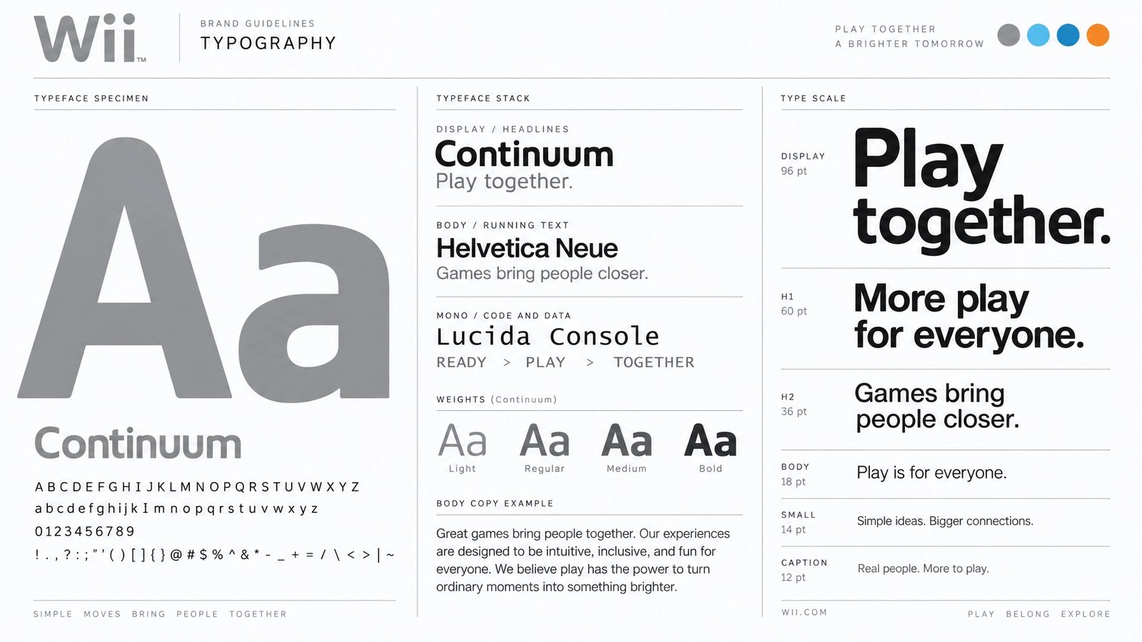
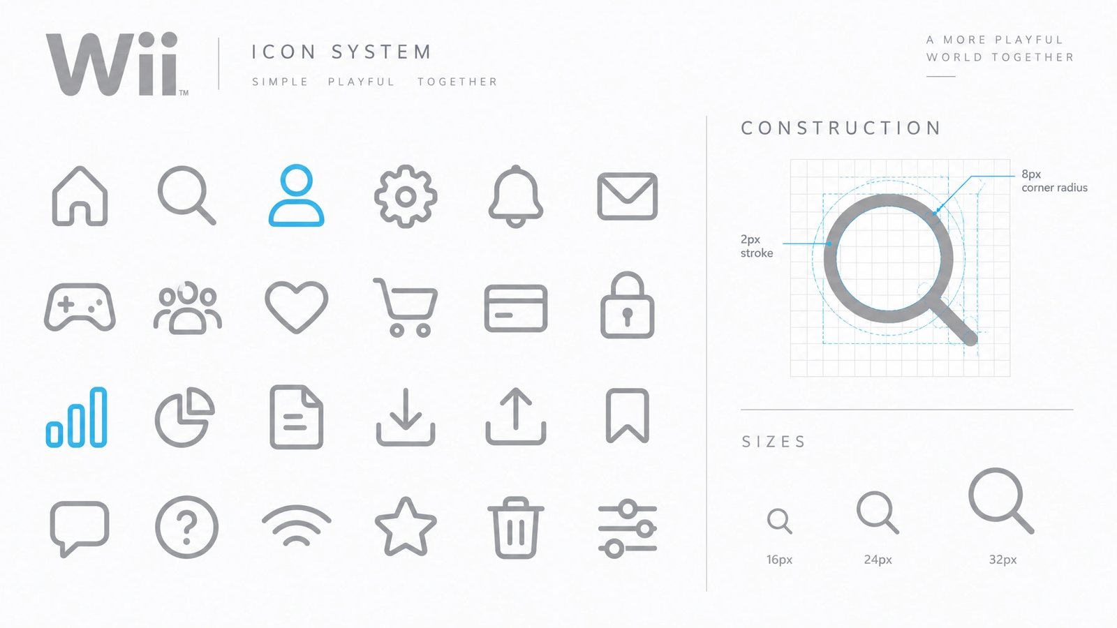
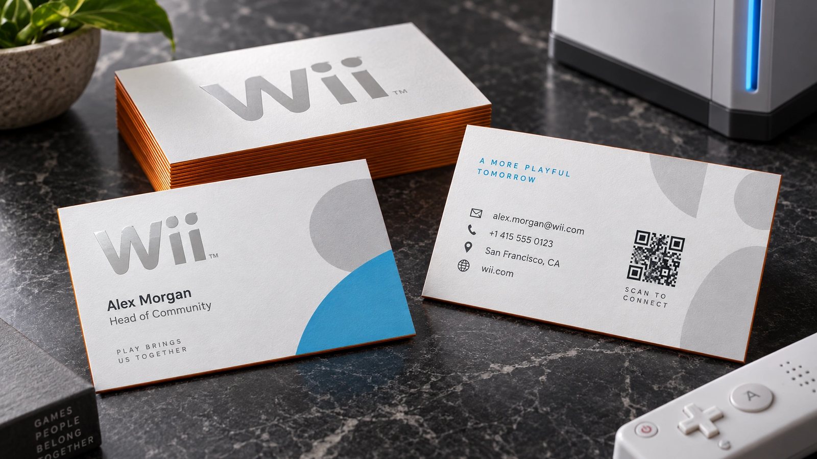
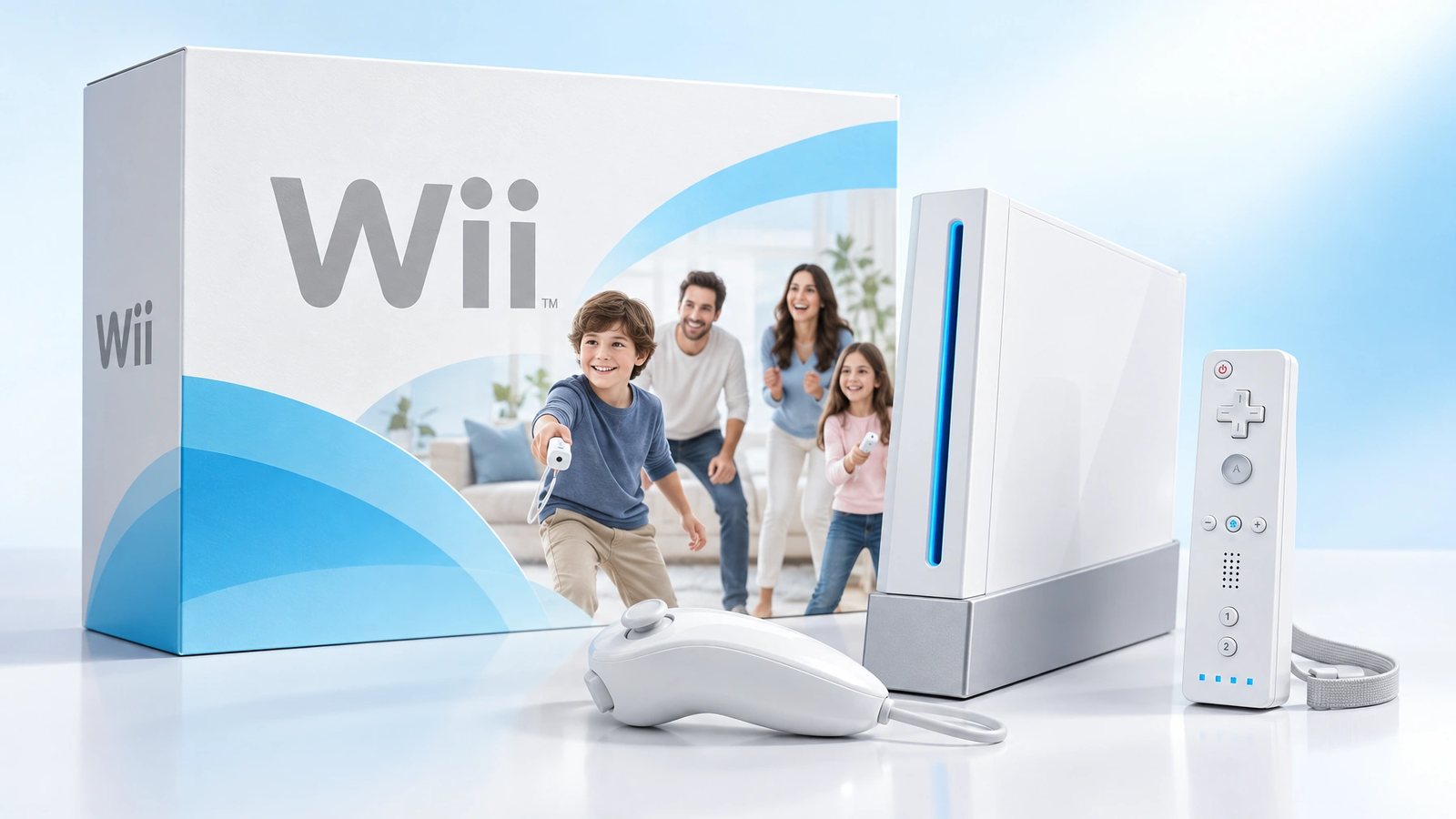
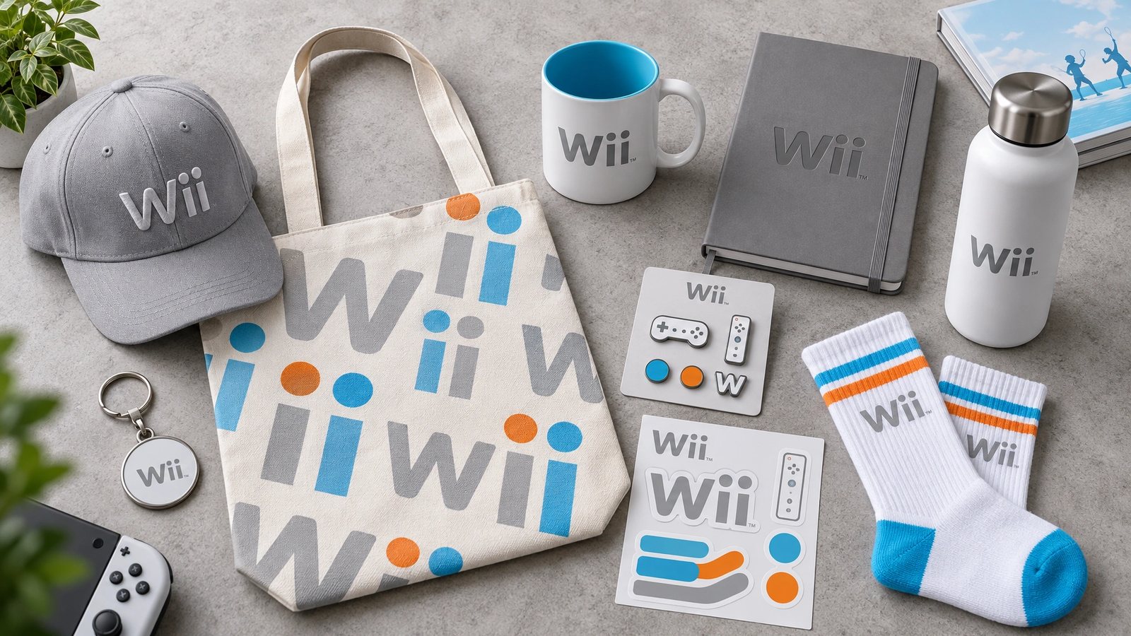
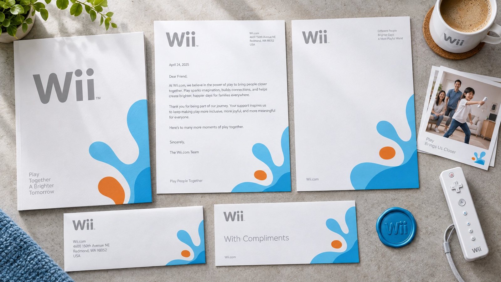
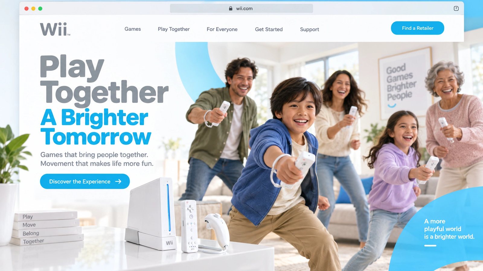
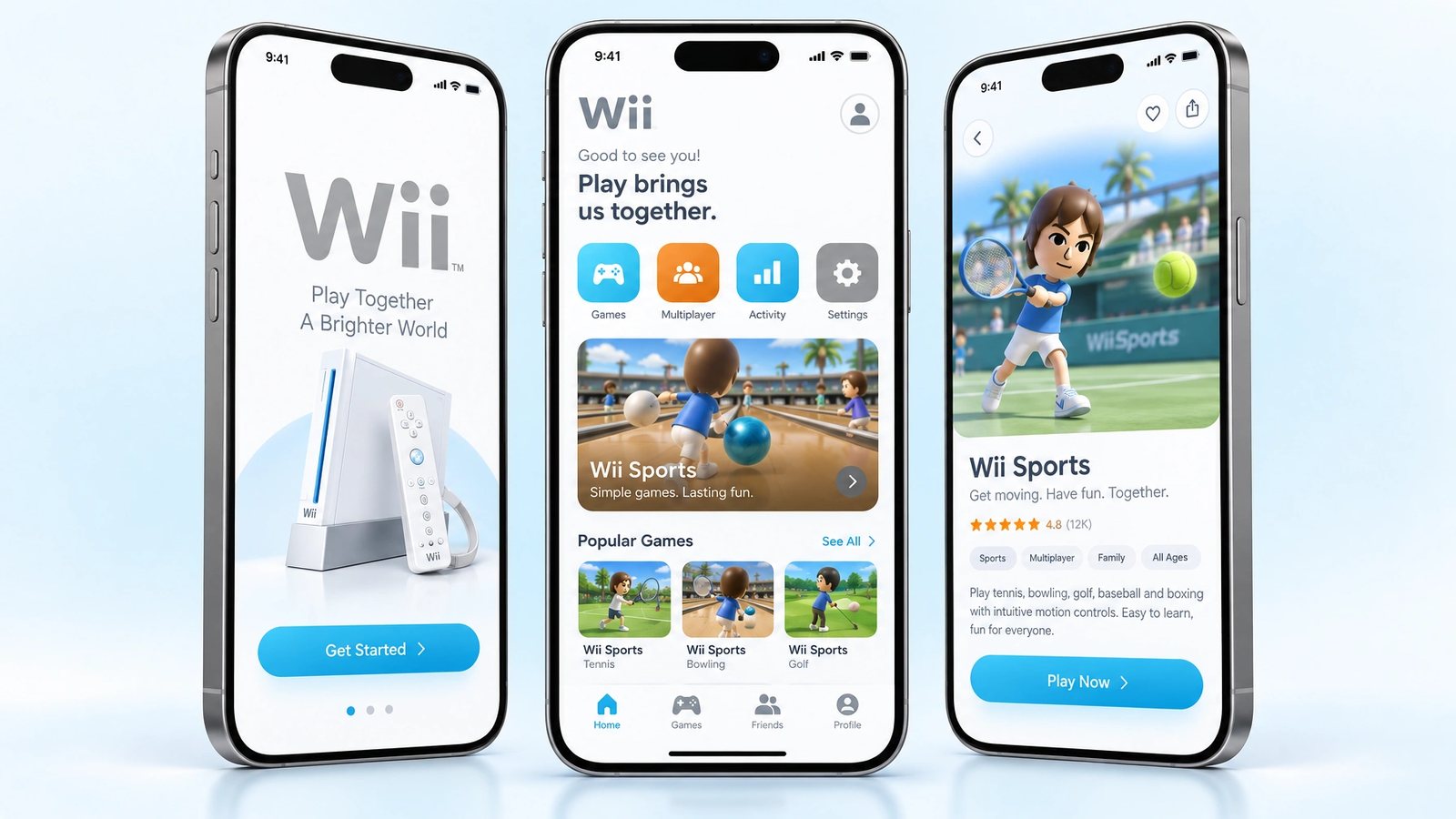
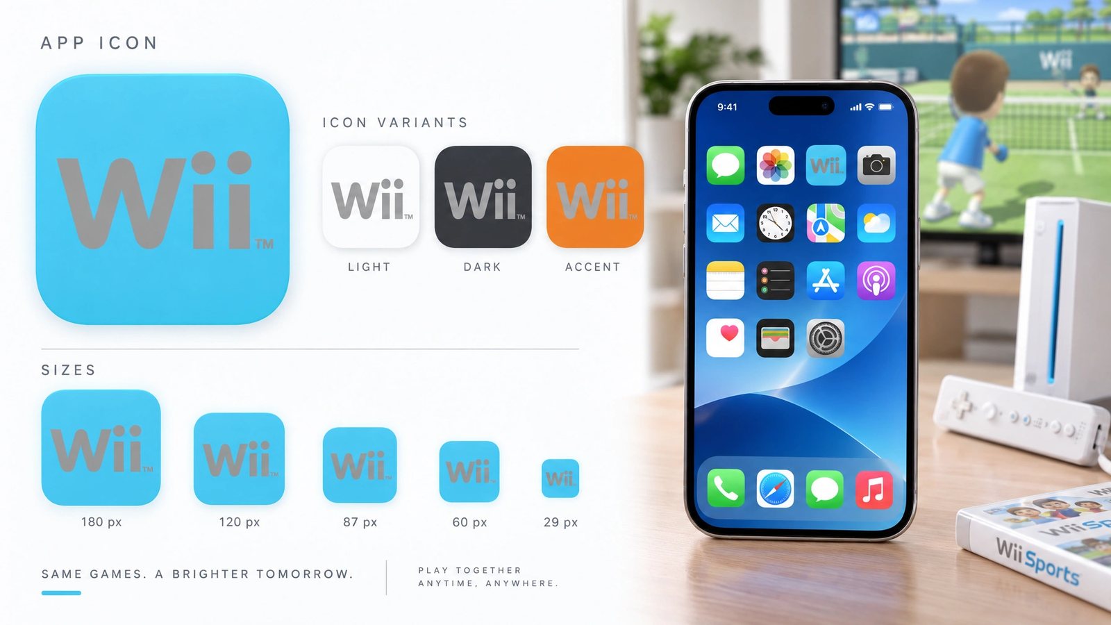
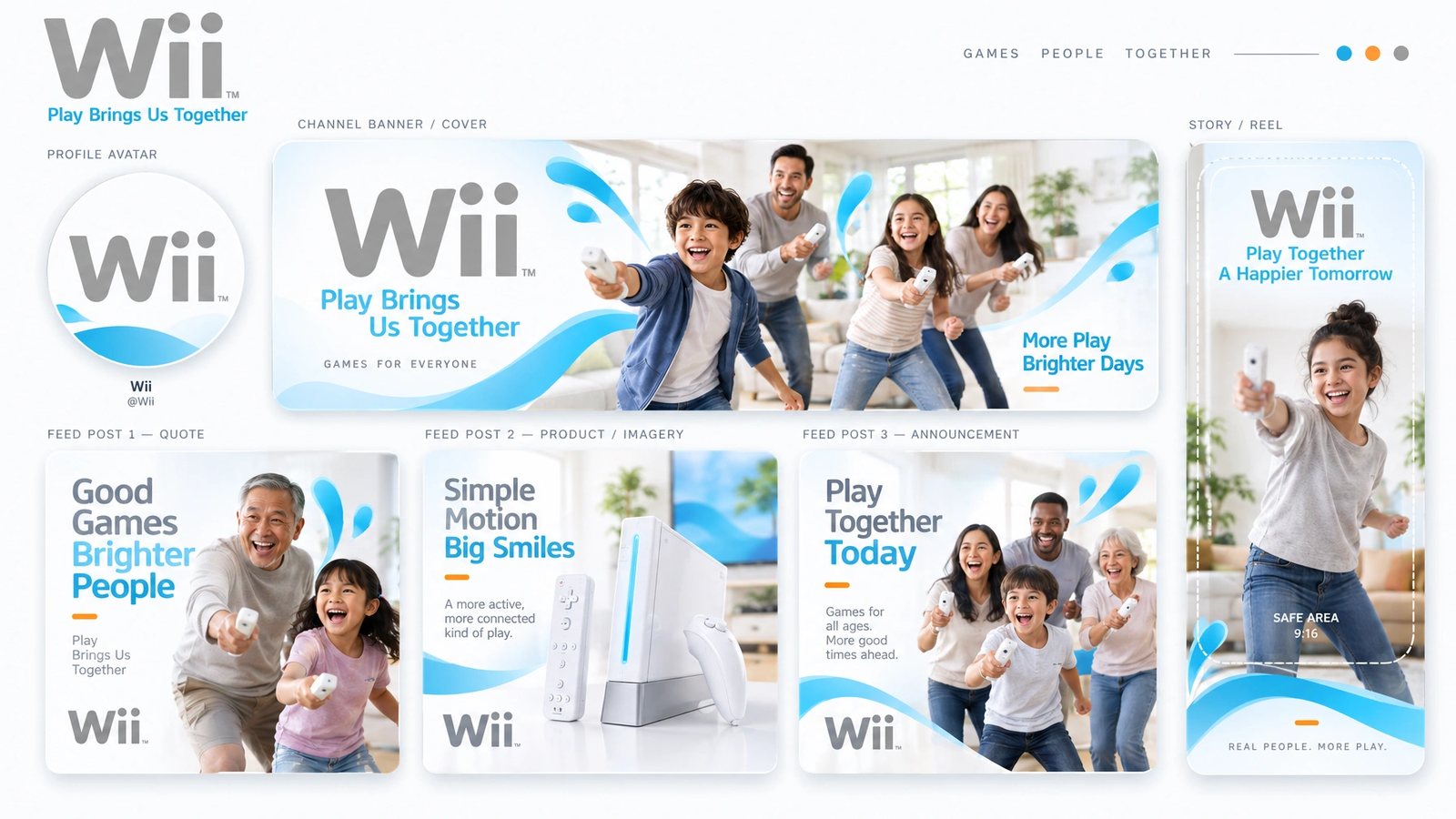
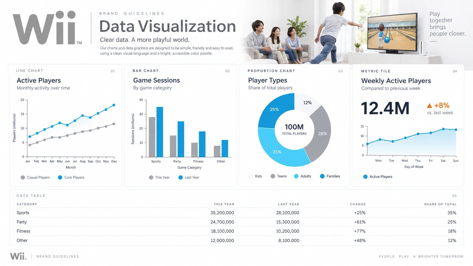
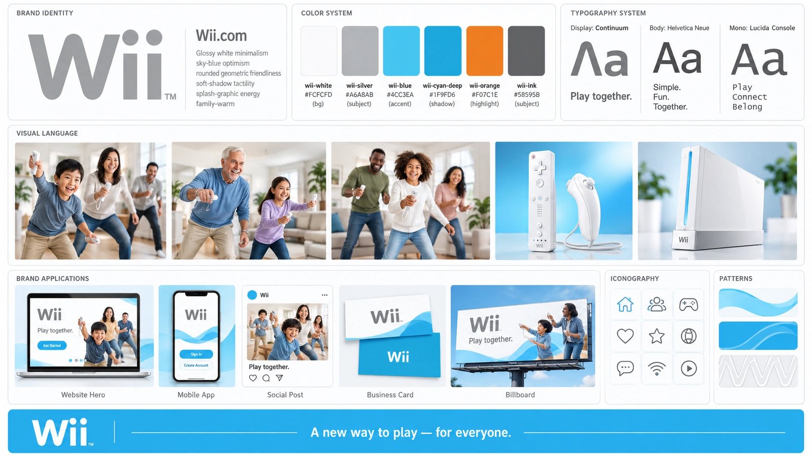
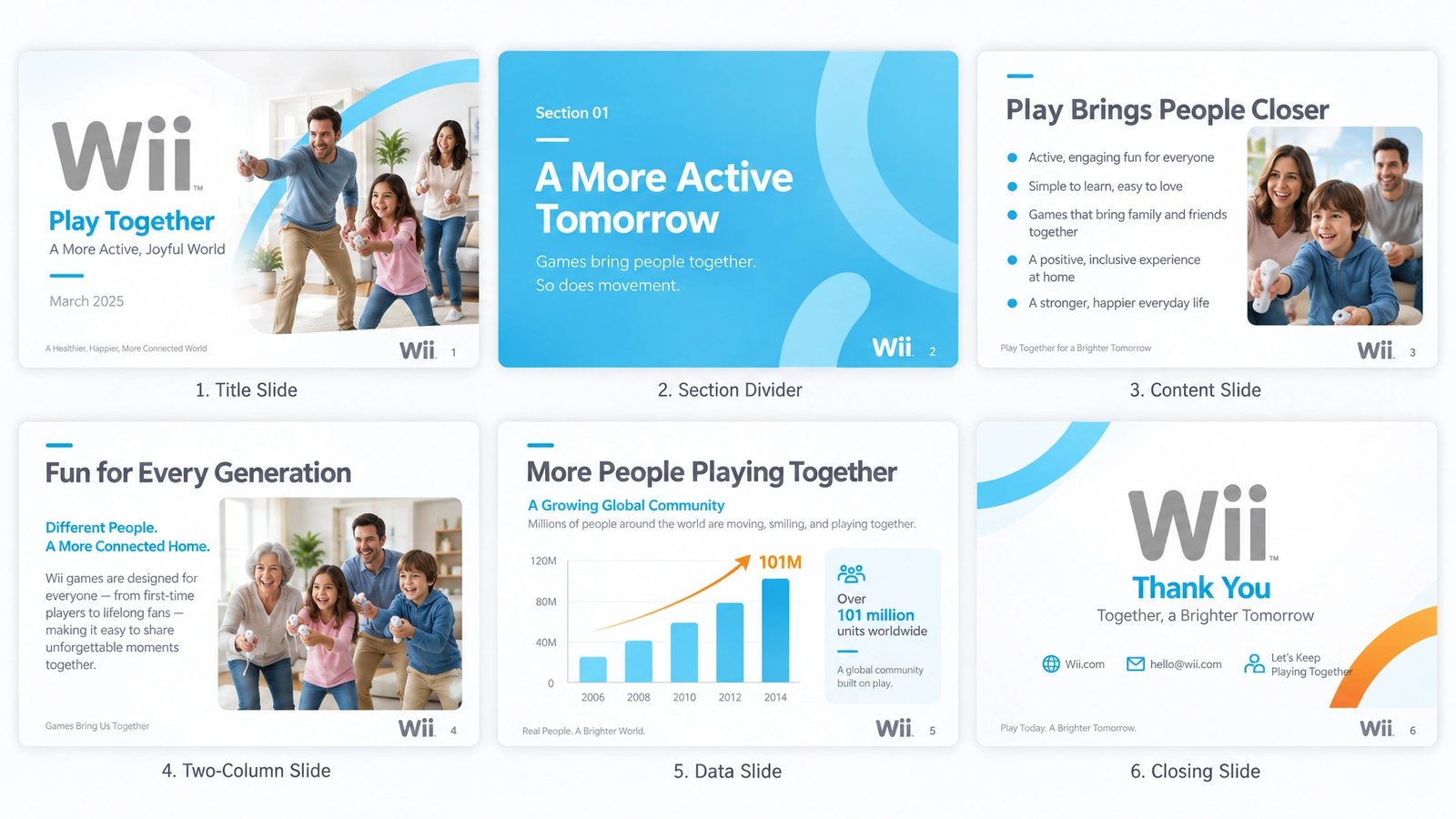
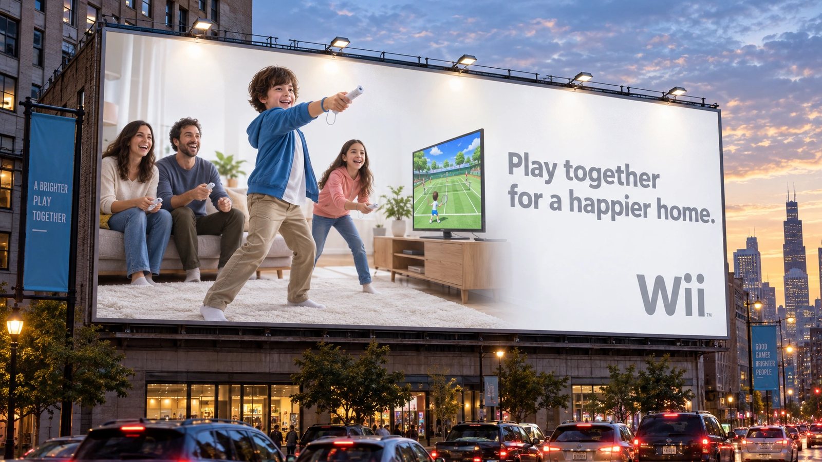
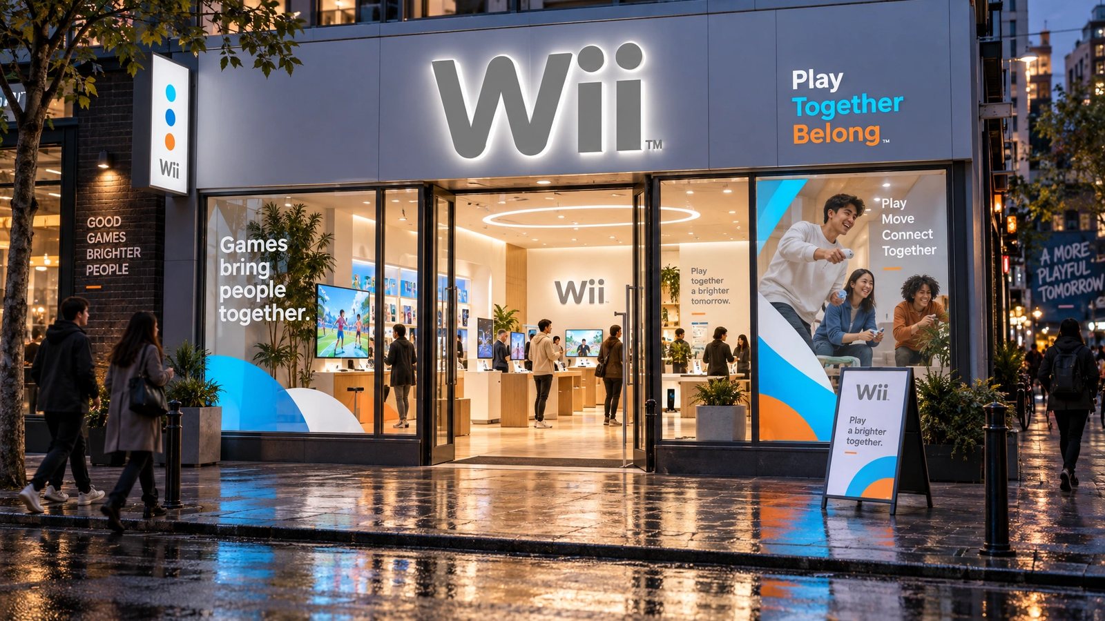
The Wii name, logo and games belong to Nintendo. The pages above are the site I worked on; the brand world is a 2026 study made with my own tool from them, not work for Nintendo.
A new way to play, for everyone.
Wii, the launch promise
Role
Nintendo of America for the site. A 2026 study for the brand world.
Online Publications
Online technical designer and Flash developer at Nintendo of America, 2005 to 2007, on Nintendo.com, Wii.com and NintendoWifi.com.
Production
Micro-sites, games and page production for the launch-era site, with the Online Publications group.
Brand DNA
Extracted from the site and locked: palette with roles, display and body type, imagery rules, anti-defaults.
Nineteen surfaces
Palette, type, icons, logo system, cards, stationery, packaging, merch, social kit, data visualisation, a presentation, web, app and app icon, guidelines, billboard and storefront.
- Web design
- Flash
- Front-end production
- Console launch
- Brand DNA extraction
- Brand systems
Next
The site lives in the archive with the rest of the Nintendo years.
Browse the archive →