 ISAAC WOOTEN

SocialCrunch
An anonymous question game from Chicago. Its identity, concepts and prototype, designed at ÄKTA in 2010 and 2011, and the brand world they implied.
SocialCrunch asked what nobody would say out loud. A Chicago start-up built around one question, where do you stand? You connected with Facebook, swapped your identity for an anonymous one, and answered what you never would in public (money, sex, religion, politics, pop culture), then saw how your friends and everyone else answered. Mashups crossed two questions to find what neither shows alone. At ÄKTA, where I was design director, we designed it in 2010 and 2011: the identity system, light and dark concepts and the prototype. The company went on to TechStars Chicago in 2013. What it taught me: anonymity is a design problem before it is a technical one. People answer honestly only when the interface makes them feel unseen.
The brief
A game about the questions people won’t answer out loud has to feel private before it can feel fun.
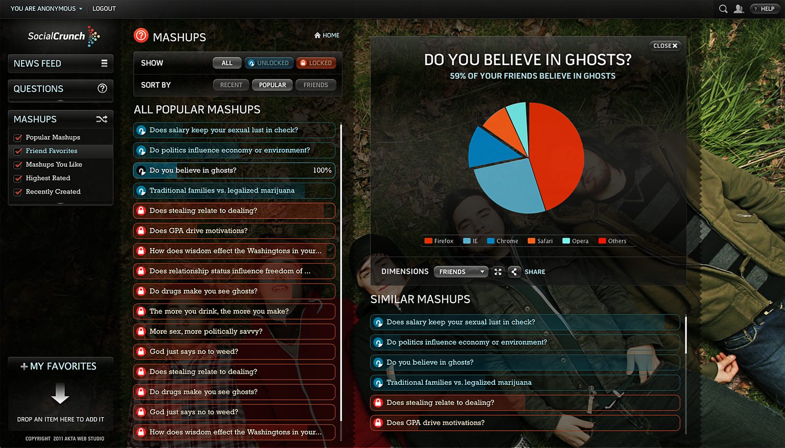
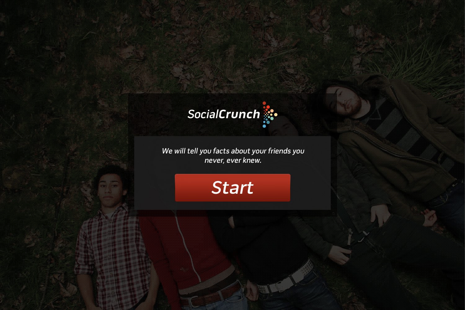
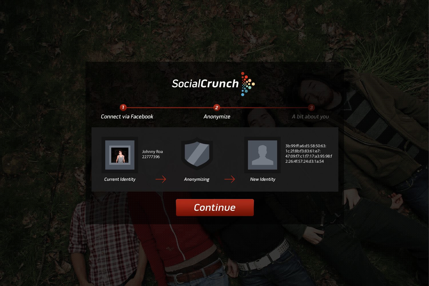
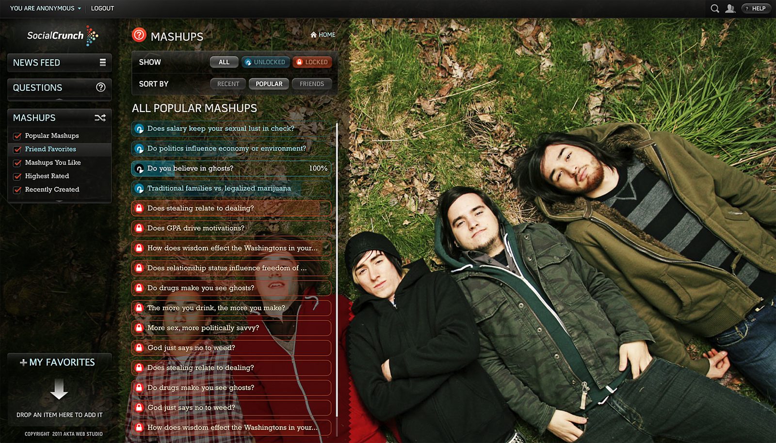
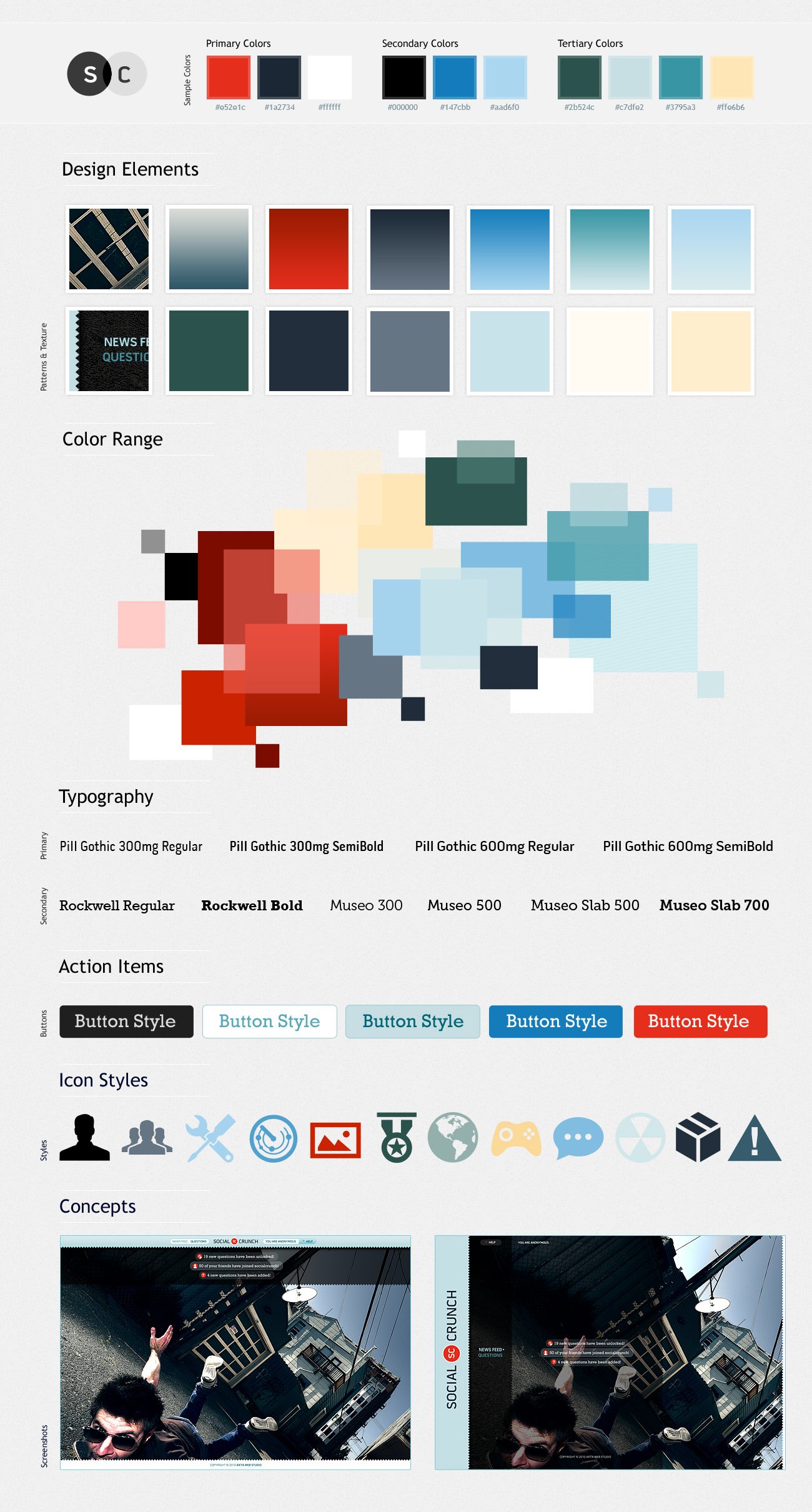
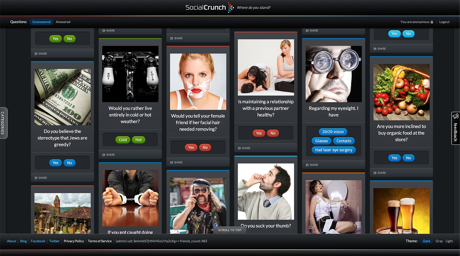
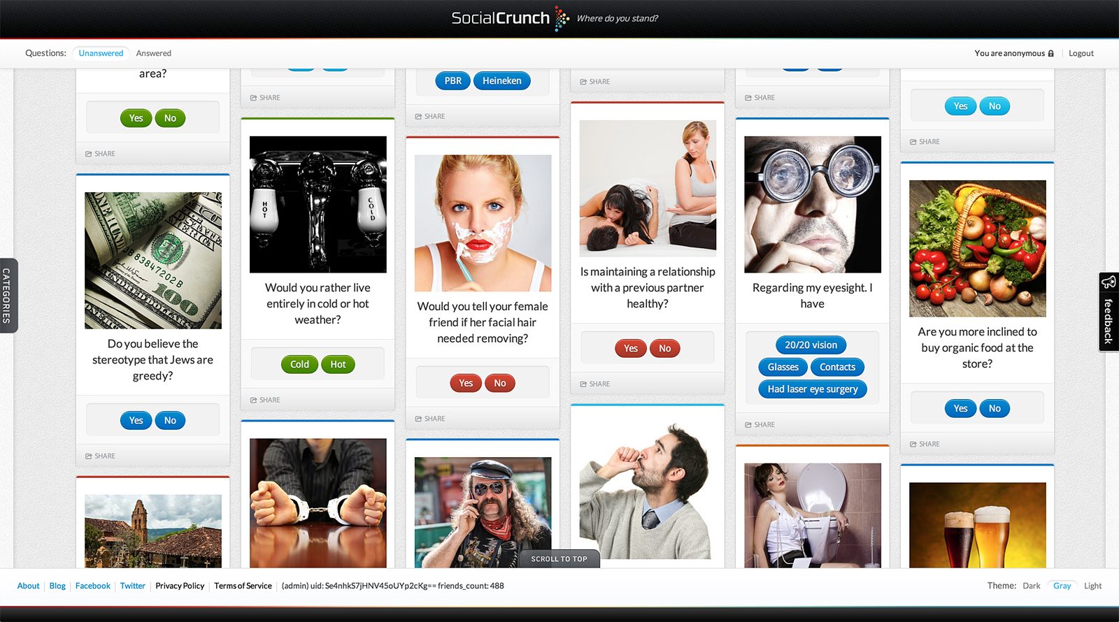
The mood board set the system: crunch red and night navy with blues, teal and cream, a squared techno sans for the interface and a slab for the questions, glossy pill buttons and a set of flat icons. The prototype puts it on a night-out photograph and asks for nothing until you are anonymous: Start, then Connect via Facebook, Anonymize and a new identity. Questions sit in a masonry feed of photo cards with two pill answers; mashups unlock as you answer, and a result lands as one big question, one line about your friends and a pie chart.
Where do you stand?
The whole product in four words, and the last line on every screen.
Anonymous by design
Your identity swapped for a hash before the first question; silhouettes, never names.
Mashups
Two answers crossed into a third question nobody would ask outright.
A crowd of dots
The mark: many coloured answers resolving into one arrow.
The work
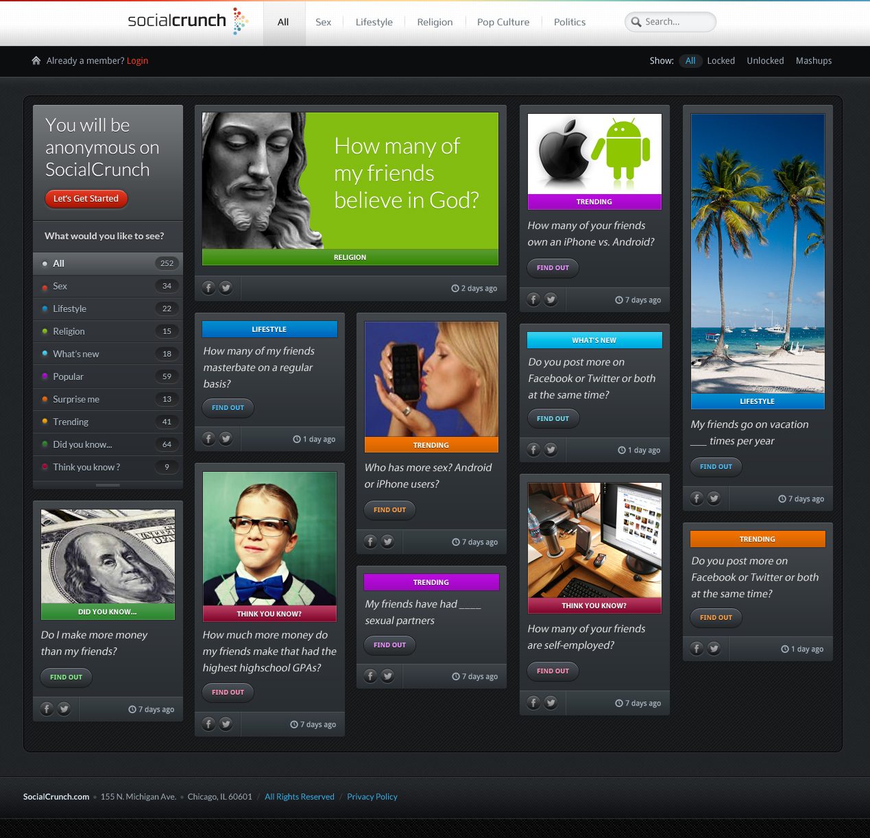
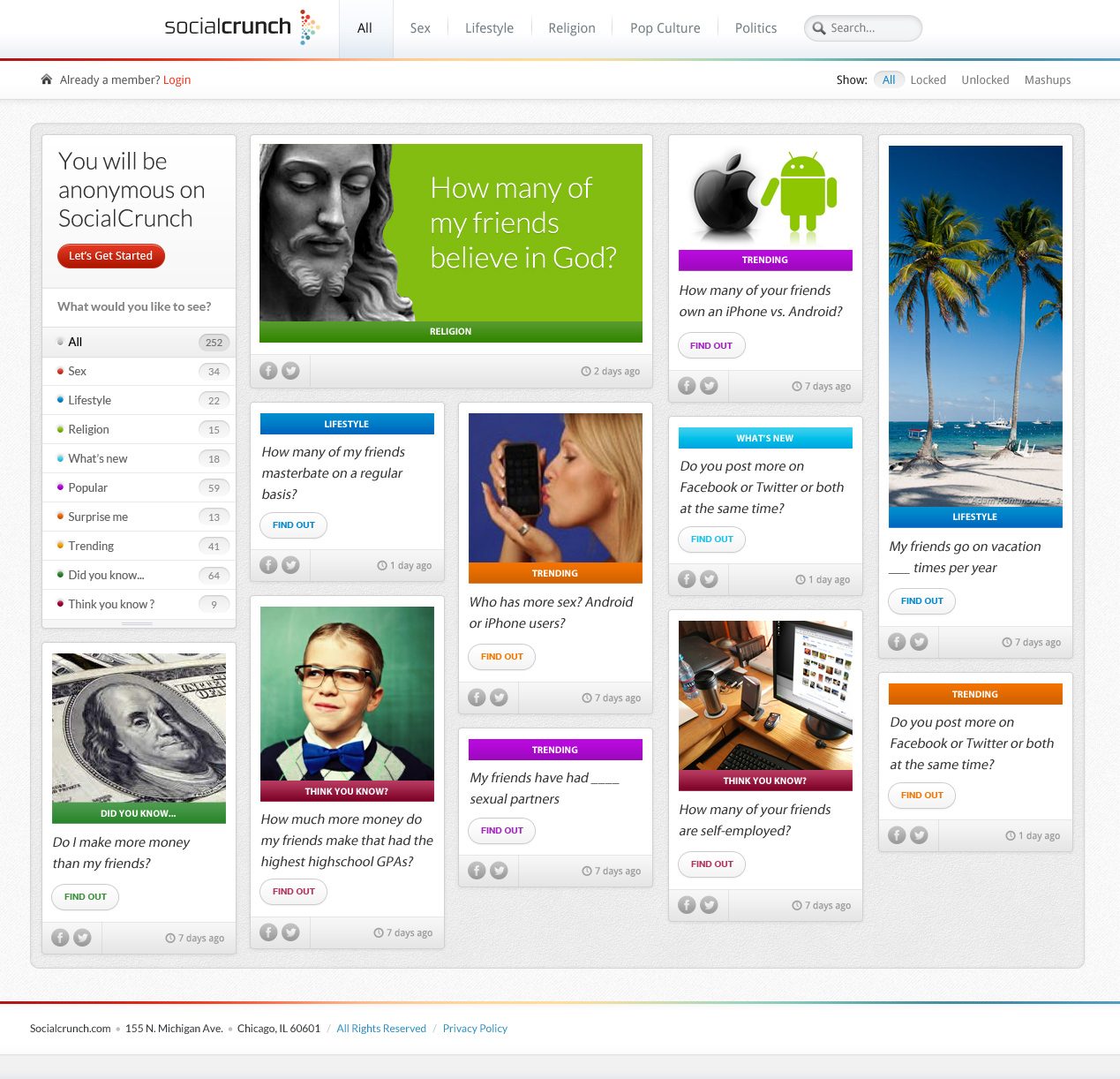
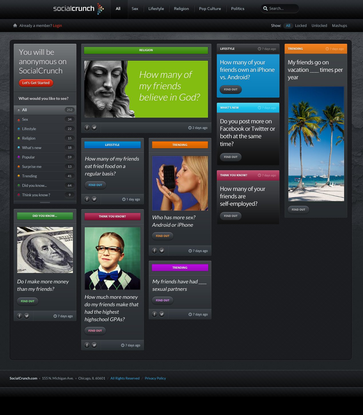
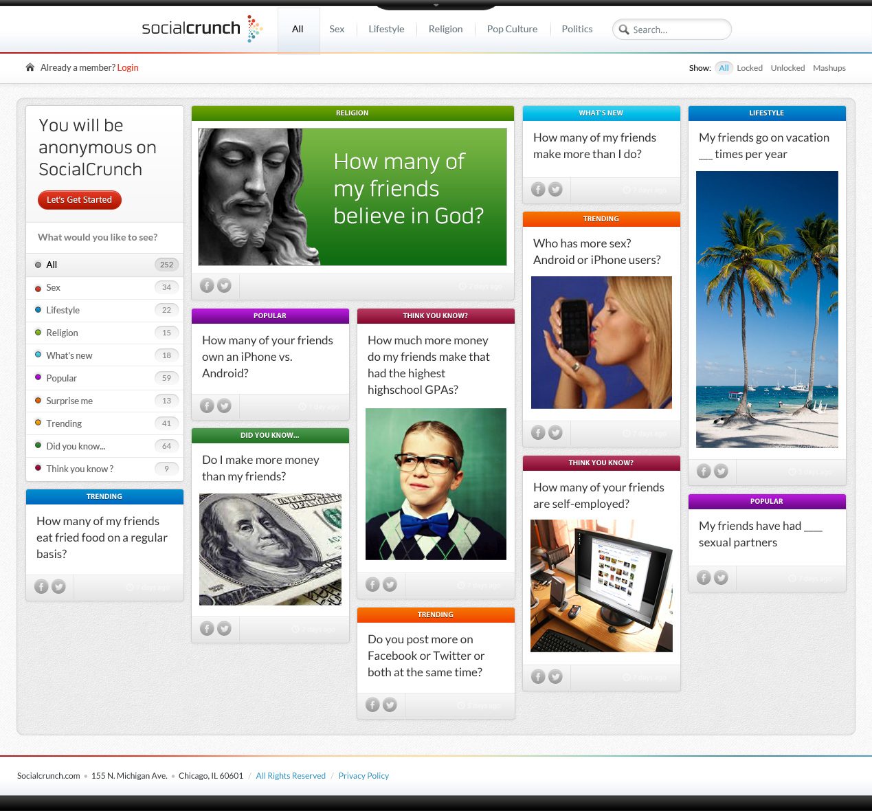
Brand system
Seen again years later, the mood board was already most of a brand. I locked what it held (crunch red and night navy, answer blue, teal and cream, a squared techno sans with a slab for the questions, the dot-cluster mark and the SC monogram, night photography under a dark interface) and followed it into print, product, photography, a social kit, data, a campaign and a storefront.
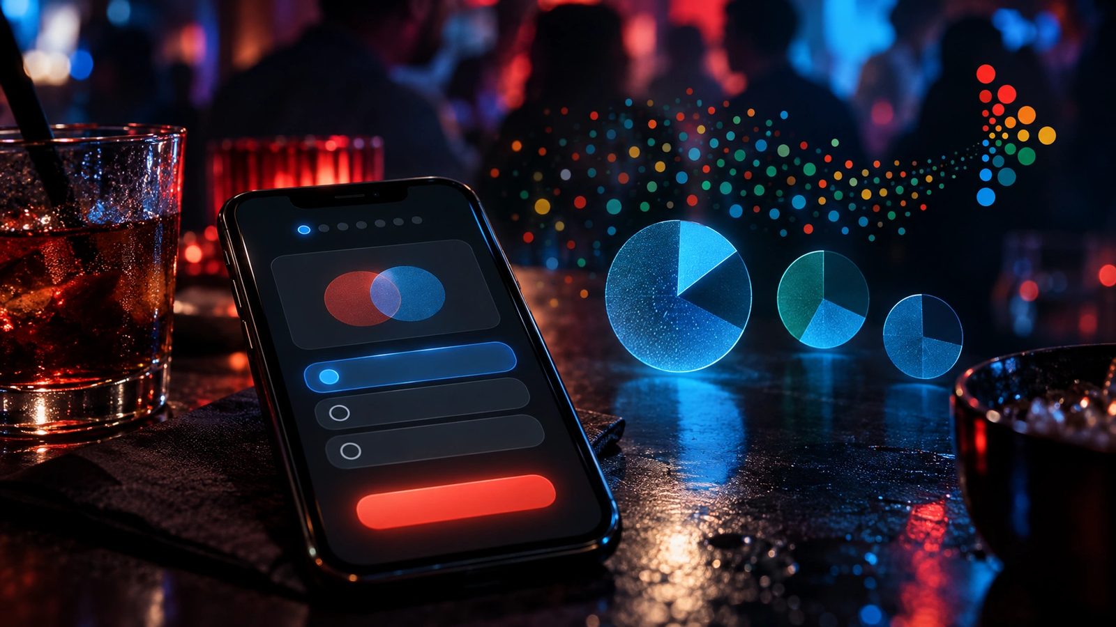 Brand world · rendered from the locked brand DNA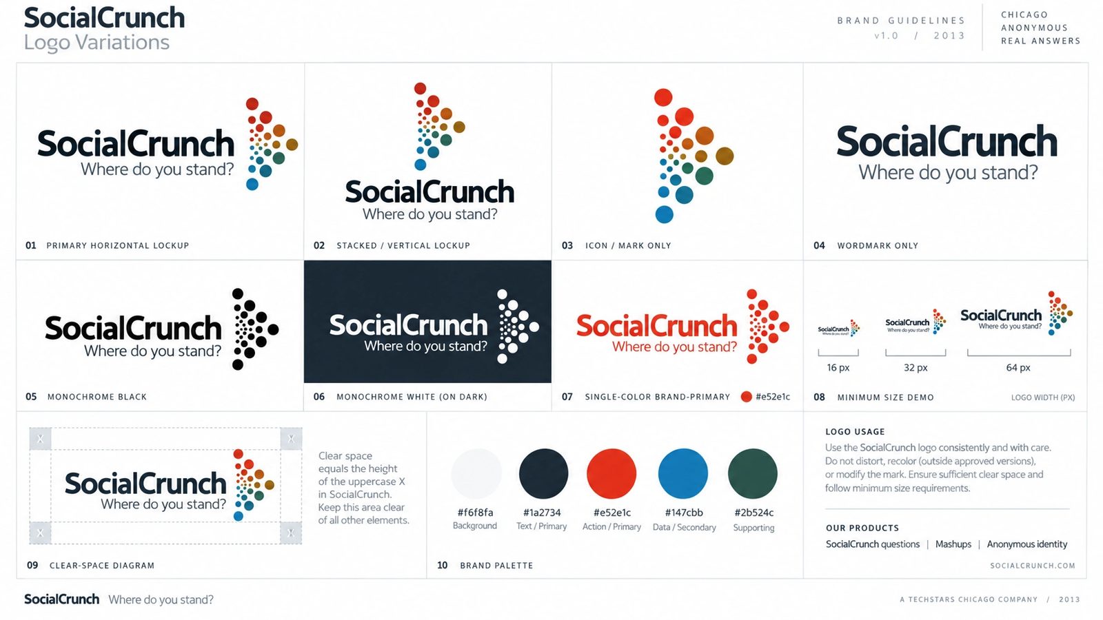
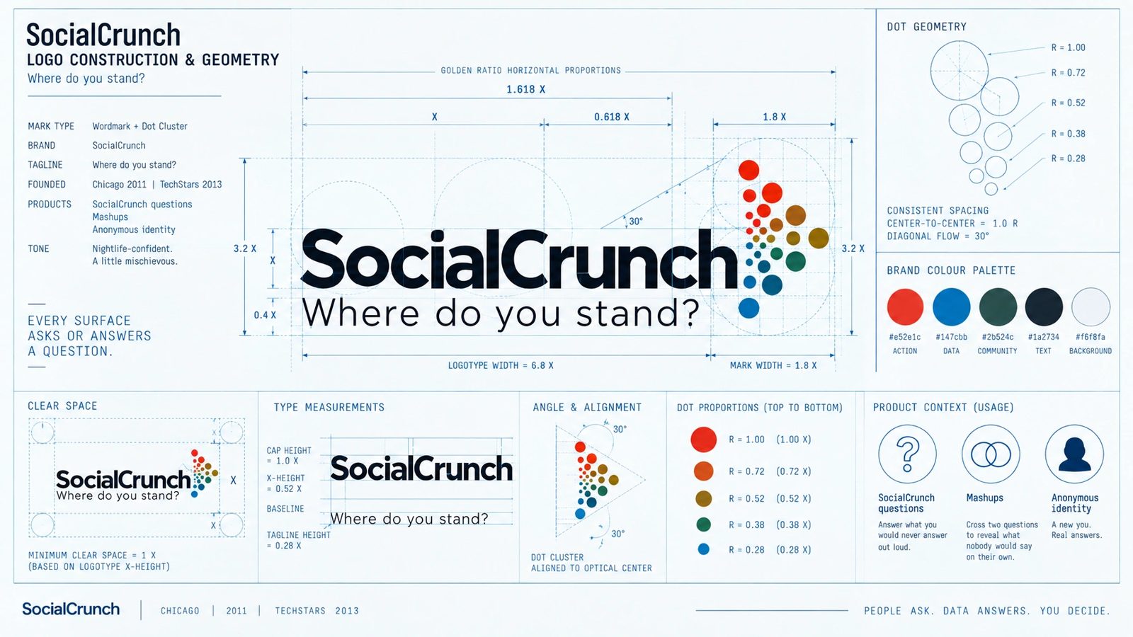
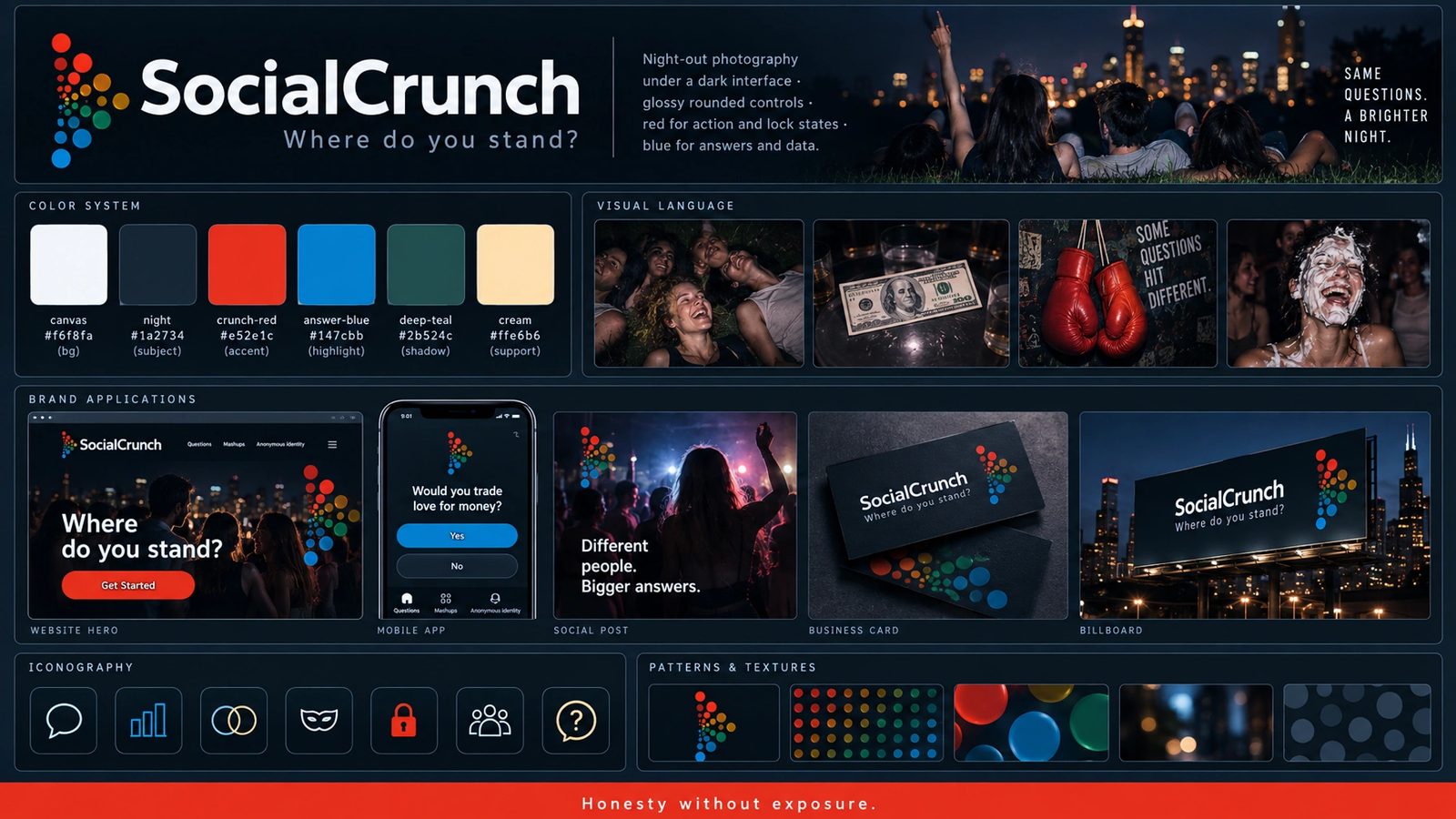
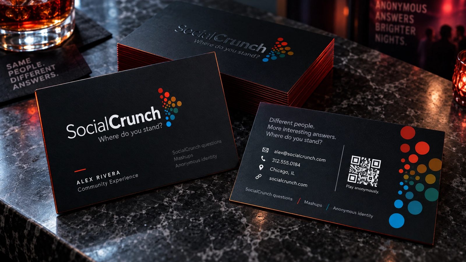
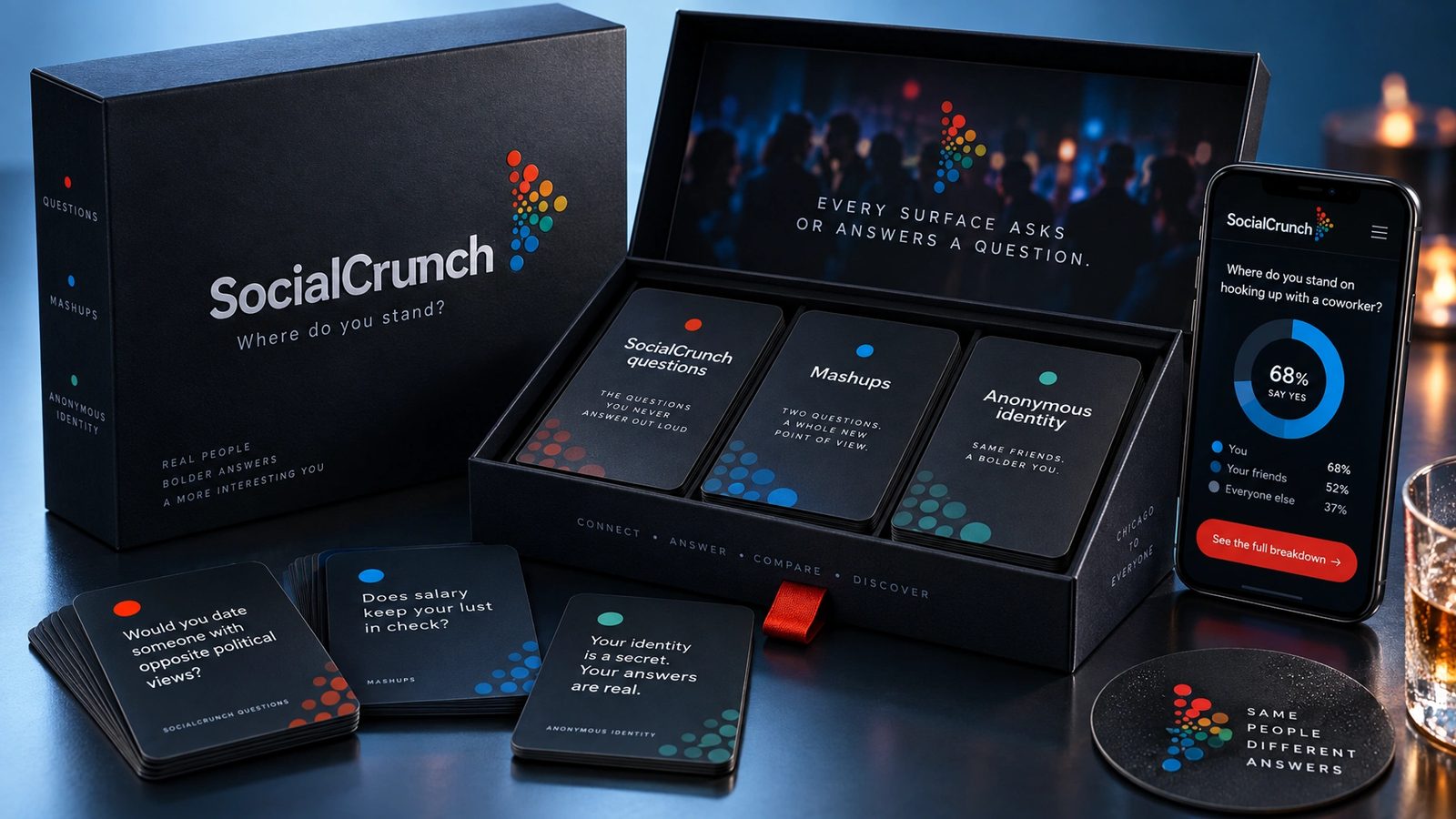
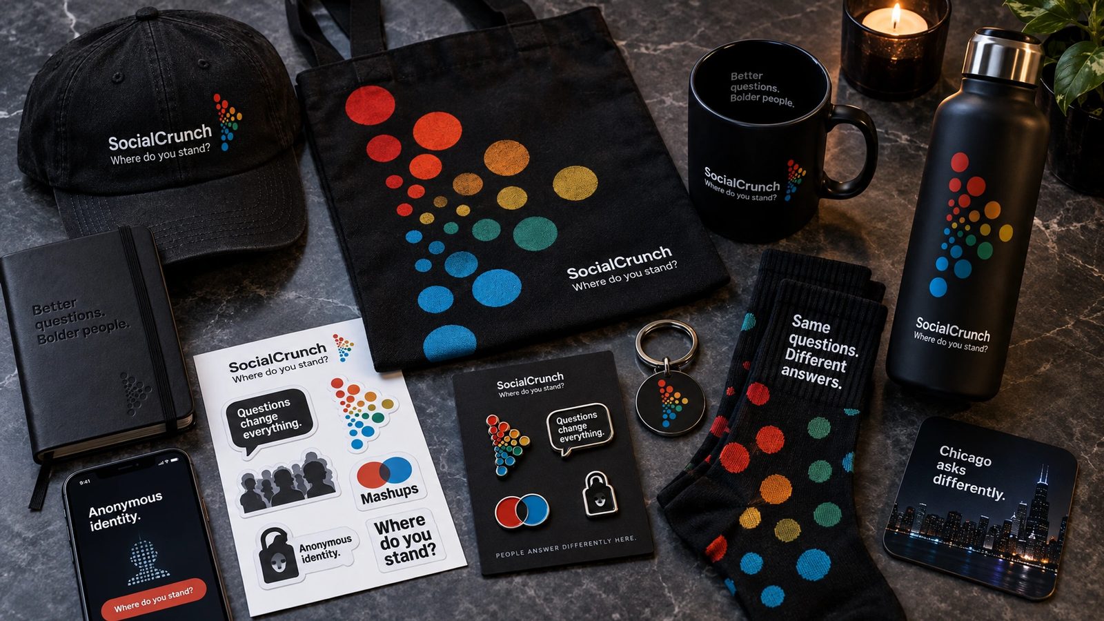
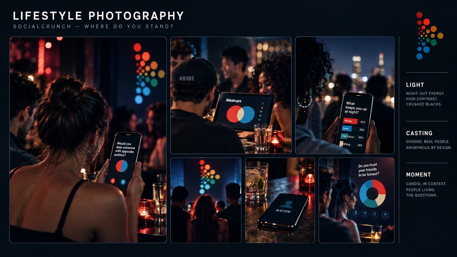
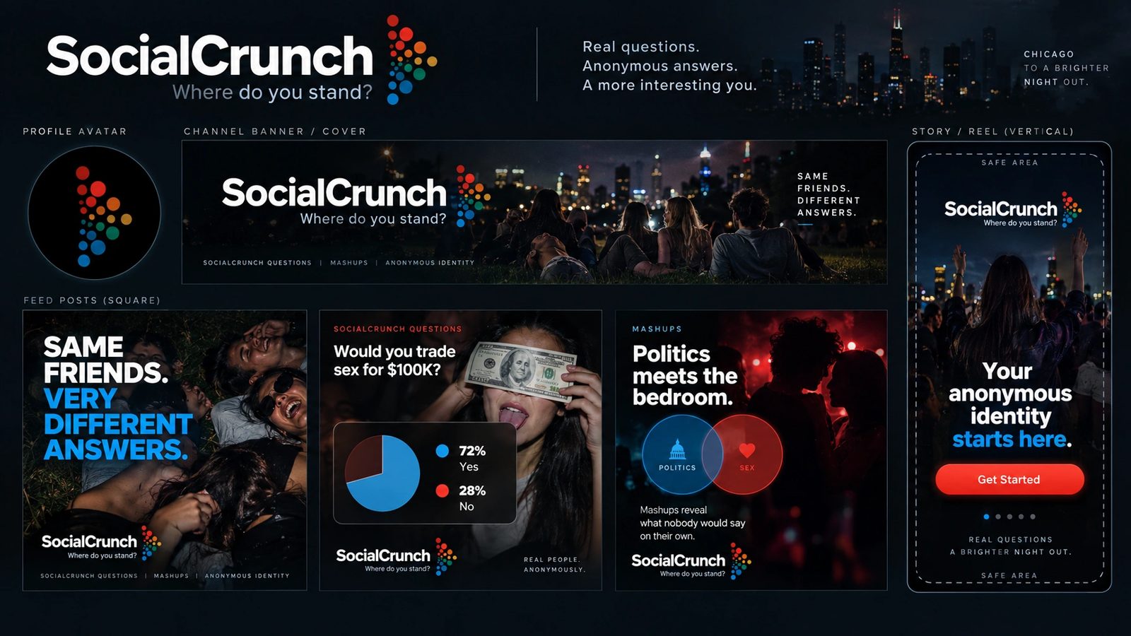
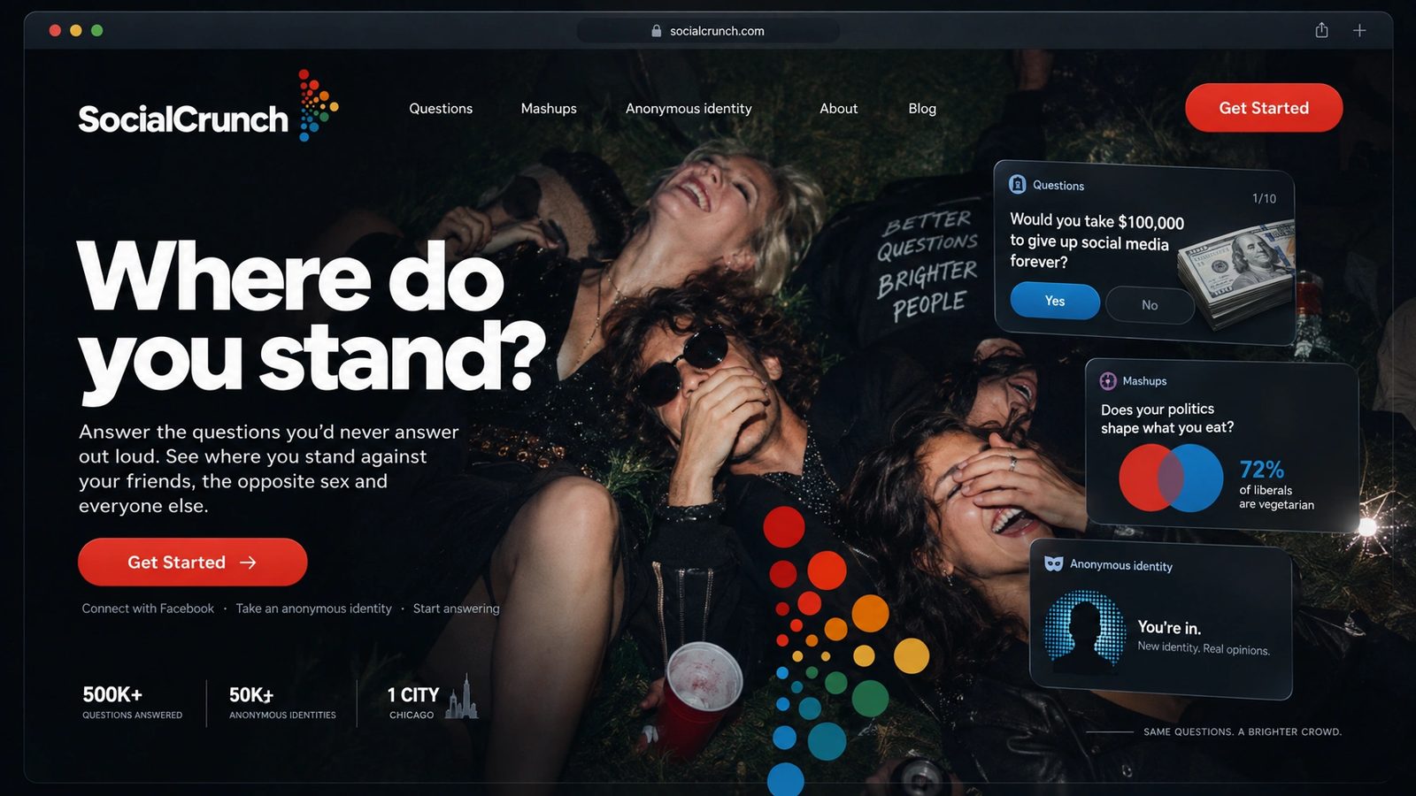
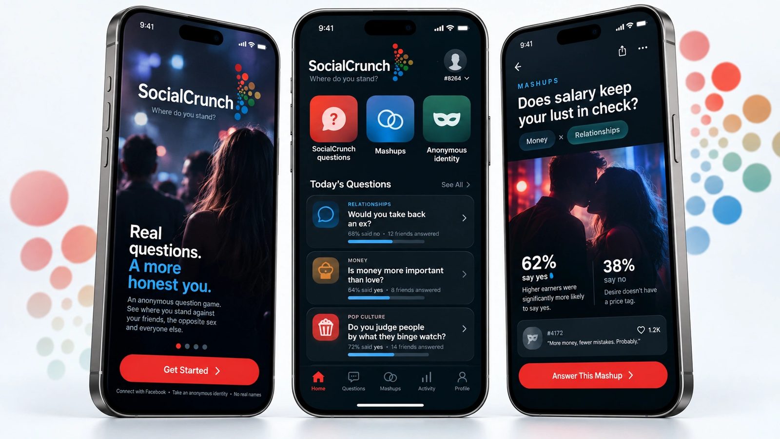
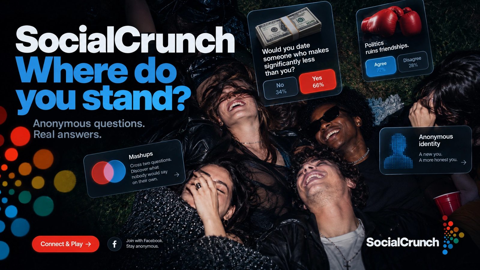
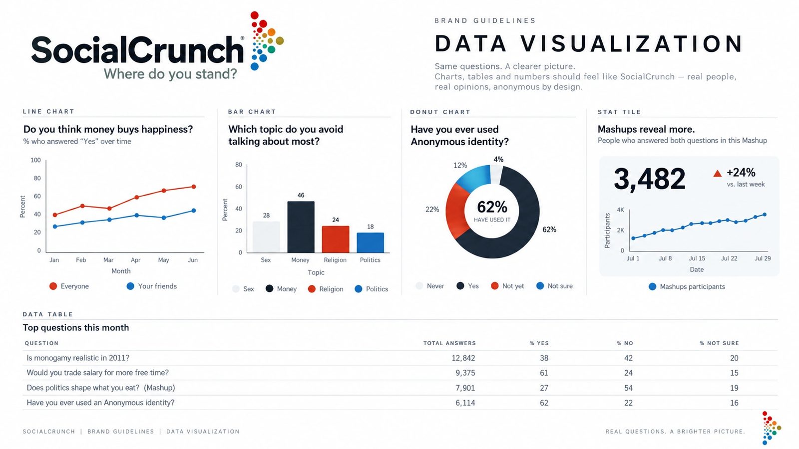
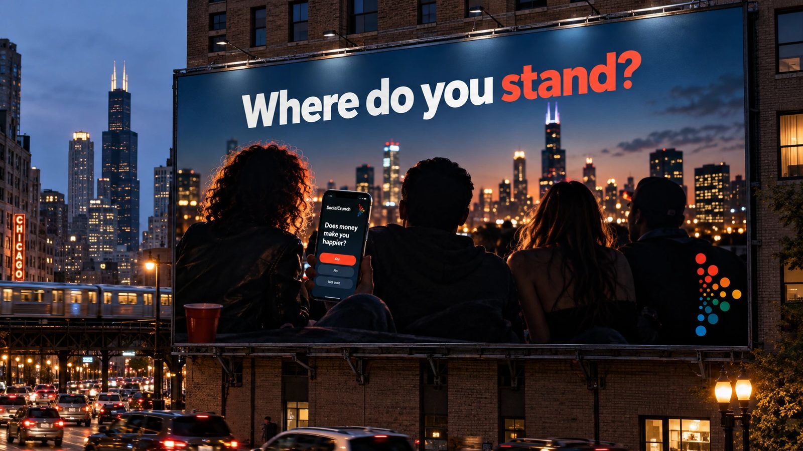
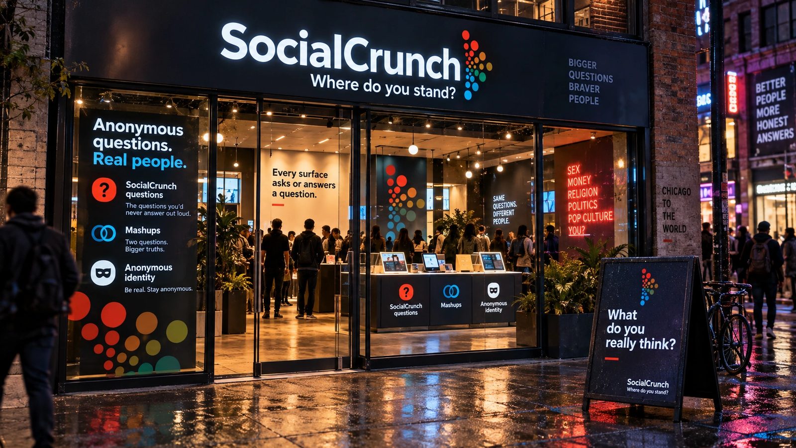
The concepts and prototype are the work. The brand world is a 2026 study made with my own tool from them, not work for SocialCrunch.
We will tell you facts about your friends you never, ever knew.
SocialCrunch, 2011
Role
Design director at ÄKTA, 2010 to 2011. A 2026 study for the brand world.
Identity system
Palette, type, buttons and icons on one mood board, the wordmark’s dot mark and the SC monogram.
Concepts
Light and dark feeds of question cards, categories down the side, anonymity first.
Prototype
Start, anonymize, the mashups list and the result, over night photography.
Fifteen surfaces
From the locked brand DNA: logo system, guidelines, cards, packaging, merch, photography, a social kit, data, web, app, a campaign, billboard and storefront.
- Product design
- Identity
- Design direction
- UI design
- Brand DNA extraction
- Brand systems
Next
The game lives in the archive with the rest of the studio years.
Browse the archive →