 ISAAC WOOTEN

Levid Media
The design agency I started in 1999. Fifteen years of work for other people, and the brand that carried it.
The agency that paid for college and then became the job. I started Levid Media in 1999, ran it through art school and full time after, and kept it going for fifteen years: sites, identities and campaigns for Nintendo of America, Microsoft, RED, Coca-Cola and dozens of smaller clients, many of them in this archive. The brand was mine to design, and it changed as often as the work did. What it taught me: you’ll redesign your own brand more than any client’s, and the one thing worth keeping steady is the mark.
The brief
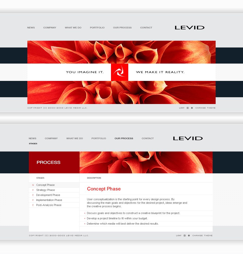
You imagine it. We make it reality. An agency’s own brand has to prove that line before anyone reads it.
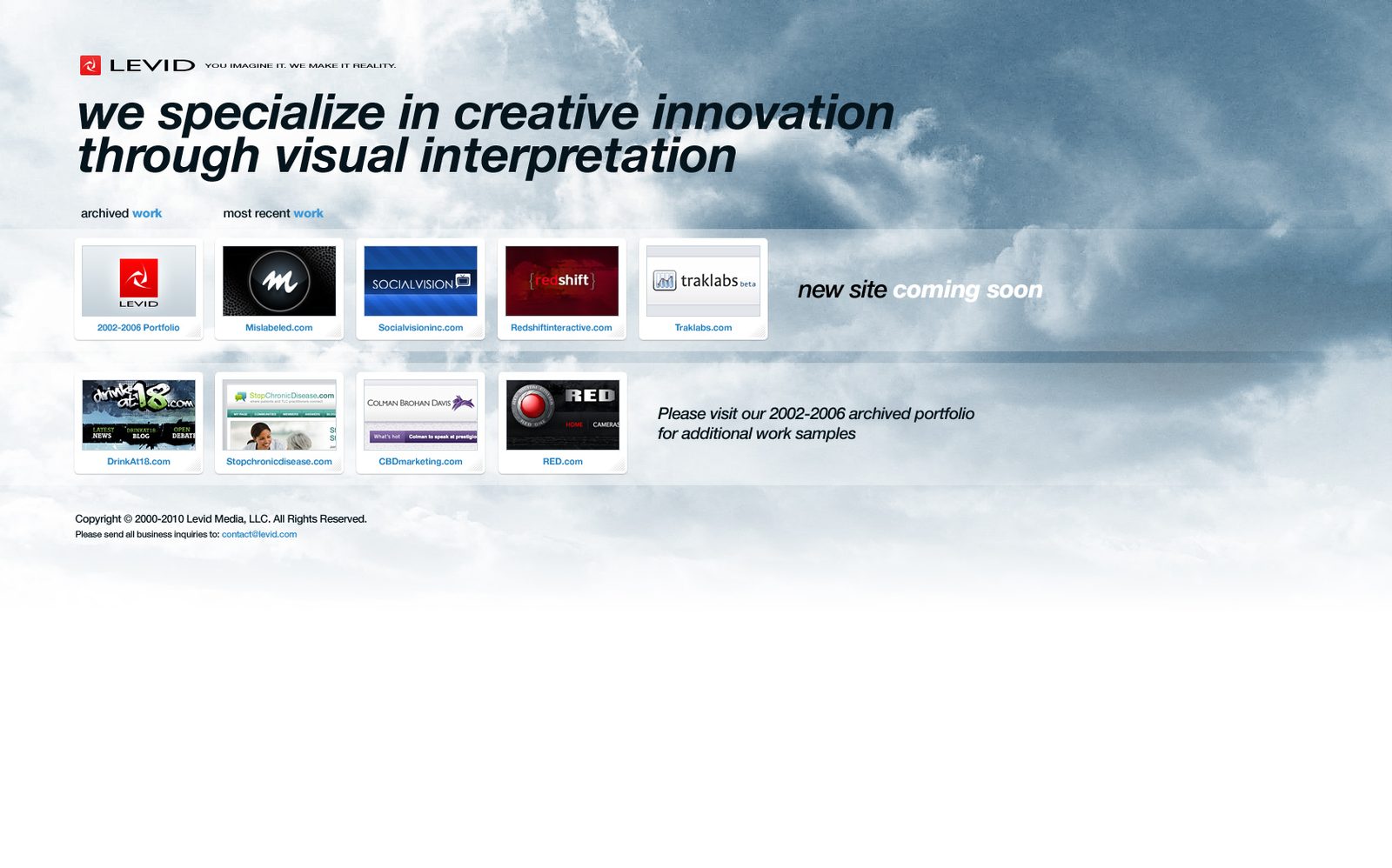
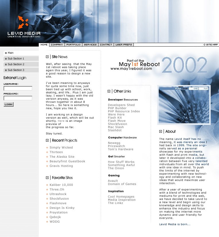
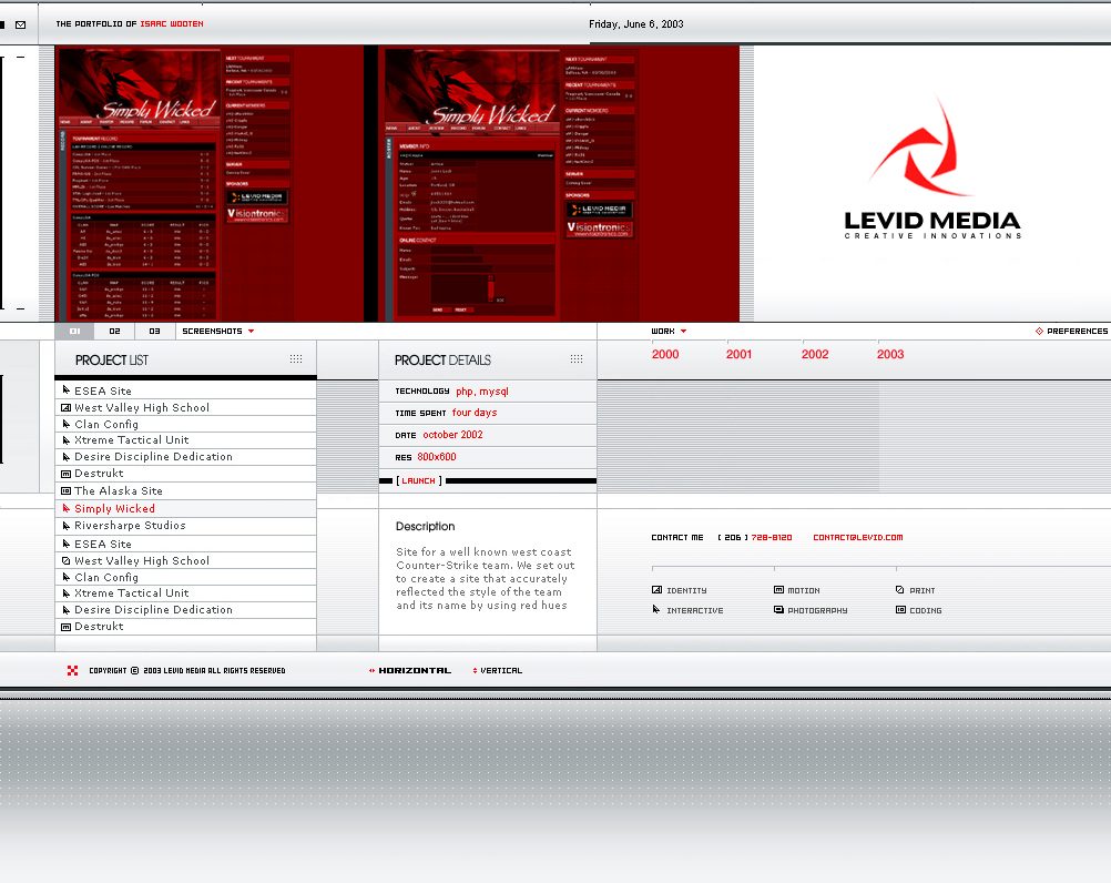
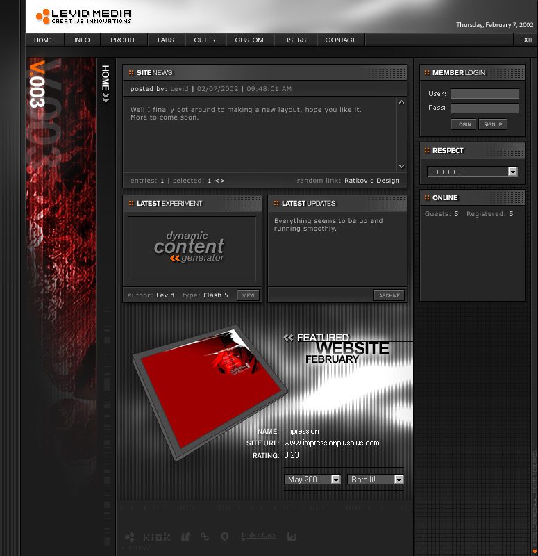
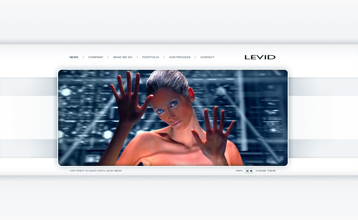
The mark is an aperture: three white blades turning inside a red square, a camera iris and a pinwheel at once, so it reads as vision and as motion. The wordmark is set wide and quiet underneath, so the red does the talking. The studio’s own site became the lab for everything else. It was rebuilt at least six times, from cool blue in the early 2000s to red portfolios, a dark web-work version, a flower close-up and finally a single framed image, and the mark stayed the one constant.
A mark that moves
Three blades, one turn. The aperture suggests a lens opening and a wheel spinning, vision and momentum in one shape.
One red square
Levid red on white, with black for type. The square works as a favicon, a stamp and a sign.
The site as a lab
Six versions of the studio’s own site, each one a test of what the next client might want.
Print that matches
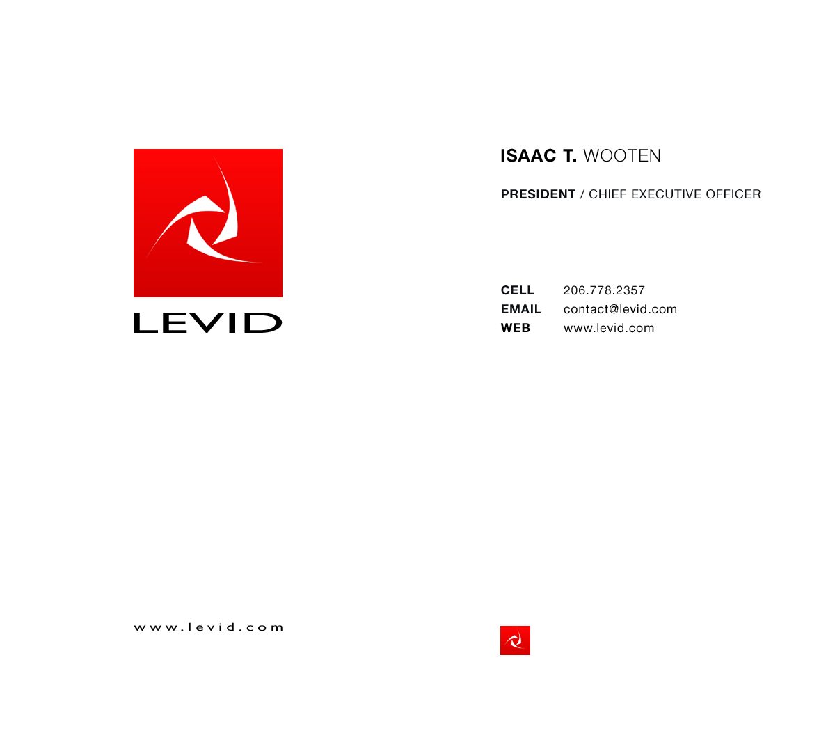
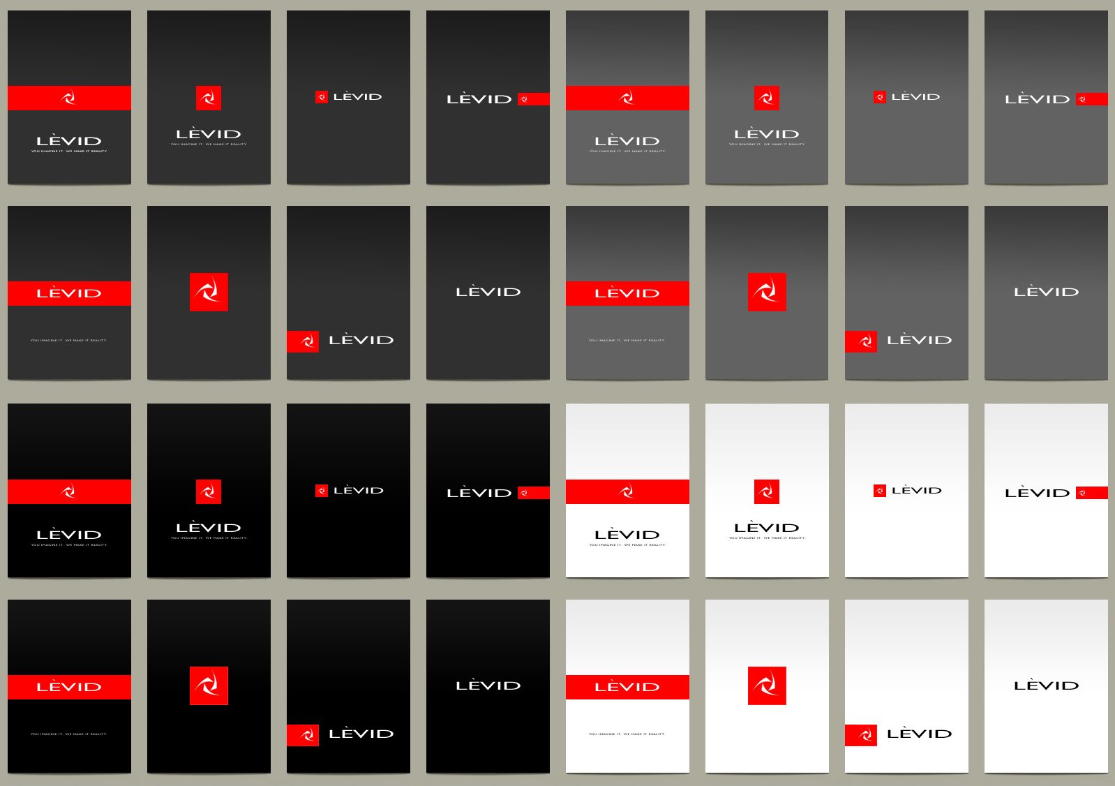
Cards and folders in black, red and white, so a pitch looked like the studio before the work was shown.
The studio
Brand system
Fifteen years of a brand nobody wrote down, so I finally wrote it down: Levid red on white and black, heavy headlines, cinematic red light and a sense of rotation, locked as brand DNA. Then I let it run into everything the studio never had time to make, from packaging to a storefront.
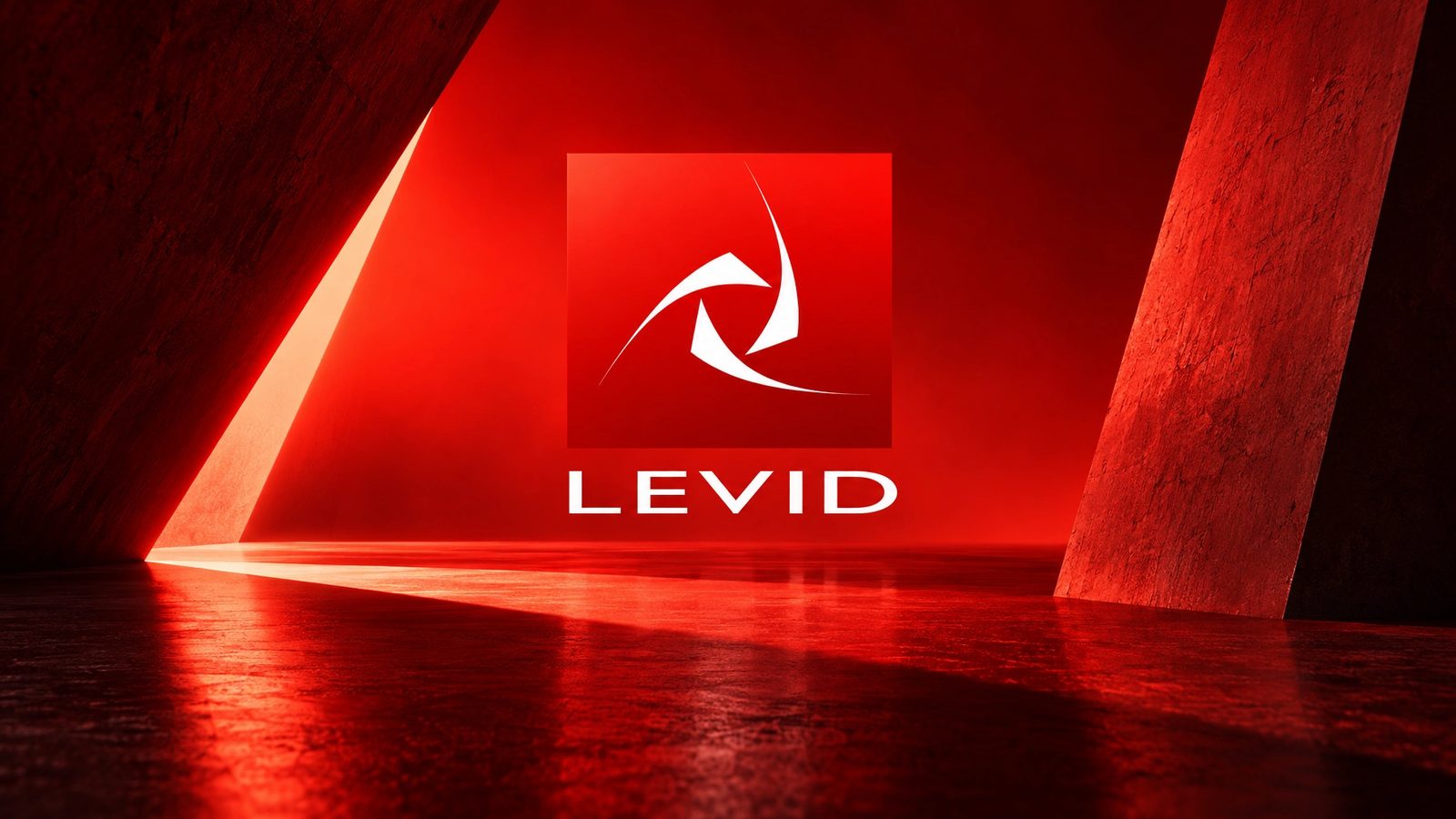 Brand world · rendered from the locked brand DNA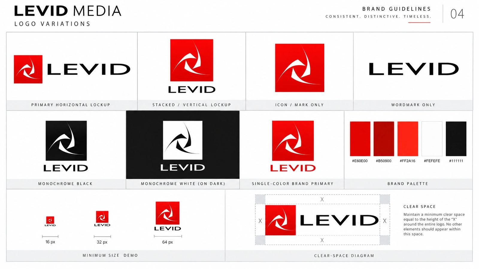
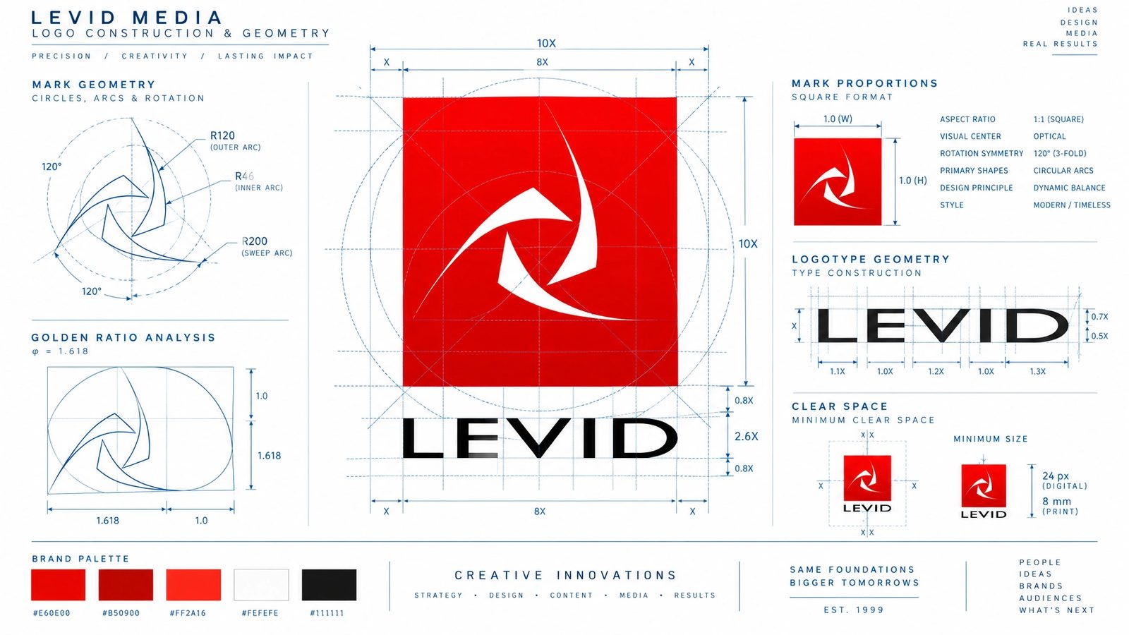
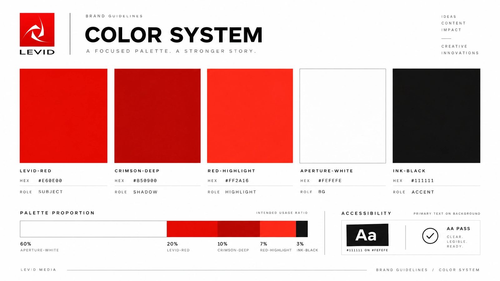
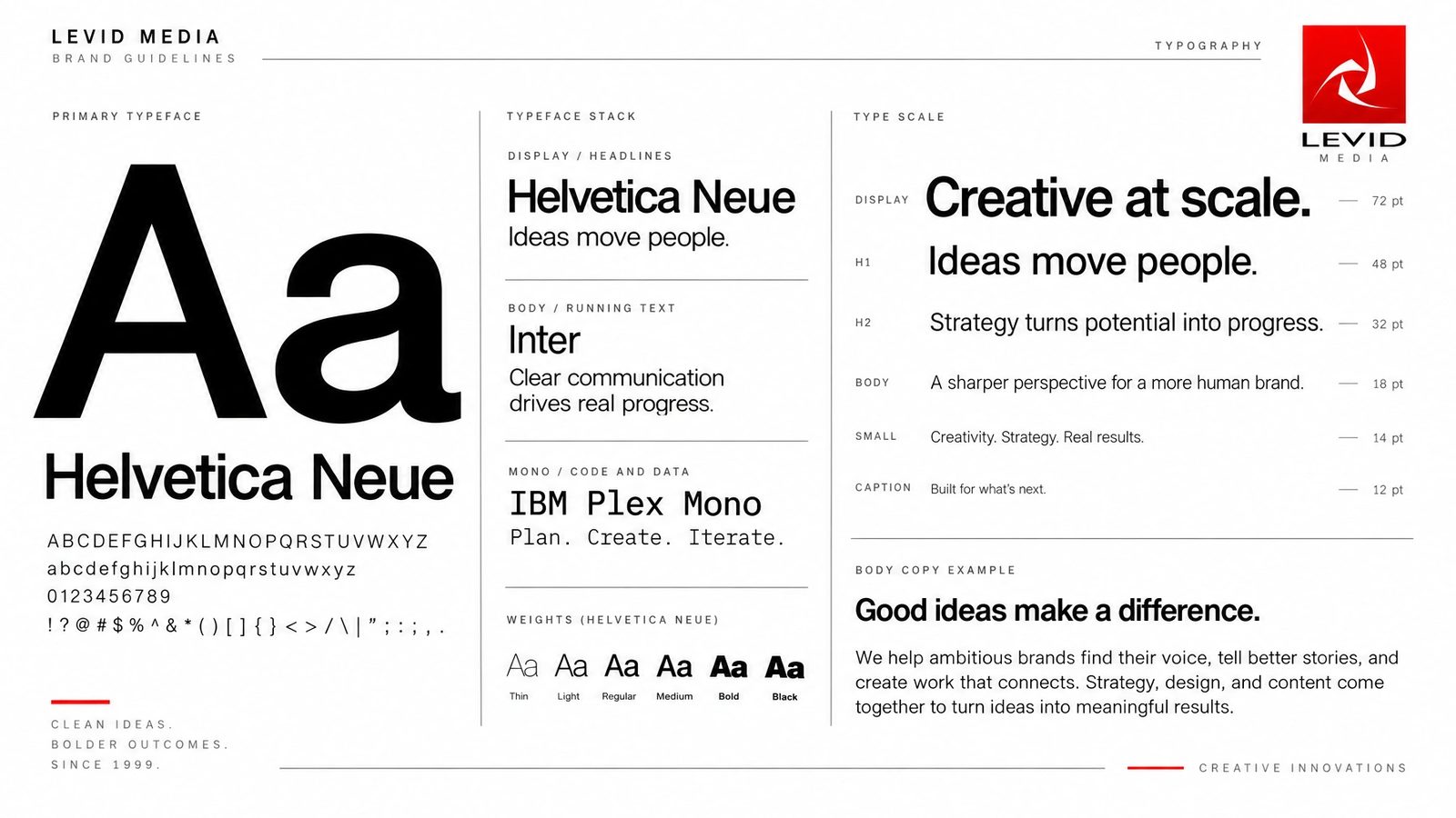
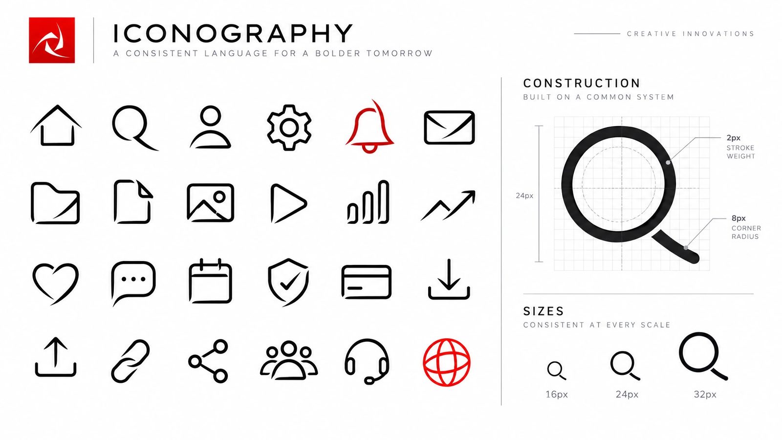
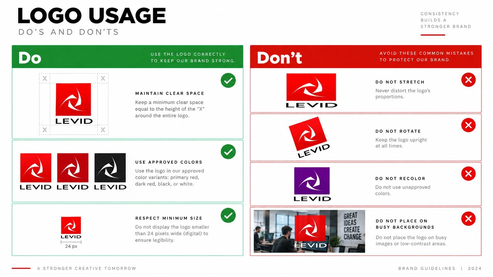
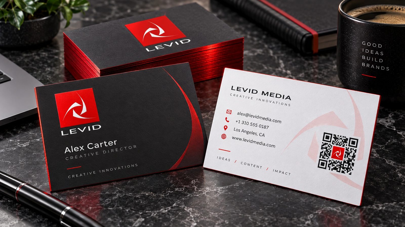
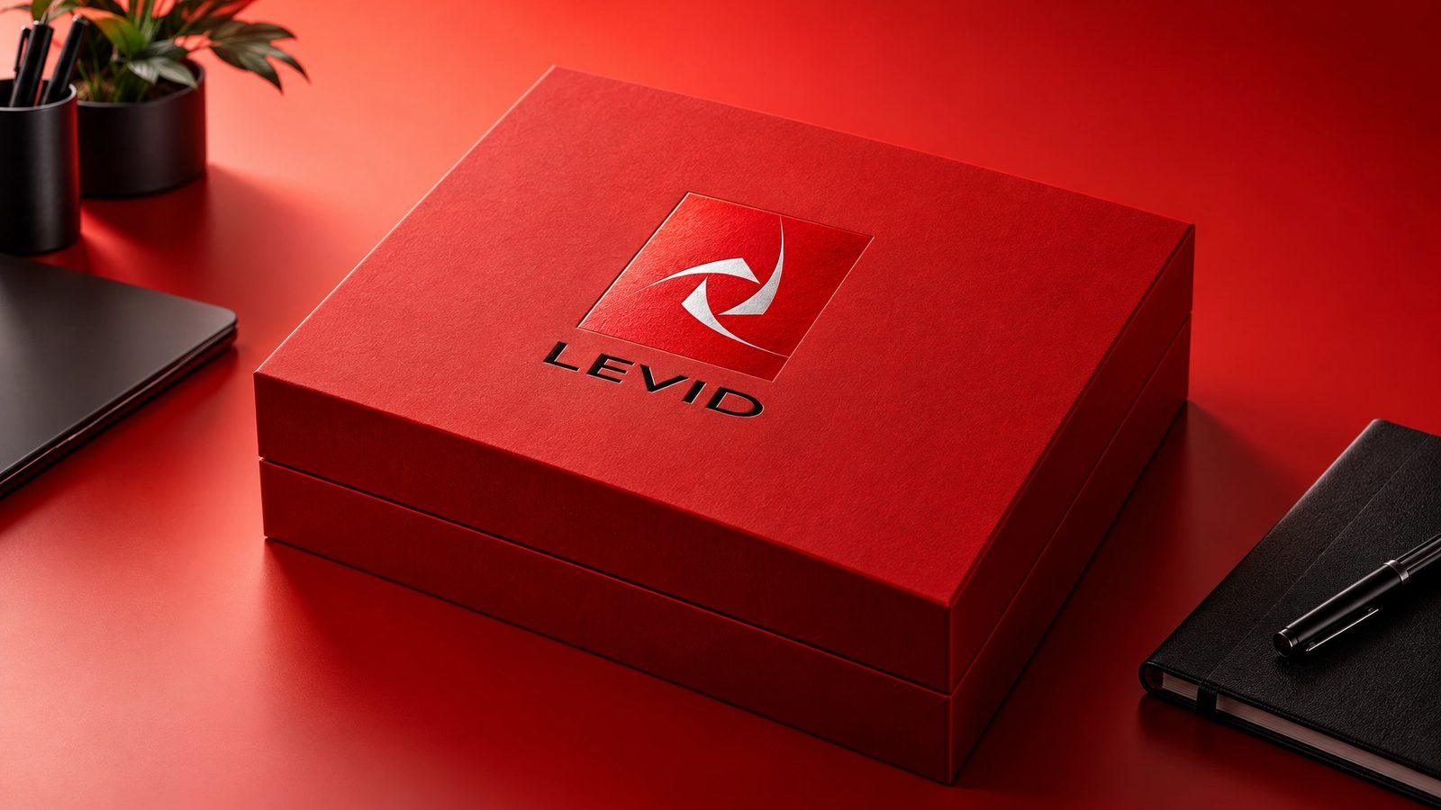
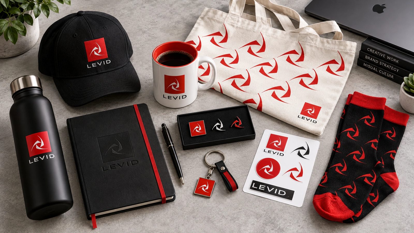
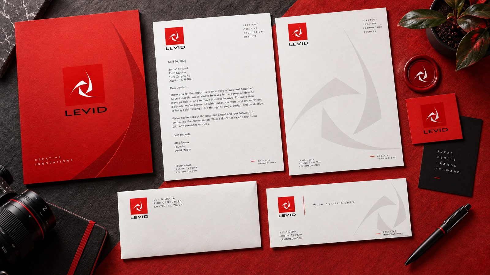
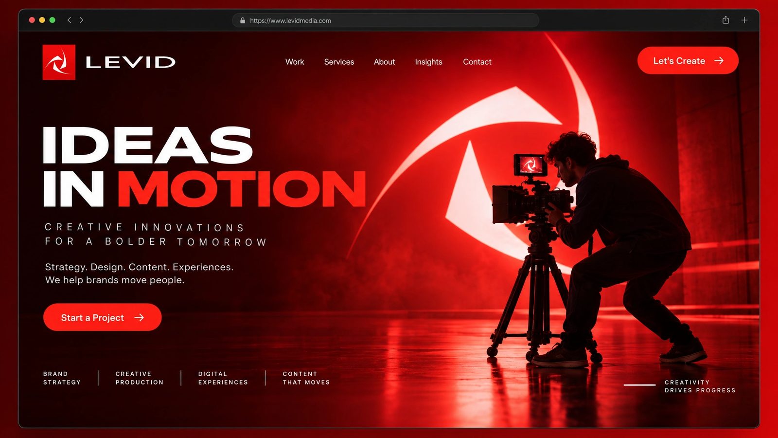
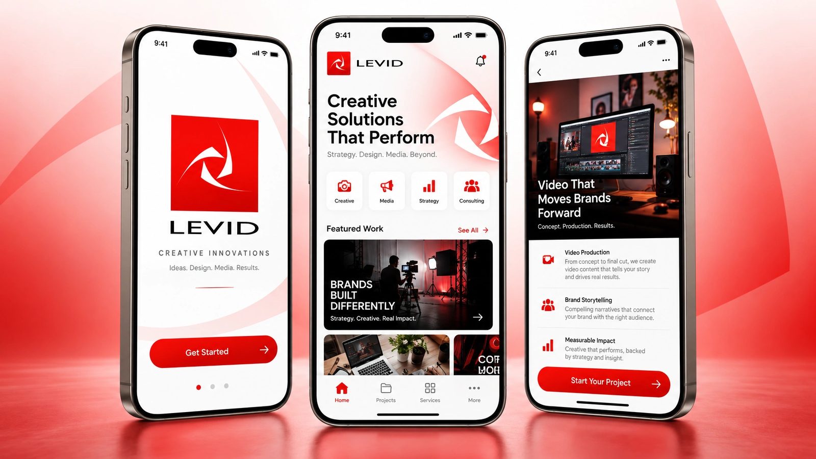
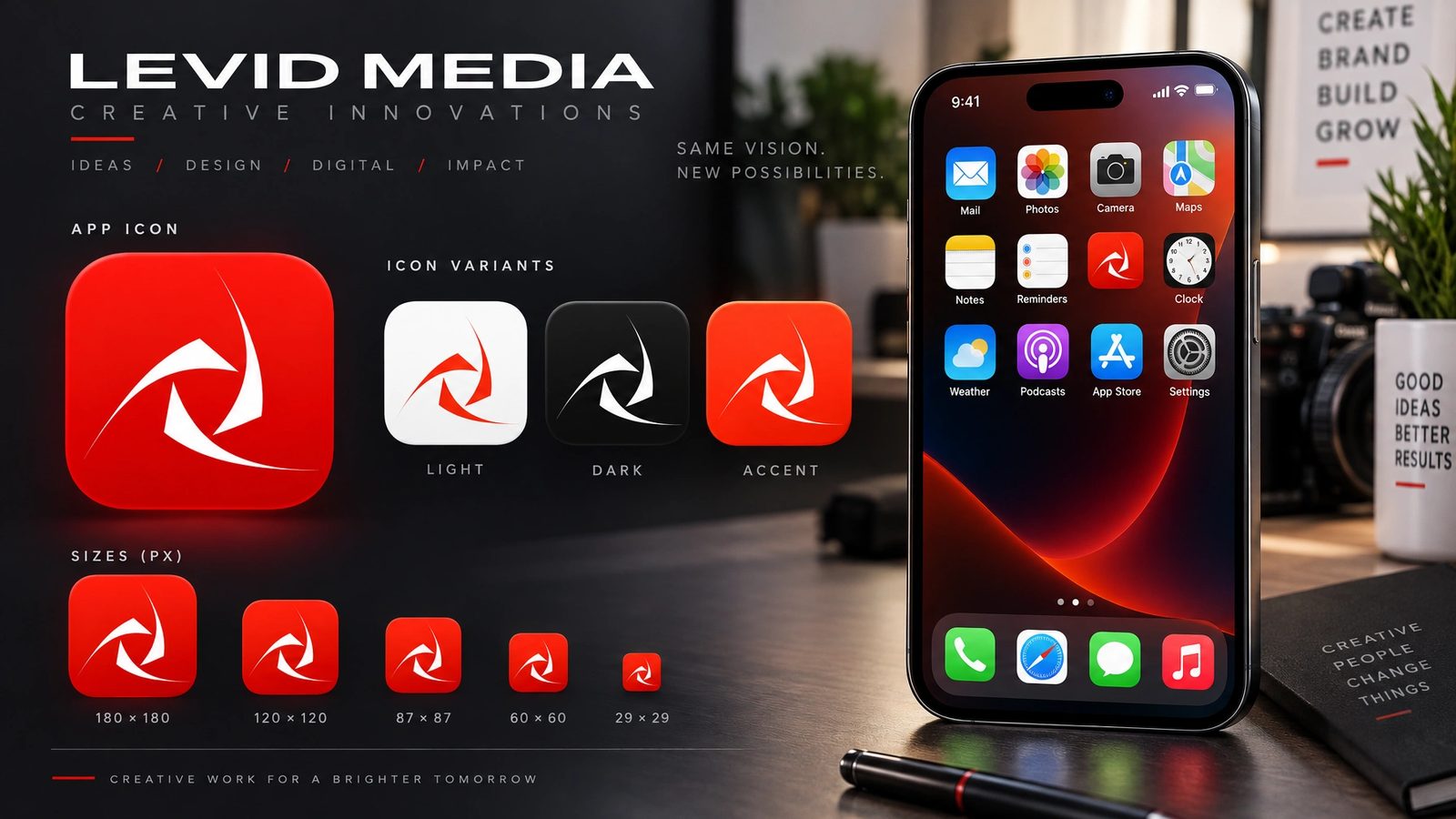
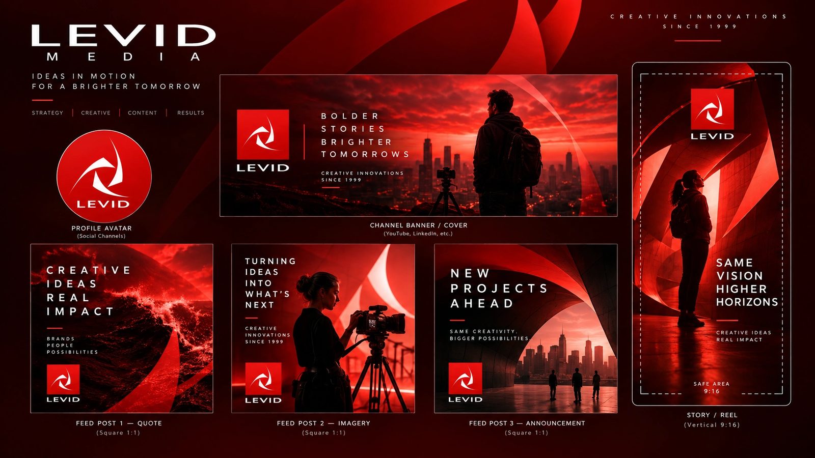
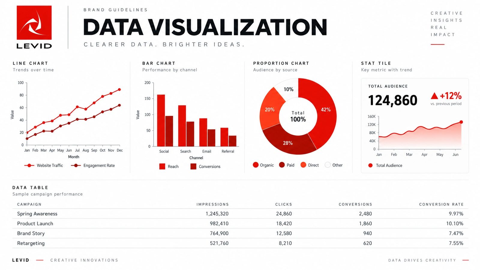
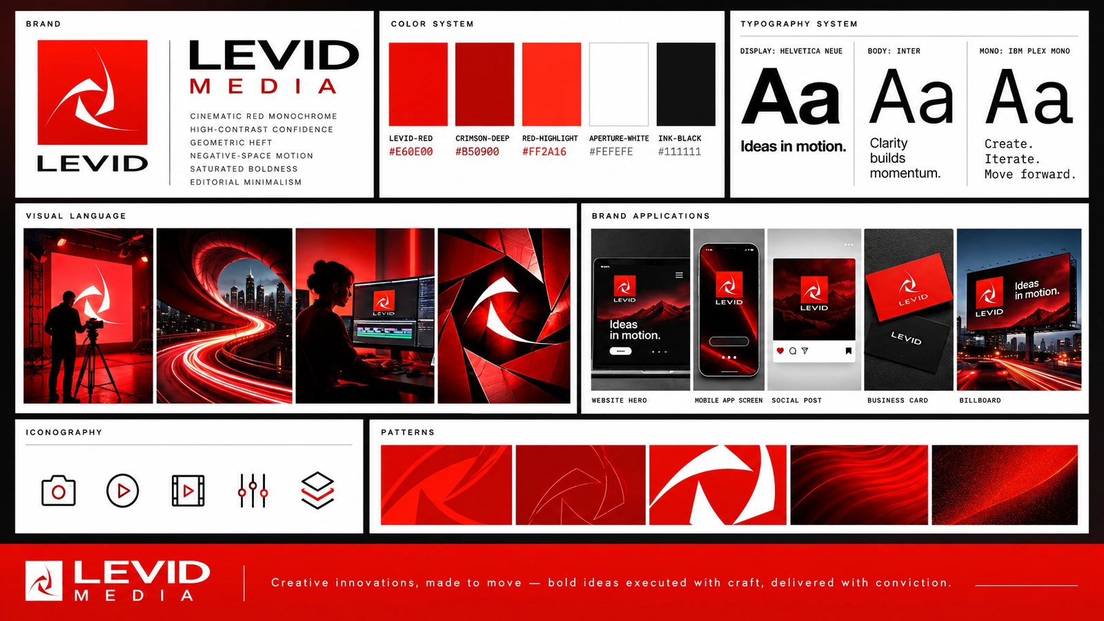
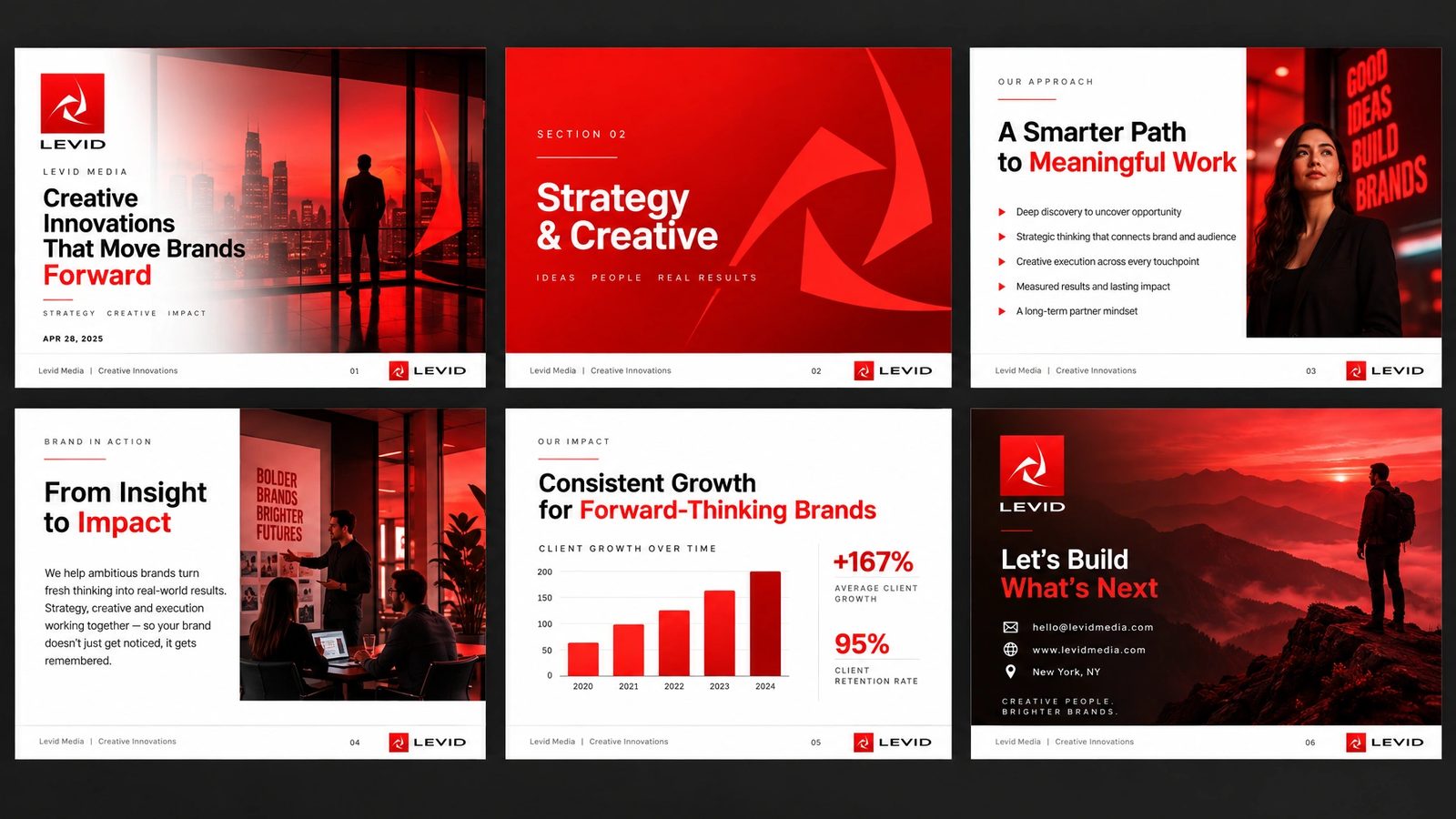
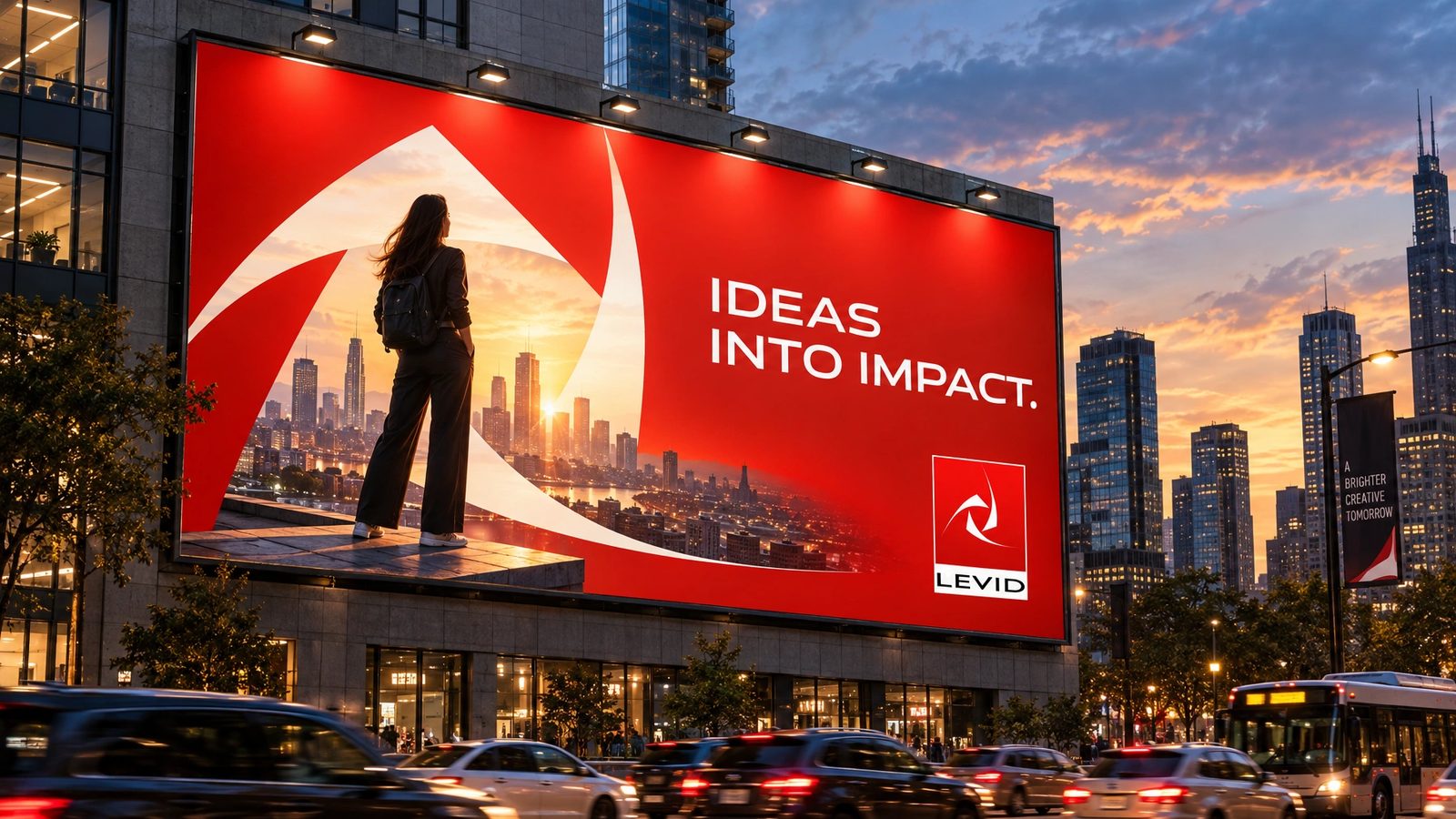
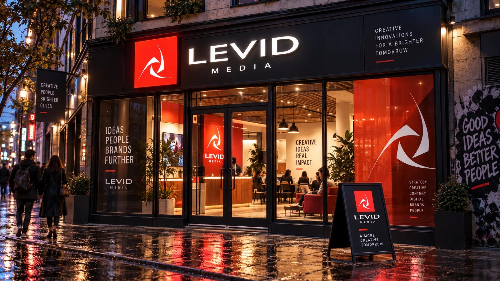
The mark, print and sites are the design. The brand world is a 2026 study made with my own tool from them.
You imagine it. We make it reality.
Levid Media, the line on the studio site
Role
Founder, creative director, and the studio’s own designer, 1999 to 2014. A 2026 study for the brand world.
Founder
Started it in 1999, ran it through art school and full time after, fifteen years in all. It still takes the occasional project.
Clients
Nintendo of America, Microsoft, RED, Coca-Cola, Speakeasy, Renovacom and Dell University, among many.
The brand
The aperture mark, cards, folders and at least six versions of the studio site, designed and built end to end.
Twenty surfaces
Extracted into brand DNA and rendered: palette, type, icons, rules, logo system, print, packaging, merch, social, data, a presentation, web, app, billboard and signage.
- Agency founder
- Brand identity
- Web design
- Creative direction
- Brand DNA extraction
- Brand systems
Next
Much of the agency’s client work lives in the archive with the studio’s own.
Browse the archive →